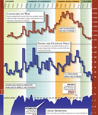
From foreignpolicy.com, a really tall chart showing statistical information covering the last five years of the Iraq war. I'm not sure I like the idea of this big chart that covers so many different types of data. The information on the bottom half of the chart tends to get lost to the reader.