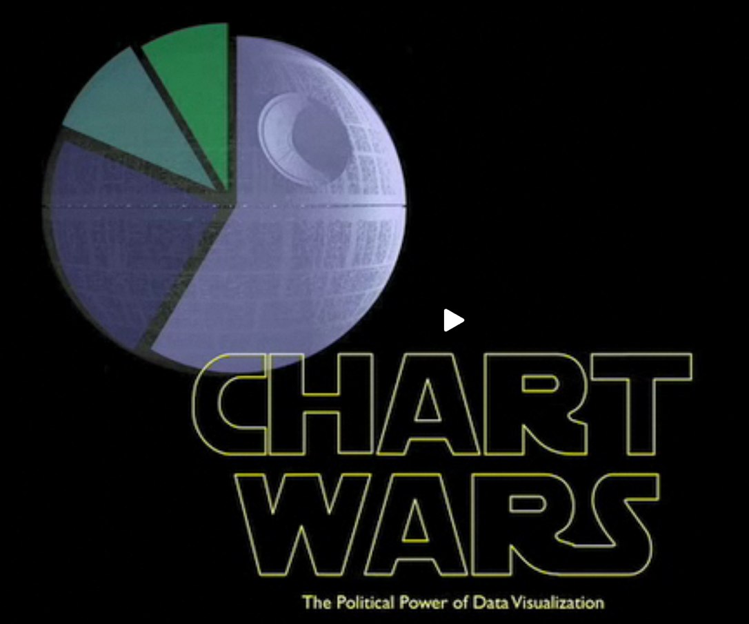
Chart Wars is a great, short (5:15) presentation by Alex Lundry on the political power of data visualization and some of the issues surrounding using charts and infographics to promote a specific agenda. Inspired title slide too. Nice job Alex!
TargetPoint’s VP and Director of Research, Alex Lundry, was recently a featured speaker at DC Ignite, an evening of short presentations in which participants are limited to 5 minutes and precisely 20 slides that auto-advance every 15 seconds.
Thanks to Dave Gray for tweeting a link!