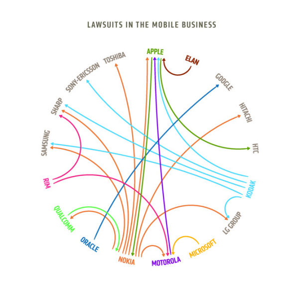
George Kokkinidis from Design Language News made another great infographic redesign of the Lawsuits in the Mobile Business. A significant improvement over the original diagrams in The Guardian and the NYTimes.
An attempt at redesigning this chart from The Guardian to make the plaintiffs and defendants a bit more clear.
Although this doesn’t add the additional data dimensions of company revenues like “Who’s Suing Whom?”, this diagram is much easier to read and understand than the originals.
Great job George, and thanks for the link!
