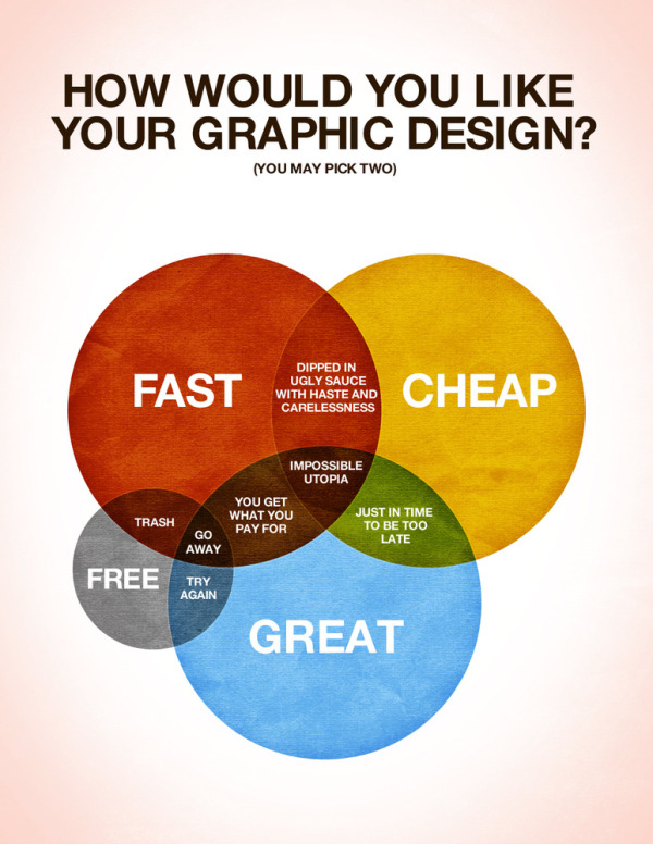
Designed by Colin Harman, How Would You Like Your Graphic Design? made me laugh this morning. Great venn diagram infographic.
There are times when things just need to be explained using a spectacular Venn diagram. I made this last night whilst sitting on a screened in porch by an outdoor fireplace when it was late. Design is a funny thing, not as funny as a Kangaroo jumping on a trampoline, but let’s be honest what is as funny as that? I’ll give you a little hint: nothing.
Anyways, I love design, but it has it’s limitations in the creation process. Hopefully this helps you understand what those are and help you choose how you would like your design work in the future.
Your thoughts?
Although designed as a treatise about graphic design, it applies to infographics as well.

 Randy
Randy