Wow! Journalism in the Age of Data, by Geoff McGhee at Stanford, is a fantastic video documentary looking at the Age of Infographics, and how we got here.
Journalists are coping with the rising information flood by borrowing data visualization techniques from computer scientists, researchers and artists. Some newsrooms are already beginning to retool their staffs and systems to prepare for a future in which data becomes a medium. But how do we communicate with data, how can traditional narratives be fused with sophisticated, interactive information displays?
A video report on data visualization as a storytelling medium. Produced during a 2009-2010 Knight Journalism Fellowship. Total running time: 54 minutes with related information and links.
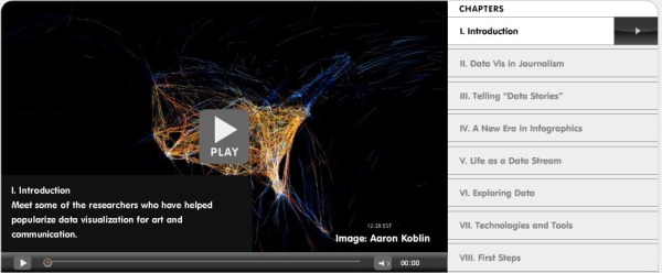
It is 54 minutes long, but nicely broken out into 8 chapters. Geoff was able to interview some of the true superstars in the Infographics field.
Found on Visual Journalism