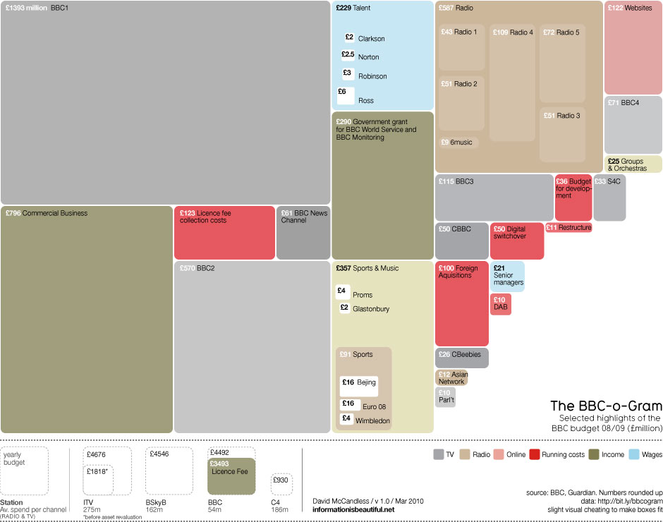
David McCandless, from Information Is Beautiful created this treemap of selected highlights from the BBC budget for the Guardian Datablog.
Recent controversy about the budget of the BBC here in the UK made me curious about its spending. Here’s the BBC-o-Gram, a visualization I created for the Guardian Datablog, exploring the costs of running one of the biggest broadcasters in the world.
David has also posted the underlying data in a GoogleDocs spreadsheet.