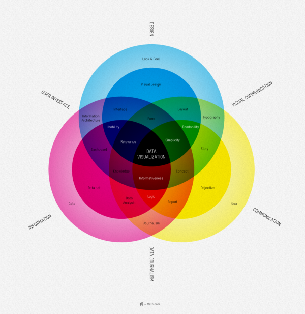
I love this map of What Is Data Visualization? from Sébastien Pierre, founder of ffunction. It lays out the different aspects of information design, and acts as a fantastic guide to the vocabulary used in the design community.
ReadQWriteCloud has a good interview article with Pierre on his thoughts behind designing the infographic.
Pierre:
“Will it be interactive or static? Will it be used as a tool or to illustrate something? Depending on how we position the visualization, it will be more demanding on UI aspects or on visual aspects. Dashboards, online reports and interactive web visualizations need a solid understanding of UI design, while infographics and print reports require a strong foundation of typography, layout and visual communication.”
Found on ReadWriteCloud and ChartPorn
