New infographic video from Mint.com, Eat, Drink and Be Thrify uses their data to visualize the statistics behind monthly spending habits.
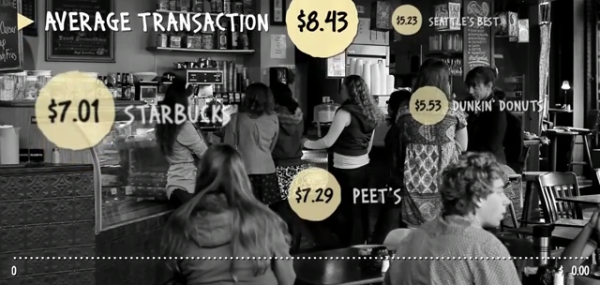
So how does your spending on food and dining compare to that of your peers? Using aggregate and anonymized data on Food & Dining spending from Mint.com, we created the video above to highlight some of the most interesting trends we found in Mint’s data, from average transaction at a variety of coffee shops, grocery stores and fast food restaurants, to the time of year when Mint users spend the most — or the least — in those categories.
Designed by Column Five Media and Akorn Entertainment.