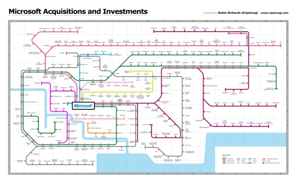
Robin Richards (@ripetungi) recently updated his fantastically detailed subway map of Microsoft Acuisitions and Investments. Although Robin is the Information Design Director at JESS3, this is one of his personal projects.
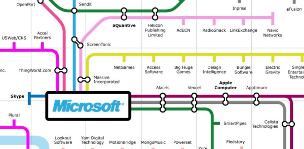
Infographic showing the acquisitions and investments of Microsoft, done as a tube map with each coloured line representing a different industry for each acquisition or investment. Where the stations meet is where the two industries overlap. The key at the bottom displays information about the location on the map of the station (company) the year of acquisition or investment.
This thing is big! Poster-sized big. I dropped the link into Zoom.it so it would be easier for you to zoom in closer and see the details.
Great job Robin! I love this project.

