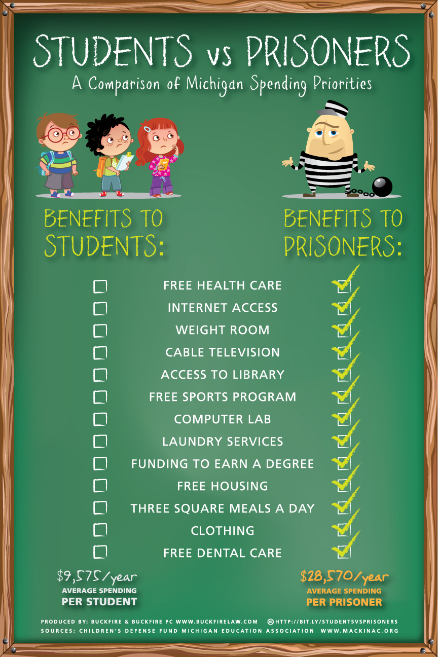
Nice, clean, simple infographic design. Students vs. Prisoners by the law firm Buckfire & Buckfire in Michigan visually communicates one message really well: In Michigan, the average spending per prisoner is close to three times that spent per student.
Potentially a controversal budget topic in Michigan, I appreaciate that they clearly listed the link to the data source. A couple things I would change about this design:
- Visualize the total spending dollars that are currently listed at the the bottom in text
- I like the use of a chalkboard style font, but it’s not used consistently throughout the design
- For the benefits listed in the middle, I think it would be more interesting to show how much each one contributed to the total spending per prisoner
Thanks to Larry for sending me the link!
