About
Randy Krum
President of InfoNewt.
Data Visualization and Infographic Design

Infographic Design

Infographics Design | Presentations
Consulting | Data Visualizations

DFW DataViz Meetup

Join the DFW Data Visualization and Infographics Meetup Group if you're in the Dallas/Fort Worth area!

Search the Cool Infographics site

Custom Search

Subscriptions:


Feedburner

The Cool Infographics® Gallery:

How to add the
Cool Infographics button to your:

Cool Infographics iOS icon

- iPhone
- iPad
- iPod Touch


Read on Flipboard for iPad and iPhone

Featured in the Tech & Science category

Flipboard icon

Twitter Feed
From the Bookstore

Caffeine Poster

The Caffeine Poster infographic

« Client Infographic: A Solar Innovation Story | Main | What Can You Expect to Earn in the Valley? »
Monday
Aug082011

Visualizing the U.S. Debt

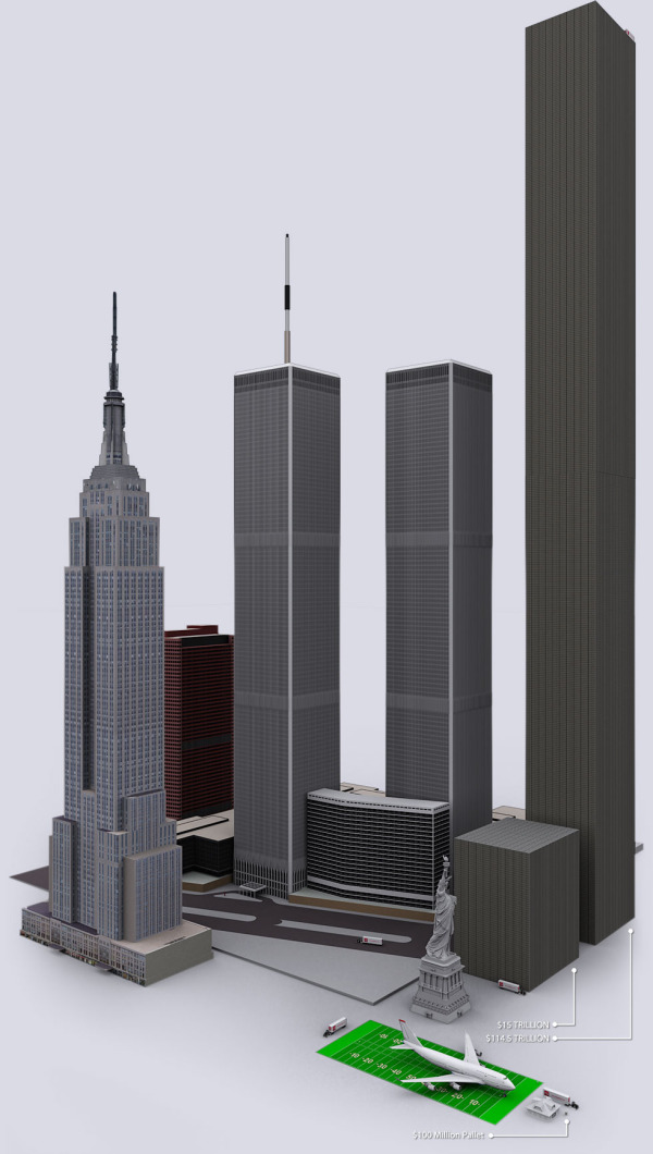
The U.S. Debt Visualized is a great visualization of scale, and can be found at usdebt.kleptocracy.us, where you start with a single $100 bill, and start stacking them in orders of magnitude.  Stack them on pallets, start stacking the pallets and show them in comparison to other real-world items.

$114,500,000,000,000. - US unfunded liabilities
To the right you can see the pillar of cold hard $100 bills that dwarfs the
WTC & Empire State Building - both at one point world’s tallest buildings.
If you look carefully you can see the Statue of Liberty.

Numbers this large become too big to truly comprehend to many people, and I love visualizations like this one that put the unbelievable high numbers into context and scale.  Here’s one trillion dollars:

A visualization like this has a natural bias.  Whatever object the designer chooses to show in relation to the stack of bills can make the pile appear large or small in comparison.  In this example, the piles of money are truly staggering, but that’s all the reader can walk away with.  In it’s defense, this visualization isn’t trying to propose a solution, it’s just trying to make the viewer understand how big the number is.

Found on SeeWhatYouMean, VizWorld, Business Insider and Information Aesthetics.

PrintView Printer Friendly Version

EmailEmail Article to Friend

Reader Comments (3)

Really nice.
August 9, 2011 | Unregistered CommenterDFH Financial Solutions
Great post! This is a shameless piece of self promotion - I've started a blog called Awesome Infographics (http://awesomeinfographics.com/), about some of the best infographics on the internet. Hoping anyone who likes this post will like this blog.
August 9, 2011 | Unregistered CommenterDavid
Excellent!
August 20, 2011 | Unregistered Commenterprinting of flyers
Comments for this entry have been disabled. Additional comments may not be added to this entry at this time.