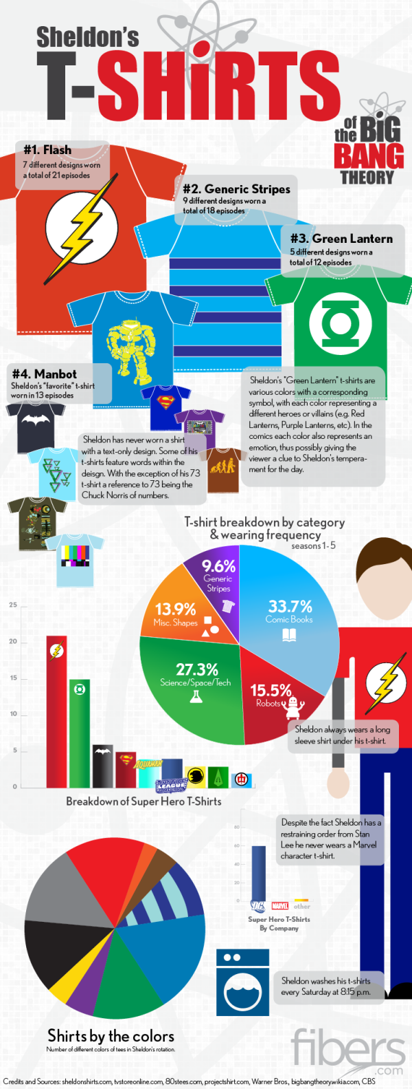
If you have seen the comedy show The Big Bang Theory, then you know Sheldon…. If you haven’t seen it, go watch it and get back to us. Have you ever noticed his wardrobe? The Sheldon’s T-Shirts infographic from fibers.com tells you his favorite shirts, how often he wears his shirts, and even what colors he wears the most!
Graphs, Charts and illustrated T-Shirts with correlating sizes to wearing frequency - would there be any other way to visualize Sheldon Cooper’s t-shirt collection from The Big Bang Theory? We think not.
Big thanks to Sheldon’s Shirts where we got most of the data for this graphic. You can find a lot of Sheldon’s Shirts for purchase on the following websites:
This is just a fun infographic that uses some data visualization to appeal to fans of the show. Good design using publicly available data that has been complied in an engaging way.
The charts actually very well done. Charts are color-coded to match the data. Icons are included on the bars or in the pie slices, so no chart legends are needed. This makes the data faster and easier to understand.
Found on Fibers.com
