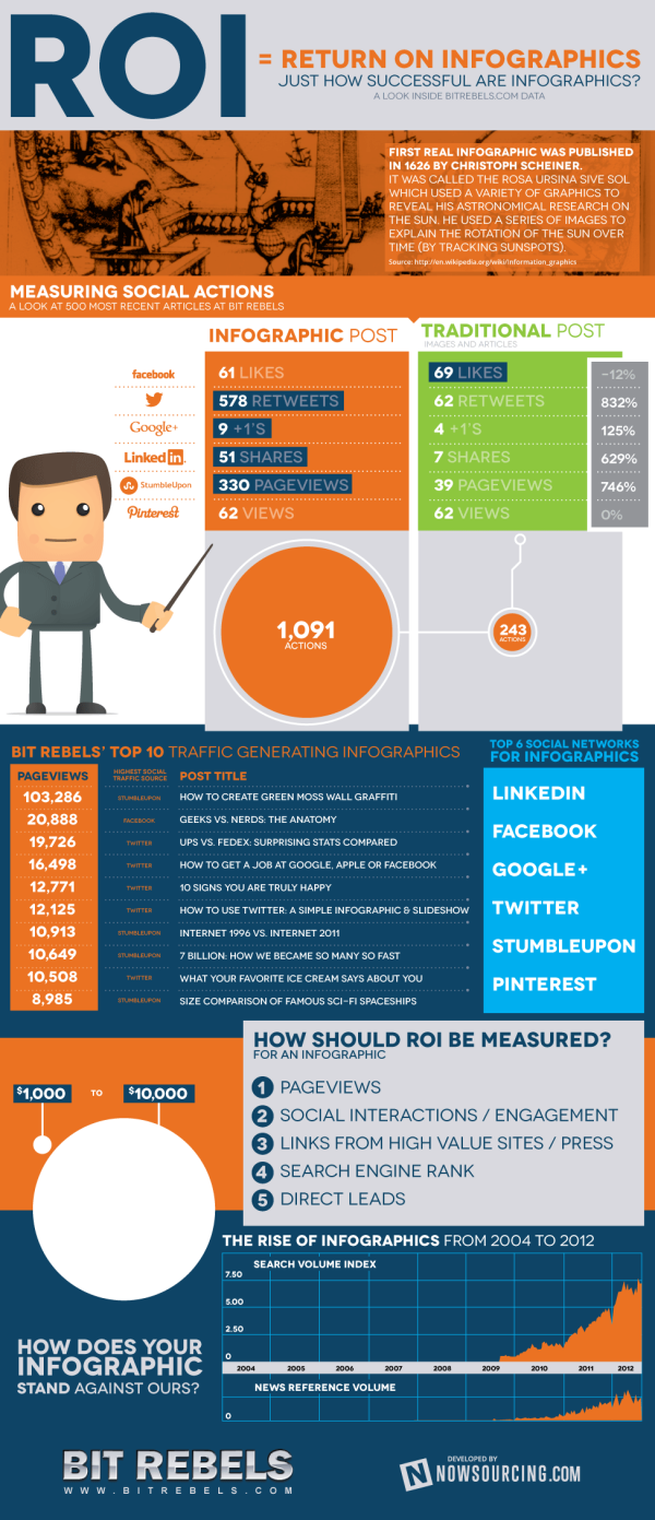
Infographics about infographics are always fun. Return on Infographics by Bit Rebels and NowSourcing takes a look at some of Bit Rebels’ own data from releasing infographics as part of their marketing.
The impact of an infographic can be measured on many levels, which makes it all just a little bit more complex and complicated to present. With the help of NowSourcing, we have been able to produce an infographic that will compare the traffic and social action impact of an infographic post with a traditional post that does not involve an infographic. It’s through social media analytics that a clear image slowly emerges to tell a story that for some has just been a question without an answer.
They’re pretty clear about this, but remember that this design is completely based on internal data from Bit Rebels. It may be a good indicator of infographics in general, but we don’t know for sure.
Bit Rebels has shared some fantastic data from their internal tracking, which will be of interest to the you, the readers of Cool Infographics. However, the design makes a few mistakes, and we’re all here to learn how to make infographics designs better.
- One of my pet peeves, the design messed up the size of the circles in the comparison table. Based on the full-size infographic they released at 975 pixels wide, the smaller circle for 243 Actions is about 55 pixels in diameter. Doing the match for the area of a circle, the diameter of the larger circle for 1,091 Actions should be about 117 pixels wide. In the design, it’s actually about 256 pixels wide! So instead of visually showing a shape roughly 4x larger, it’s actually showing a circle about 22x larger! This is a “false visualization” and mis-represents the data.
- Are these comparison data points an average or a total of the 500 posts?
- How many infographic posts are compared to how many traditional posts?
- Love the use of the actual logos from the social networks in the comparison table, and they should have continued that with the rest of the design instead of just text later in the design.
- The blue bars behind the higher comparison value look like bar charts, but obviously don’t match the data. They just fit the text, and have no visual relevance to the data. An indicator icon or highlighting the entire column width would have been better than the bars.
- Are the Top 6 Social Networks in rank order? LinkedIN is the top social network for infographics???
- The circles near the end of the design are also incorrect. Instead of showing a 10x comparison to match the dollar values, the circles show an over 100x comparison!
Found on WebProNews, MediaBitro’s AllTwitter, and Visual.ly. Thanks to everyone that also submitted it and tweeted links to it!
