On February 12, 2013, President Obama gave his annual State of the Union speech, but this year it was “enhanced” with charts, data visualizations and additional information in a sidebar of the display (full video above). The team at NPR (@nprapps) published a great review a few days later called Chart Check: Did Obama’s Graphics ‘Enhance’ His Big Speech? They also included opinions from a couple of the best data visualization experts Stephen Few (PerceptualEdge.com) and Nathan Yau (FlowingData.com)
I will say that I think the use of the charts was very successful and does make the President’s speech more effective. By their very nature, the charts imply that the President has data behind his message, and that can be a very persuasive, compelling tactic. You’ll also notice the wide array of chart styles so they are each memorable for different topics in the speech. We didn’t get 27 bar charts, because the audience wouldn’t have been able to tell them apart after the speech. We got different data visualizations for different types of data. Stacked bars, line charts, area charts and grids colored icons.
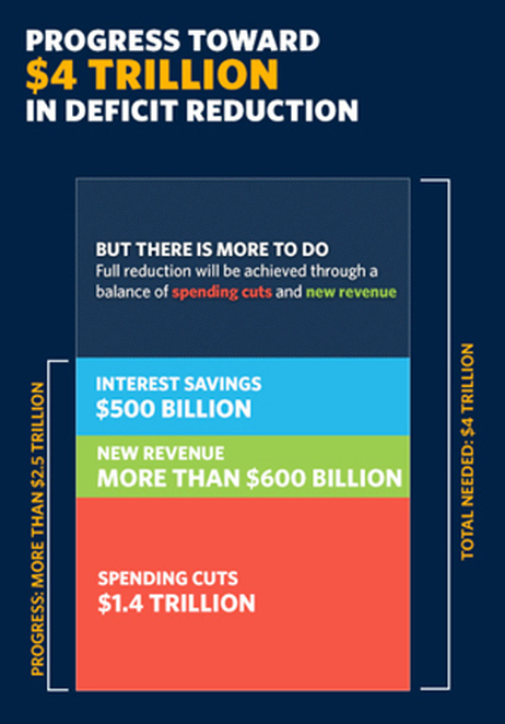
The key frame from the video (above) is what first caught my eye. This is the still image shown before you start playing the video. I was instantly concerned about all of the charts after seeing this one about Deficit Reduction. It may be because I work with data visualizations every day, but I could see instantly that the chart was wrong. How can the $500 Billion part of the stacked bar be larger than the $600 Billion part? That can’t be right! Seriously, I look at this stuff all the time, and this jumps out at me in a big way. Welcome to my life.
Here’s the full chart:
One of the biggest risks with data visualizations and infographics is what I call the Risk of Negative Impression. The idea is that while good visuals can quickly leave a good impression with your audience, if your visualizations are incorrect or flawed, you can leave a bad impression just as quickly and effectively. The audience thinks, “if they messed up this chart, why should I trust anything else they have to say?” Then they feel like they have to carefully scrutinize every chart, and you have lost all credibility with your audience.
The NPR piece does a great job of breaking down 14 of the 27 charts from the speech, and even created some corrected charts to show a more realistic real visualization of the data. I highly recommend you read the whole article on the NPR site.
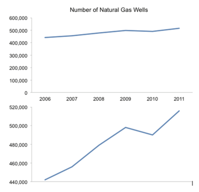
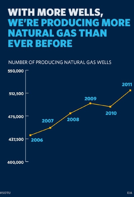
I’ll mention one more example. By visualizing data, the designer adds context and bias to the information. The best designers try to minimize the bias, but even the choices about what data to include in the visualization help frame the audience’s understanding. One common way to skew perception of the data is to change the scale of one or both of the axes. A number of slides from the speech don’t start at zero, so the chart exaggerates the changes. This is a common practice when charting stock values so the audience can see the small changes, but they often make the changes feel much bigger than they actually are. That was the intent with this chart that only shows the range of values from 400,000 to 550,000.
Stephen Few redesigned this corrected chart for the NPR piece, and I think he nailed it. By expanding the y-axis to start at 0, he puts the changes over time into a different perspective for the audience.

The White House has published all of the 107 slides as a scribd.com presentation:
White House State of the Union 2013 Enhanced Graphics by The White House
Found on the White House blog


