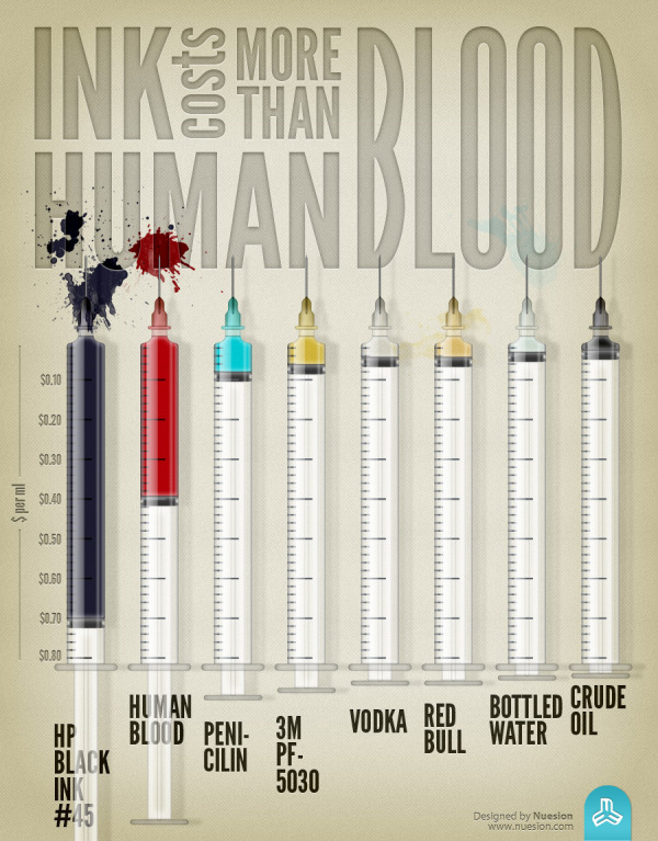
The Ink Costs More Than Human Blood infographic is a demonstration design by the team at Nuesion.
I think this is a fantastic design, but lacks some crucial elements for a successful infographic. The overall design is telling one story very clearly, and that’s one of the best practices in infographic design. Some of the best infographics have one Key Message that the audience can’t miss, and this design nails it!
The problem I see with this design is that it lacks credibility. There are no sources listed, so the audience doesn’t know where the data came from or how current it is. Why should they believe the data visualization? Is it biased or skewed in any way? Without doing a ton of research on their own, the audience has no way to tell.
Also, the footer of the design is missing both copyright information and a URL to the infographic landing page. It lists the nuesion.com home page, but it took some digging on my part to find the original high-resolution infographic buried in one of their blog posts.
