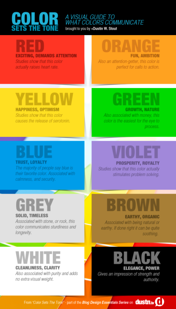
When you are designing your blog or website, how do you decide what colors to use? Your choice will make a difference on how others receive and interpret your content. Dustin Stout from dustn.tv has created Color Sets the Tone: A Visual Guide to What Colors Communicate infographic to educate website builders and bloggers on how to communicate to their readers with color.
Did you know that colors communicate? The use of color in your blog design can be an essential part of how your personal brand is perceived. Color usage can either make or break your blog design, and I will show you how to choose your colors wisely by understanding what they communicate.
When new visitors land on your blog, the first things they interpret are colors. Before they read a single character, their brain is registering colors which are subconsciously (or consciously) tied to emotions, states of mind, or [preconceived ideas]. If you do a poor job at putting together the colors in your blog design, it can be detrimental to the growth of your brand.
I’ve come up with an essential guide to what colors communicate, as well as a quick infographic to reference that is free to download!
Simple design that tells one story really well. Quick and easy for readers to digest, and the text associated with each color is really short. Less text is better for infographics.
The footer should include the URL back to the landing page to make it easier for readers to find the full-size original version.
