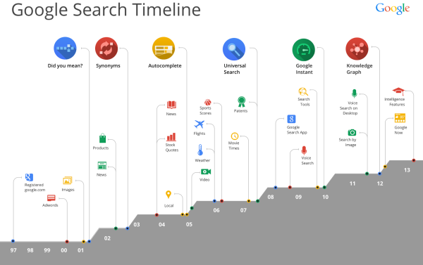
Last week, Google celebrated its 15th year, and posted the Google Search Timeline to help remember how far we have come in that time.
Google Search is turning 15. Remember what it was like to search in 1998? You’d sit down and boot up your bulky computer, dial up on your squawky modem, type in some keywords, and get 10 blue links to websites that had those words. It seemed like magic (and it was way way faster than card catalogs and microfiche!).
The world has changed so much since then: billions of people have come online, the web has grown exponentially, and now you can ask any question on the powerful little device in your pocket. You can explore the world with the Knowledge Graph, ask questions aloud with voice search, and get info before you even need to ask with Google Now.
I love the visual design, with icons and minimal text in the design to show all of the major milestones.
I don’t understand the increasing area chart across the bottom though. It isn’t representing any data, and each step up coincides with one of the major advancements across the top. It’s visual, but it doesn’t have any meaning. You would think it could show the growing total number of searches or stock price or amount of data processed.
Found on TechCrunch
