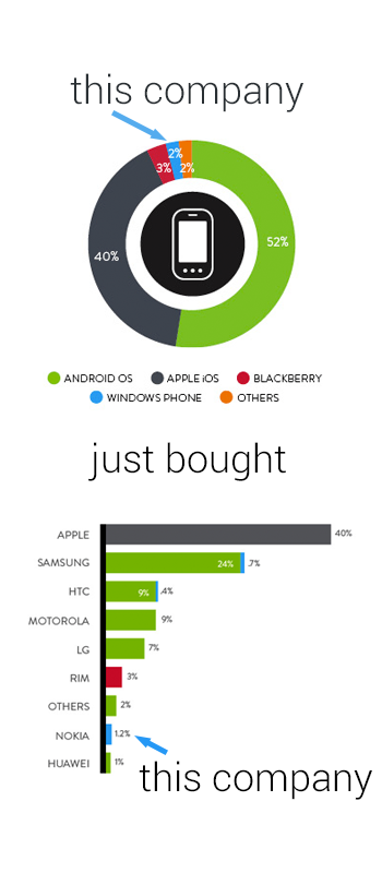
Good data visualization uses visuals to put data into context for the readers, making the information easier to understand. This simple infographic takes a couple charts previously published by Nielsen, and uses them to provide context to the news story of Microsoft acquiring Nokia’s handset devices unit for $7.2 Billion.
Combining data visualization with text and images should make the information easier and faster to understand, and this design does a great job.
Designer unknown. Thanks to Mike Elgan for posting on Google+ and Luke Millar (@ltm) for posting on Twitter.