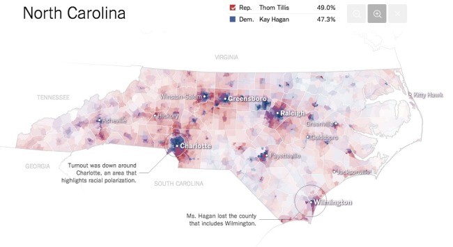
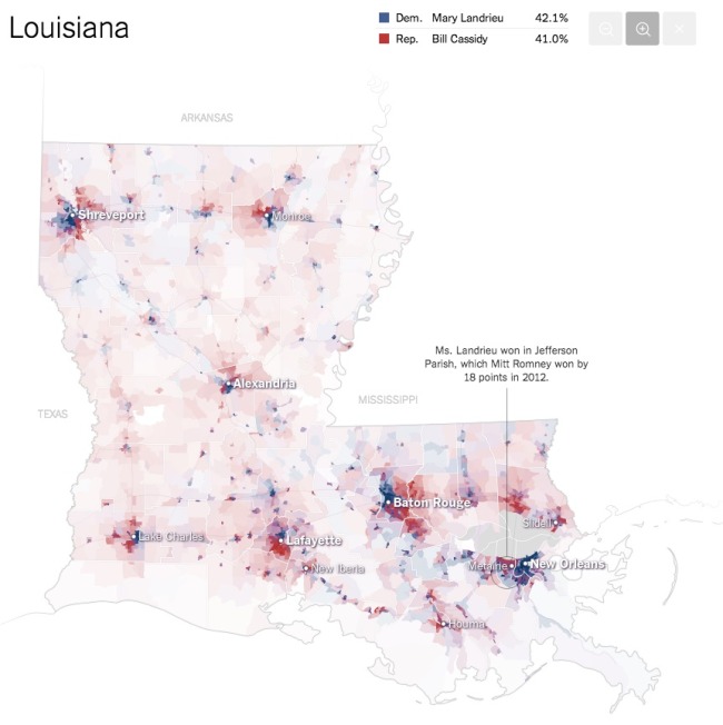
The team at the NYTimes has published these fantastic Most Detailed Maps from the Midterm Elections.
Why are we so confident these are the most detailed maps you’ll ever see from the 2014 Senate elections? Precincts are the smallest level of geography for publicly-reported election results. There were more than 175,000 precincts in the United States in 2012, fifty times the number of counties. The maps here show precinct-level results, where available, from some of the closest Senate races.
Maps exclude early votes in counties that do not report them by precinct. Some precinct boundaries are approximate.
I would call these Pop-Up Infographics, where the map is static, but additional details are shown in a pop-up frame when you hover over each voting precinct.
Found on Flowing Data, and thanks to Mike Wirth for posting on Facebook!

