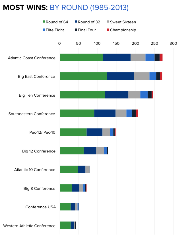
The Basketball Staff at CBS Sports has put together a handful of really good data visualizations showing the 29-year history of the NCAA Tournament since the field expanded to 64 teams. The chart above shows Most Wins won in the Tournament by conference, color-coded by round. These aren’t complicated designs, but the story they tell is very powerful.
Go N.C. State Wolfpack! Fantastic win over Xavier tonight! The Big East looks pretty strong too, but there’s nothing like ACC Basketball. These data visualizations tell that story much better than text and numbers. In Texas (Big 12), they just don’t seem to understand the importance of basketball. Football is what you play in the off-season! They have it reversed here in Texas, where football is much more important.
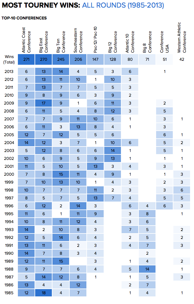
Here is that same data shown as a color-coded table that spells out the Most Tournament Wins by Year by year. This looks like it could have been designed with Conditional Formatting in Microsoft Excel, but it’s done very well. The simple color-coding adds context and makes the entire table easier to understand.
As an infographics design, the PNG image file itself should include a little more information, in case it gets shared online without the rest of the article (like this blog post). It should list CBS Sports as the publisher/designer and the URL back to the original article. I also would have used the conference logos along the y-axis instead of text.
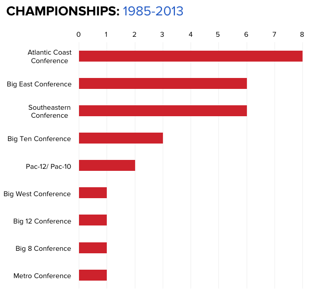
Here’s their chart of overall NCAA Championship Wins over that same 29 year period.


