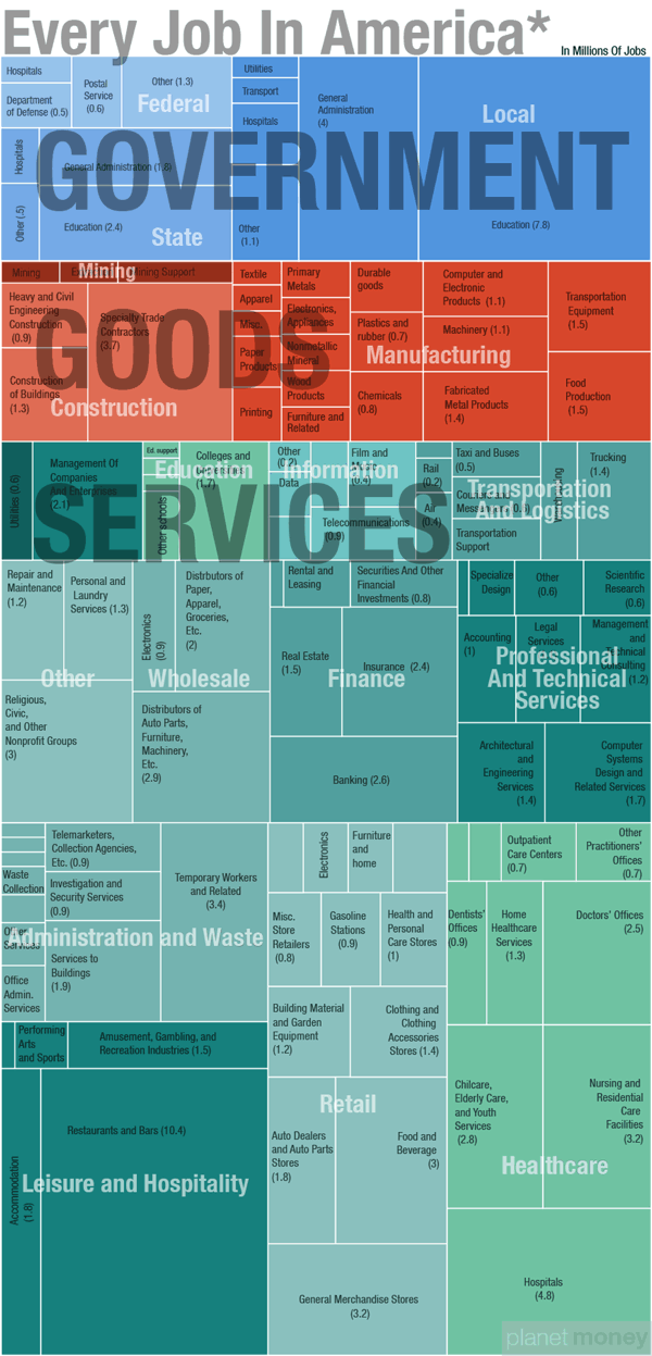
Every Job In America is a treemap data visualization design from Quoctrung Bui at NPR based on the data that the U.S. government collects for the monthly Jobs Report. I think I probably fit somewhere in the Services-Professional and Technical Services-Specialized Design section.
Whatever Friday’s monthly jobs report says, it won’t change the big picture. There are roughly 137 million jobs in this country. About two-thirds of those jobs are in private-sector services; the remaining third are split between goods-producing jobs (mainly manufacturing and construction) and government work (mostly at the state and local level).
Here’s a closer look, drawn from the same data that the government collects for the monthly jobs report.
Notes:*The data come from the government’s non-farm payroll report — which, as the name suggests, does not include farm jobs. Update: The report also excludes military personnel, government intelligence employees and some self-employed workers.
There isn’t much I would change about this design. The treemap visualization is well done, and carefully organized to allow for the color coding rectangles. Titles are missing from any rectangle that was too small to hold the text, but a smaller font could have been used, or a reference to a list at the bottom.
Even though this is part of an article posting, the infographic image itself has a title for easy sharing without the rest of the article. Including a few other elements in the image file like the data sources and the URL to the landing page would be very helpful.
This is the type of project where I think a link to a public spreadsheet with the numbers used would be helpful. The article links to the U.S. Bureau of Labor Statistics press releases, but then someone would have to dig through the reports.
