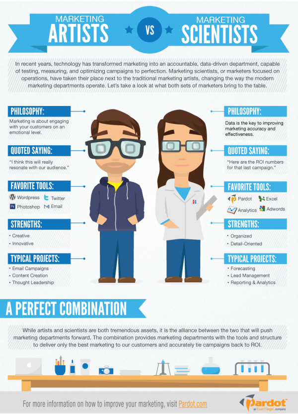
The Marketing Artists vs. Marketing Scientists infographic from Pardot highlights the assets of both kinds of marketers in the modern age. But the alliance between the two groups will create the best end product.
In a great article published last week, Stan Woods of Velocity Partners offered his thoughts on how fast marketing has developed over the past few months, and the new marketing roles this change has created.
In his closing paragraph, Woods distinguishes between the creative-driven and data-driven marketers by referring to them as “marketing artists” and “marketing scientists,” respectively. Although a slight oversimplification, these distinctions hold a lot of truth about the current divide that exists within many marketing departments.
Technology has given marketers the ability to track, quantify, and optimize marketing processes at a level that was unheard of only a year ago. The marketing scientist has come to dominate this new arena of objective measurement and data-driven thinking, while the marketing artist continues to thrive on creative ideas and a more abstract way of thinking.
But while these two differently-minded marketers may sometimes disagree over where the focus should lie, the marketing departments that will truly excel in this new age of marketing are those that recognize the value in both approaches. We have put together the infographic below to help highlight the tremendous assets marketing artists and marketing scientists can bring to the table, and the advantage of finding a balance between the two.
This is a purely informational design with no numerical data, but tells a good story. There are two aspects to marketing represented by the illustrated personas. I would prefer less text and more icons or illustrations, but the infographic does a great job of telling one story really well. That keeps the design short, easy to share and easy to read. The dominant central visual is also appealing and attracts attention.
The footer should include the URL to the infographic landing page, not just Pardot.com. When readers come looking for the full-size version, don’t make them search your site for it.
Found on http://www.business2community.com/
