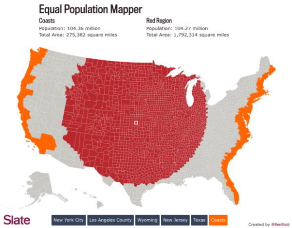
Ben Blatt has created the Equal Population Mapper infographic. The interactive version at Slate.com allows you to choose New York City, Los Angeles County, Wyoming, New Jersey, Texas, or the Coastal regions as the target population. Then you select anywhere else on the map and a red circle will appear to show how big of an area you would have to select to have an equal population to your selection.
If you throw in New York City’s other four boroughs, the Big Apple’s total population is just greater than 8 million. That’s about the same number of people who live in Idaho, Montana, Wyoming, North Dakota, South Dakota, Nebraska, and the western half of Minnesota combined.
But don’t let my New York City–centric comparisons hinder your imagination. The interactive at Slate.com lets you visualize how different parts of the country compare in population density.
Click the button at the bottom of the interactive to select Los Angeles County, for instance, and then click anywhere on the map to generate a (roughly) circular region of (roughly) equal population. The population data come from the 2010 census, and the square mileage was calculated by summing each highlighted county’s total area. You can also use New Jersey (the most densely populated state), Wyoming (the least densely populated state outside of Alaska), Texas, the coasts (the group of all counties that come within 35 miles of either the Atlantic or Pacific oceans), and, yes, New York City as the baseline for your population comparison.
Cool interactive map!
Found on Flowingdata!
