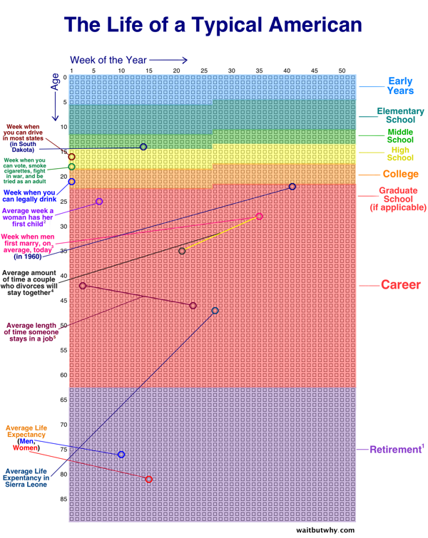
Your Life in Weeks infographic is the life of a typical American broken down into the 52 weeks within each year. This infographic was created by Tim Urban from Wait But Why. Each dot represents one week of your life. The infographic highlights some of the major milestones in life, while color coding the weeks into the big categories of schooling, career, and retirement.
Each row of weeks makes up one year. That’s how many weeks it takes to turn a newborn into a 90-year-old.
It kind of feels like our lives are made up of a countless number of weeks. But there they are — fully countable — staring you in the face.
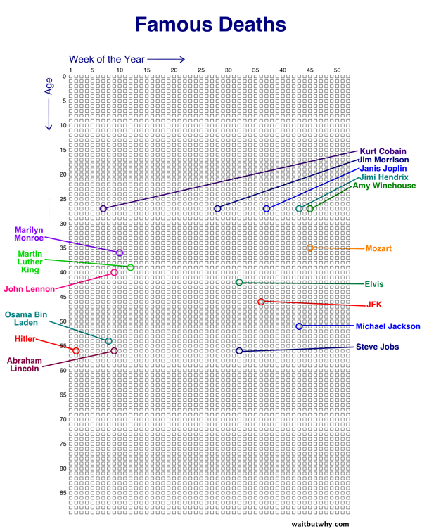
There are multiple events you can chart on this graph. Famous Deaths is an example of charting which week some famous people died.

Tiger Woods Major Championships (red) and Roger Federer Grand Slam Championships (blue) is another example. This chart makes it easy to track the peak years for athletes.
Tim made a blank version also available for you to fill in your own events or add some world events for perspective like the examples above. What would you add?

Found of Huffington Post.