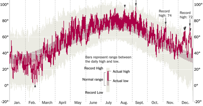
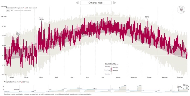
This is a cool interactive data visualization from the NY Times: How Much Warmer Was Your City in 2015?
Scientists declared that 2015 was Earth’s hottest year on record. In a database of 3,116 cities provided by AccuWeather, about 90 percent of them were warmer than normal. Enter your city in the field below to see how much warmer it was last year.
Temperature and precipitation data are provided by AccuWeather. The normal range of temperature is calculated by normalizing the weather from 1981 to 2010.
Data for some cities are incomplete. When actual or historical temperatures were missing, the corresponding bar is not shown for that day. The data presented here are as they were recorded on Jan. 22, 2016.
By K.K. Rebecca Lai, with additional work by Gregor Aisch
You can choose your city (or a city close to you) from the 3,116 cities included in the data. For many cities, you will see the 2015 daily temperature ranges in comparison to the normal temperature range and the historical high and low record temperatures. If historical data is not available, you will only see the comparison to the normal temperature range.

