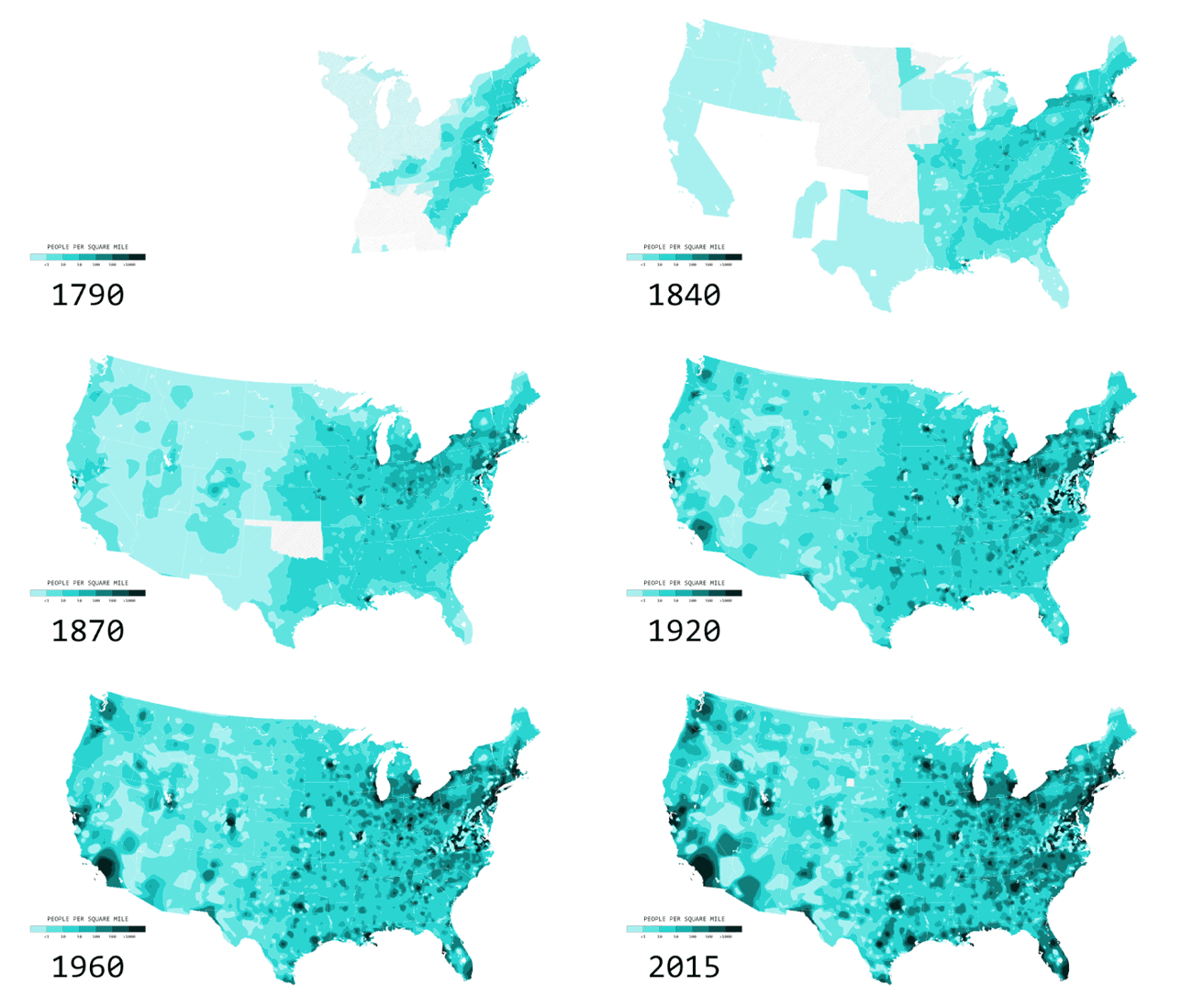
Nathan Yau from FlowingData has created a cool, new animated data visualization, Two Centuries of Population, Animated. The visualization shows the growth and spread of
You’ve likely seen the population density map of the United States in one form or another. A lot of people per square mile reside in big cities, fewer people reside in suburban areas, and a lot fewer people reside in rural areas. Cities weren’t always cities though. Rural wasn’t always rural. If you look at people per square mile over a couple of centuries, you get a better idea of how the country developed.
The animated map above shows population density by decade, going back to 1790 and up to recent estimates for 2015. The time in between each time period represents a smoothed transition. This is approximate, but it gives a better idea of how the distribution of population changed.
Nerd Notes:
