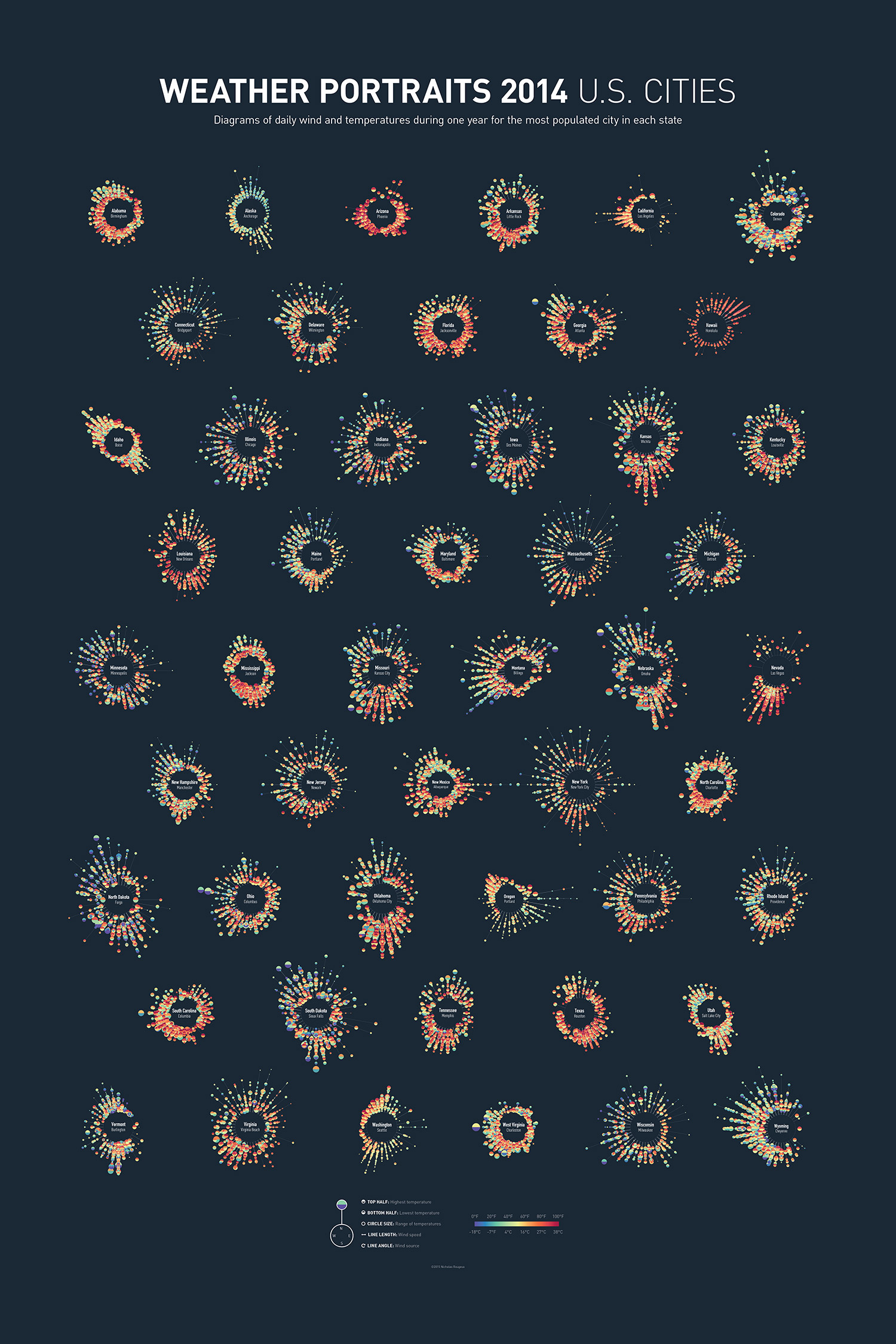
Weather Portraits 2014 US Cities infographic poster is Nicholas Rougeux's project for visualizing weather data. The poster shows diagrams of daily wind and temperatures during one year for the most populated city in each state. He tried many different ways to visualize his data, a process that he outlined in his blog post, Making of the Weather Portraits poster. The final infographic poster can be seen above.
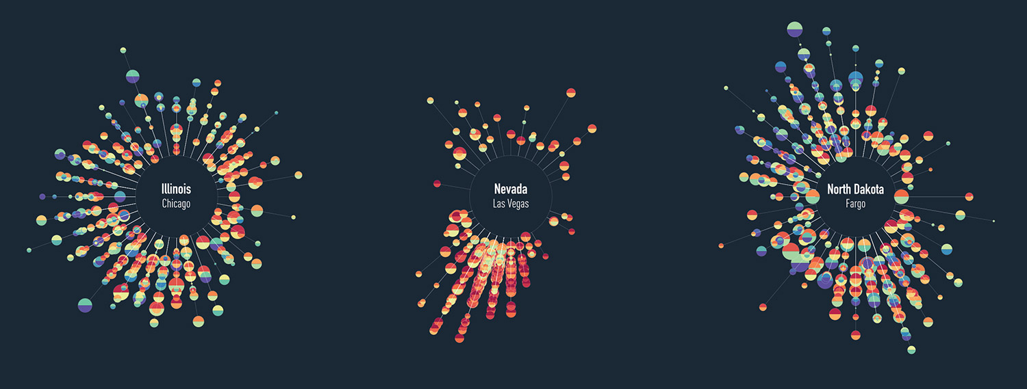
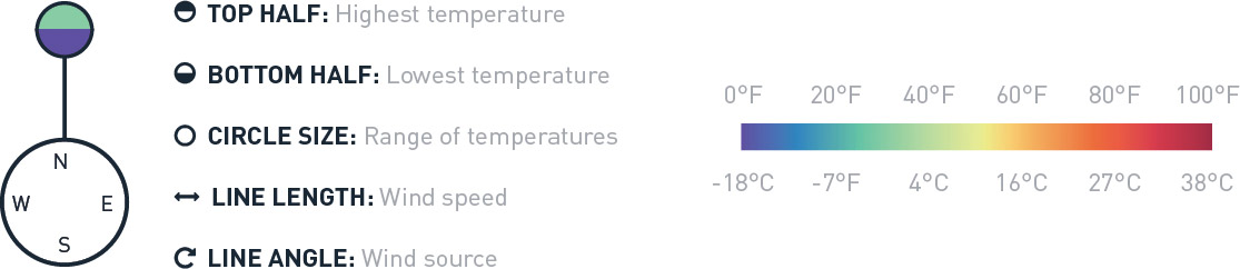
Each diagram includes five daily measurements for an full year in a city: wind direction, wind speed, high temperature, low temperature, and range of temperatures.
Poster prints for 2014 and 2015 are available for purchase.
Colorful diagrams display five daily measurements for an full year in each city: wind direction, wind speed, high temperature, low temperature, and range of temperatures. Data were collected from the Quality Controlled Local Climatological Data (QCLCD) provided freely by the National Oceanic and Atmospheric Association (NOAA).
Thanks to Nick for sending in his project!