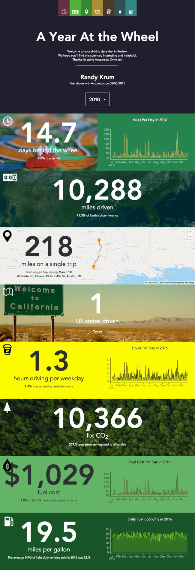
A Year At The Wheel. If you are an owner of an Automatic connected car adapter, they create a personalized infographic with your own custom data.
A number of companies have started creating personalized data visualizations and infographic for their customers, which is a trend that I really like. As part of Automatic Labs, the Year In Review graphics give you insights into your own personal driving history data that you couldn't see anywhere else. One of many ways they are experimenting making your personal big data useful.
Big fonts are not data visualizations! My biggest critique is that there are sections that just show the data value in a big font. They were too lazy to create visualizations for the comparisons. For example, they took the time to calculate that 10,366 lbs of CO2 would require 207 large trees to offset, but a visual of 207 tree icons would be way more impactful!
