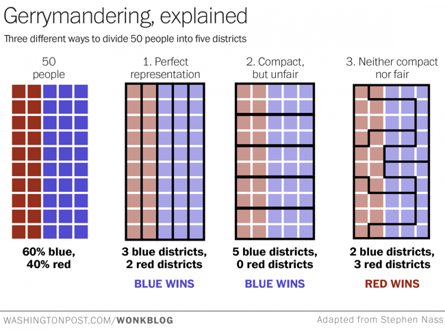
The Washington Post recently published this simple but very effective visual explanation of Gerrymandering: How to steal an election: a visual guide
Gerrymandering -- drawing political boundaries to give your party a numeric advantage over an opposing party -- is a difficult process to explain. If you find the notion confusing, check out the chart above -- adapted from one posted to Reddit this weekend -- and wonder no more.
Suppose we have a very tiny state of fifty people. Thirty of them belong to the Blue Party, and 20 belong to the Red Party. And just our luck, they all live in a nice even grid with the Blues on one side of the state and the Reds on the other.
Now, let's say we need to divide this state into five districts. Each district will send one representative to the House to represent the people. Ideally, we want the representation to be proportional: if 60 percent of our residents are Blue and 40 percent are Red, those five seats should be divvied up the same way.
This is a great example of using data visualization to explain a complex process. The use of the matrix of squares to represent people simplifies the context and keeps the audience attention focused on the groupings.
