This week I launched my first class on the Skillshare platform. Data Visualization: Design Better Charts in PowerPoint is a 10-lesson class covering how to apply data visualization design principles specifically to the default charts created in Microsoft PowerPoint. Too many people click the chart button and think they're done!
If you know of anyone else that’d be interested to learn how to Design Better Charts in PowerPoint, I’d appreciate if you’d share the link with them too. Thanks!
Class Description:
Most PowerPoint charts suck! Your company spends a huge amount of time and resources on research and data analysis, but when it comes time to present your results, the default charts from PowerPoint are nothing special. Learn how to apply core data visualization design principles to create charts that clearly make your audience go “Ah-Ha!”
If you’re just using the default chart templates in PowerPoint, you’re making a big mistake. Your charts will look like the same default charts your audience sees in every other presentation, and it makes you and data look generic. Those default chart are only meant to be the starting point (you have to start somewhere), but you need to customize your charts to effectively communicate your own insights and key message to your audience in a unique, memorable way.
This course will focus applying data visualization design best practices to charts created in Microsoft PowerPoint.
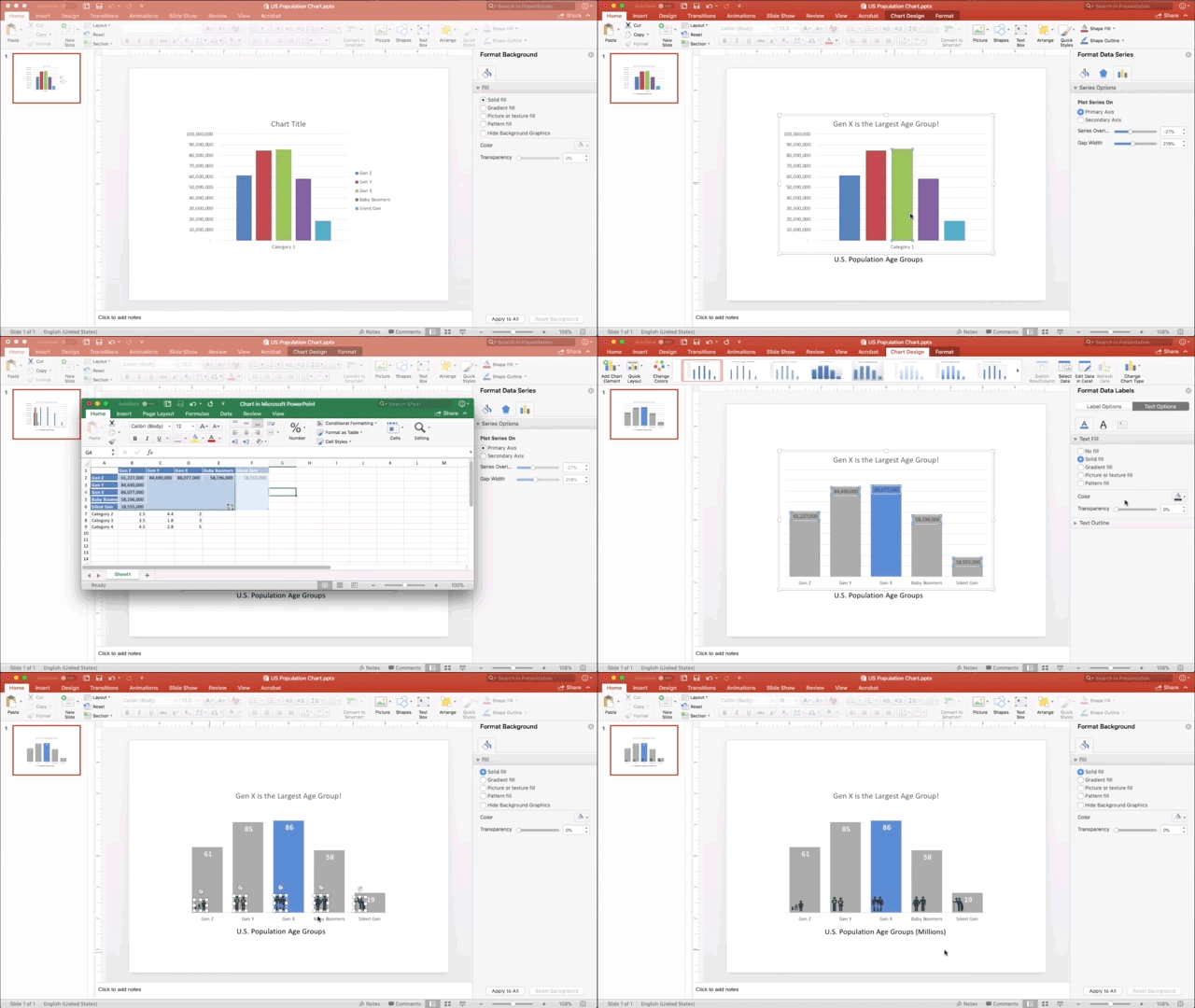
- Choose a Key Message
- Write a Good Title
- Remove the Chart Legend
- Reduce Visual Noise
- Use Color with Purpose
- Add Chart Elements
If you’re not familiar, Skillshare is an online subscription learning community with thousands of classes on everything from business to graphic design to fashion – it’s the Netflix of learning. You can use THIS LINK to see my class and sign up and get two free months! That's plenty of time to take my class and try out a few others. Once you're a member, you have access to all of classes that Skillshare offers, and there are thousands of them.
If you're already a Skillshare member, then you already have access. Please check out my class, and share with your network of friends and co-workers. Follow me on Skillshare to catch any future class I post as well!
Here's a quick timelapse of the sample file I use for demostration in the class. This will give you an idea of how the data visualization design principles are applied to a bar chart in PowerPoint:
I want to thank Skillshare for inviting me to record the class, and the support they provided for planning, editing and promoting the class.
I have more video projects and big news to announce planned for this year, so stay tuned!

