Visualization of Hurricane Florence's Path
Friday, September 14, 2018 at 9:03AM
Randy in history, hurricane, map, weather

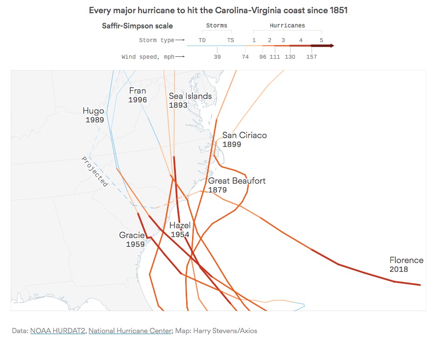
Harry Stevens from Axios created a simple but great visualization of Why Hurricane Florence is so unusual — and so dangerous. The DataViz shows what makes the path of Hurricane Florence different than all of the past major hurricanes to hit the Carolinias.

Article originally appeared on Cool Infographics (http://coolinfographics.squarespace.com/).
See website for complete article licensing information.