About
Randy Krum
President of InfoNewt.
Data Visualization and Infographic Design

Infographic Design

Infographics Design | Presentations
Consulting | Data Visualizations

DFW DataViz Meetup

Join the DFW Data Visualization and Infographics Meetup Group if you're in the Dallas/Fort Worth area!

Search the Cool Infographics site

Custom Search

Subscriptions:


Feedburner

The Cool Infographics® Gallery:

How to add the
Cool Infographics button to your:

Cool Infographics iOS icon

- iPhone
- iPad
- iPod Touch


Read on Flipboard for iPad and iPhone

Featured in the Tech & Science category

Flipboard icon

Twitter Feed
From the Bookstore

Caffeine Poster

The Caffeine Poster infographic

Tuesday
Oct282008

Map of Newspaper Presidential Endorsements


Staying on the presidential election theme, here's a great infographic on infochimps.org.  Red shows newspapers endorsing McCain, and Blue show newspapers endorsing Obama.  The inner color of each circle also represents which candidate the newspaper endorsed in the 2004 election.  The size of the circle represents each newspapers circulation.

Also notice the mismatch between the newspaper endorsement and each state's "Red vs. Blue" alignment.

Thanks Garrett for the link!

Sunday
Oct262008

Does Your Vote Matter?  YES!


Sticking with the stuff from GOOD magazine, this is one of the GOOD Sheets available for sale as a poster at Starbucks for a limited time.  I've been looking for some good election related graphics.  There are a ton out there, but I'm looking for the gems.

I hear all the time that people don't think their vote matters, and in some cases it may get lost in an election that isn't close or competitive.  However, you never actually know if a race is going to be close or not (unless there is only one candidate).

In some of our local elections, I've seen some decisions put up to vote that won by only 12 votes!

I'm not pushing any specific politcal opinion, just that everyone should get out and vote.  Early voting is already open in many areas, so do your part and be heard!

Wednesday
Oct222008

It's the Economy, Stupid!


Great timeline from GOOD Magazine (via picdit.com).
What most of the doom-and-gloom reports on our economy don’t provide is perspective—a historical survey of an economy that’s been through more than a few ups and downs in its day. Here’s a farsighted view of how our temperamental economic machine works, and a close-up of how it stands today.
Thanks Adam!

Monday
Oct202008

NEW Death and Taxes 2009 poster


New Death and Taxes infographic for 2009!  Interactive viewer let's you zoom in to see all of the details.
"Death and Taxes:2009" is a representational poster of the federal discretionary budget; the amount of money that is spent at the discretion of your elected representatives in Congress. Basically, your federal income taxes. The data is from the President's budget request for 2009. It will be debated, amended, and approved by Congress by October 1st to begin the fiscal year.

The poster provides a uniquely revealing look at our national priorities, that fluctuate yearly, according to the wishes of the President, the power of Congress, and the will of the people. If you pay taxes, then you have paid for a small part of everything in the poster. 
The Death and Taxes poster from 2007 was my initial post on Cool Infographics, so I'm very excited to see this update.  Now the 2009 version is available to purchase as a poster here.

Thursday
Oct162008

Brand Tags


BrandTags.net is a project by Noah Brier that gathers user input to create tag clouds for many of the biggest brands in our culture.  You can add your own input into the project on the main page, or browse brand results.  The example above is for Velveeta.

Tuesday
Oct142008

VizThink 2009


So VizThink Europe was this last weekend, and I came across this infographic ad in Fast Company magazine.  The next VizThink in the U.S. is coming up quickly.  February 22-25 in San Jose, CA.

Again, my friends at VizThink have created a discount code that I can offer to the readers of Cool Infographics!  Use the code BCRK01 to get $100 off of the standard registration price!

Special thanks to Ryan and the gang at VizThink!

$100 Off regular admission

DISCOUNT CODE: BCRK01

Monday
Oct132008

Air Traffic Worldwide movie

Very similar to the Flight Patterns video I posted back in October 2007, this is a video showing all commercial flight in the world over a 24-hour period.  The previous video was only the U.S., but this one shows the entire world.  It also shows the day/night areas and you can see the increase in air traffic as dawn rises around the world.  Its from the Zhaw School of Engineering in Zurich.

Found via FlowingData.com

Friday
Oct102008

Savings Mis-Trust video

Our friends over at XPLANE have done a fabulous video explaining what led up to the recent credit crisis in the U.S. economy.  A great job simplifying a complex problem.

Thanks Parker, and great job to your team!

Thursday
Oct092008

Watercube, The Book


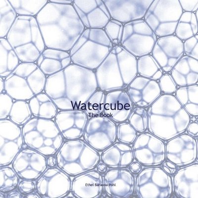
Watercube, is a new book by Ethel Baraona Pohl.  The book is about the National Aquatics Centre built in Beijing for the 2008 Olympics, and has some cool infographics inside.  Some of the graphics were contributed by architect César Reyes Nájera.  A review of the book can be found here on www.v2com.biz
WATERCUBE: The Book is a complete monographic publication about the National Swimming Center for the Beijing Olympics 2008. With an exhaustive description about the Watercube we present a detailed study of the project. The book makes an holistic approach to the project that starts with a brief description of urban and social changes that China has been experienced in the last decade. These facts have encouraged the construction boom that made possible these kind of projects occur in cities like Beijing.

 
This page compared the amount of steel used to built the Watercube to some of the most well known buildings around the world.
This page shows a comparison to the same set of buildings around the world, but shows the tons of CO2 produced due to the steel used in their construction.


This page is one of the years of the timeline leading up to the construction of the Watercube.

Here you can buy Watercube, by Ethel Baraona Pohl, on Amazon.com.

Special thanks to Ethel for sharing the images from her book, and allowing me to post them on Cool Infographics!

Tuesday
Oct072008

Vampire Energy infographic video & chart

From GOOD magazine, they created an infographic video about Vampire Energy, all of the energy used by electronics in your house while you are not actively using them.  The chart itself from the magazine is fairly simple chart, but I really like it.  It's effective getting the message across with simple graphics.