About
Randy Krum
President of InfoNewt.
Data Visualization and Infographic Design

Infographic Design

Infographics Design | Presentations
Consulting | Data Visualizations

DFW DataViz Meetup

Join the DFW Data Visualization and Infographics Meetup Group if you're in the Dallas/Fort Worth area!

Search the Cool Infographics site

Custom Search

Subscriptions:


Feedburner

The Cool Infographics® Gallery:

How to add the
Cool Infographics button to your:

Cool Infographics iOS icon

- iPhone
- iPad
- iPod Touch


Read on Flipboard for iPad and iPhone

Featured in the Tech & Science category

Flipboard icon

Twitter Feed
From the Bookstore

Caffeine Poster

The Caffeine Poster infographic

Wednesday
Jun132012

The Value of Retail-Integrated eCommerce

The Value of Retail-Integrated eCommerce

What can Retail-Integrated eCommerce do for your brand? is a new infographic based on a research study from Shopatron.  

Retail-integrated eCommerce is a business model that allows branded manufacturers to sell directly to consumers and pass those orders to their retailers for delivery to the customer. According to March 2012 surveys answered by over 200 branded manufacturers and 1,300 retailers, retail-integrated eCommerce benefits branded manufacturers in the following ways.

This is obviously a design for a niche audience, but I can tell you from past experience that Branded eCommerce is a HUGE challenge.  A company makes products for the end user; however, their immediate customers are usually retail stores.  As soon as a product company starts trying to sell their products on their own website (cutting out the retail store), they suddenly become a competitor to all of the existing retail store customers.  The idea of Retail-Integrated eCommerce is a potential solution.

The statistics at the bottom of the infographic that explain this challenge (not visualized) are so important, I think they should have been visualized and highlighted at the top of the design.  This is the background information that makes the rest of the infographic relevant.

In 2012, 70% of retailers said they would reduce buying from brands that sell online directly to consumers, with 9% saying they would cease buying from that brand altogether.

This is a good design that doesn’t try to throw too much information at the reader.  Most of the important data points are clearly visualized with short descriptions.  The orange color scheme clearly identify the design with the Shopatron brand.

You can also download the PDF version here.

Wednesday
Jun132012

Digital Anatomy of the Affluent Male

Digital Anatomy of the Affluent Male infographic

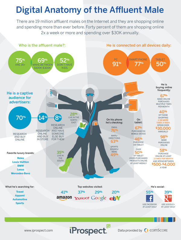
Busy busy busy! The affluent male is always searching online! The Digital Anatomy of the Affluent Male from iprospect.com describes who the affluent male is and what he searches for.

There are 19 million affluent males on the Interent and they are shopping online and spending more than ever before.  Forty percent of them are shopping online 2x a week or more and spending over $30k annually.

I really like the design style and the colors on this one.  The correctly-highlighted map in his pocket and the cowboy boot are a nice touch.

The data visualizations do a good job, but there are a bunch of statistics that aren’t visualized and are left just in text.  Visually, this makes these other statistics less important because they didn’t warrant being visualized.  The favorite brands could use the actual logos, and the “What he’s searching for” could use some icons.

From an SEO perspective, the URL at the bottom really should be the landing page address, and once you get to the landing page, there aren’t any social sharing buttons so you are left to your own to figure out how to share it.

Also available as a PDF download.

Thanks to Douglas for sending in the link!

Monday
Jun112012

It's All About The Images

It's All About The Images infographic

Here’s some irony for you. It’s All About The Images infographic from MDG Advertising relays information visually about the importance of relaying information visually.  Yes, it’s very meta.

Some say image is everything, and that’s especially true on the Internet where the shift to visual optimization is playing an increasingly important role in the recent phenomenon of photo marketing. In light of their numerous benefits for brands of all kinds, MDG Advertising developed an insightful infographic that illustrates the influence of images on a company’s business, branding, search, and social media efforts. For insight on optimizing images for content and commerce, along with advice on image optimization techniques, take a look at the following infographic to see why images can help make success a snap.

In our world, this information is true for posting infographics as well as photo images.

Thanks for sending in the link!

Wednesday
Jun062012

Gymkhana: The Infographic

DC Shoes - Gymkhana Infographic

Gymkhana: The Infographic, is a design collaboration between InfoNewt (my company) and the design team at DC Shoes.  Gymkhana has become a mega-viral hit series of YouTube videos showing Ken Block and his rally car racing through different locations and performing many cool driving stunts.  There have been four Gymkhana videos released on YouTube in the last four years with over 135 million views combined, and Gymkhana 5 is expected this summer!

The DC Ken Block Gymkhana Project is a viral phenomenon with well over 135 Million views worldwide and a collection of more than 40+ videos. The Gymkhana franchise has won countless awards including top rated, most shared video series and most recently received the award for #1 viral video ad of 2011.

Created as a fun way to check out all things Gymkhana, the Infographic displays highlights, amazing stats and facts about the Gymkhana YouTube videos. “The fun just keeps on rolling along,” said Ken Block, the Gymkhana star and co-founder of DC Shoes. “The Gymkhana Infographic puts together some outstanding facts. Even I didn’t know that the Ford Fiesta used in Gymkhana 4 had 9 times the horsepower as my first car, a 1984 Toyota Corolla station wagon. Astounding!”

The infographic brings new viewers up to speed leading up to the release of Gymkhana 5, and gives fans of the videos a bunch of behind-the-scenes information they can’t find anywhere else.

Thanks to the team at DC Shoes for a great project!

Tuesday
Jun052012

Market and Competitive Intelligence Trends

Market and Competitive Intelligence Trends

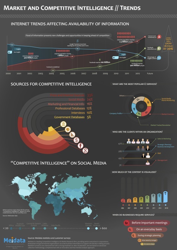
Meidata brings us the Market and Competitive Intelligence Trends infographic that covers the sources and uses of competitive intelligence online and related Internet trends that affect the availability of information.

Meidata is a company in Israel, but has clients from around the world.  The infographic is based on their own internal information from global customers and system statistics, so this information is not available anywhere else in the world.

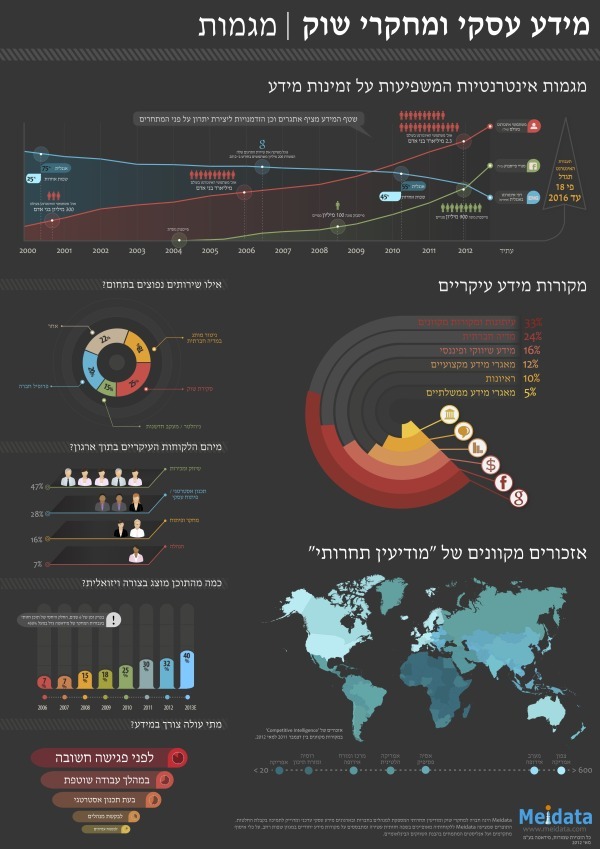
Designed by Robert Ungar at Meidata, the design is colorful and easy to follow.  A great design overall.  One of his best design accomplishments is the language translation.  More than merely pasting the translated text, the design has to account for the change in direction between Hebrew and English, and still tell a smooth story.

You can view the original design in Hebrew, and they just released an English language version (above) on their site, and you can download either the English PDF or the Hebrew PDF.


Thanks to Shaul from Meidata for sending in the link, providing the information and the English translated version.

Monday
Jun042012

Eat at the Best British Restaurants for Less Than You Think

Eat at the Best British Restaurants for Less Than You Think

If you ever find yourself in the UK, this will be a very helpful infographic! The Michelin Star Lunches infographic from thetrainline.com keeps your belly, taste buds, and wallet happy!

For passionate foodies, Michelin star food is one of the finer things in life. However, for many of us, such top quality dining may feel out of reach price-wise. In fact, a day out to enjoy the finest dining (maybe taking the train and enjoying a guilt-free glass of wine or 2) could be as affordable as £15 for two courses at the two star gastro pub, the Hand & Flowers in Marlow. Even fine dining in London is affordable with 3 courses at Arbutus, Soho for just £17.95.

Look at our handy guide to all the Michelin starred restaurants in the UK above - shown in order of their most affordable set lunches.

This is a fantastic, informational, reference infographic to help you find outstanding food at reasonable prices…as long as you go for lunch instead of dinner.  Color-coded by region of the country, and organized in ascending price range, this design tells one story really well.

Seriously, if you travel or live in the UK, I would keep a copy of this infographic on your phone just so you could easily lookup these highly rated restaurants near you.

Thanks to Luke for sending in the link!

Monday
Jun042012

Digital Technology in Your Car

Digital Technology in Your Car

Here is an infographic from Allianz called Digital Technology in Your Car that illustrates current technology in our cars to keep us safe and entertain us.

Digital technology has transformed and continues to transform every aspect of our lives. In the motor industry, technology developed throughout the years has enhanced our safety and comfort. The introduction of modern safety mechanisms such as lane departure warning and brake assist systems as well as iphone applications such as Driver Reviver and Car Butler has seen technology faithfully assisting drivers in times of need. With technology advancing and disseminating at a rapid rate, Global Positioning System units have already become a staple accessory in Australian cars.

There’s not much in the way of data visualizations in this one, but it does tell a good story about the history of new technology in your car, and what’s coming soon.  There’s too much text, but the use of icons and illustrations helps the story.  

I’m not sure what all the dead space at the bottom is.  Plenty of room for the copyright, company logo, URL to the original landing page and even a mention of the designer.

Bring on the self-driving cars!

Thanks to Sandra for sending in the link!

Thursday
May312012

How Draw Something Blew Up Without Blowing Up

How Draw Something Blew Up Without Blowing Up

Now here is a game for everyone! It doesn’t matter how well you can draw, you can just draw and laugh with your friends at your attempts! This app has become very popular and quite quickly, the How Draw Something Blew Up Without Blowing Up infographic from The Next Web (with help from Couchbase) charts the growing trendiness of this game.

Draw Something was downloaded 50 million times in 50 days. Users created billions of drawings, adding 3,000 new pictures every second. On March 21st, OMPOP, the company behind the game, was bought up by Zynga for more than $200 million. On the first weekend in April, I downloaded the game for my first time and was admittedly addicted for 72 hours.

Today, a company called Couchbase gave us the exclusive on an infographic that charts the app’s viral growth. In case you’ve not heard of Couchbase, it’s the platform that enabled the game to keep up with its NoSQL database technology — from 6 database servers to more than 90 — without a second of game downtime. That’s impressive.

The infographic below charts the amount of user data, drawings per second, number of servers used to keep the game up and going and the number of users over 8 weeks of the game’s mind-blowing growth. The only question now is, will the game’s addictive nature keep fans or will they get over it as quickly as I have?

Intended as a quick summary of Draw Something’s growth, and Couchbase’s success in supporting their database expansion needs, this infographic does a good job.  Simple, easy-to-understand visuals, and use of some hand-sketch illustrations to reinforce how Draw Something works.

Some visualizations in the Billions of Drawings section would have been nice to communicate the immense scale of the growth numbers.  Most readers don’t truly grasp the difference between 10 million and 2 billion by just reading the text numbers.

Wednesday
May302012

How Mobile Technology is Changing World Travel

How Mobile Technology is Changing World Travel

Do you use your smartphone to help make traveling easier? If you do, then your part of a huge growing trend. The How Mobile Technology is Changing World Travel infographic from MyDestination.com shares some interesting statistics when it comes to traveling. 

Back in 1903 when the Wright Brothers first took flight in their first fixed winged aircraft, little could anyone have imagined what travel would become. Fast forward to 2012 and the internet has revolutionised travel – along with communication – with the birth of the smartphone. But just how much as this palm-held device influenced and changed our travelling habits? And just how far has travel–based mobile technology still got to go?

There’s a lot of information gathered from many different sources in this one, which is one reason it’s so long.  The use of mobile devices to plan your travel and the use of them during your travel are definitely growing, and this infographic does a great job of helping the readers get some basic understanding of what’s going on.

A few issues with the data visualization designs though:

  • The doughnut charts at the top are hard to read because the edges are so thin.  A thicker area around the circles would have been easier to see.
  • How can the UK have 129% Mobile Penetration?  By definition that number can’t be higher than 100%.
  • The visualization using the airplane silhouette is challenging.  There should be 10 windows to easily visualize the 74%.  Readers think in tens, and it’s hard to understand a portion of six windows.  I’ll bet the 54% color fill is close, but I have no way to figure out if it’s accurate.
  • Again, readers think in tens, so don’t show the “…traffic for 78% of travel sites” as a visualization of seven computer monitors, use ten.
  • At the bottom should be a copyright, and the URL to the original infographic landing page

My Destination is also asking readers for suggestions for their next infographic design:

Are you an avid smartphone user abroad? Can’t imagine life without Facebook on the move? Don’t have a smartphone and not intending on caving in? We want to hear from you! Whether you are embracing the mobile travel revolution or just love travel, we want to know what is getting you talking. We’re also on the lookout for ideas for our next infographic special. Email hq.socialmedia@mydestination.com with any suggestions or tweet us @MyDestination using #TravAndTech.

Thanks to Oli for sending in the link!

Tuesday
May292012

The History and Beginnings of Memorial Day

The History and Beginnings of Memorial Day

The History of Memorial Day does a good job of explaining the background history of the Memorial Day holiday in the U.S.  

Learn about how we celebrate memorial day and how it was formed in the United States.

We work hard to bring you insight to memorializing a loved one at In the Light Urns. Information provided through graphics can really help communicate the important points and we really enjoy using the infographic approach to discussing memorials. Visit our military urns page for more information on memorializing a veteran.

Nice, clean design that blends the use of data visualizations and icons to explain some of the history.  Some basic things are missing at the bottom of the design though: Company logo, copyright statement and the URL to the original landing page.  You can’t assume that people who share your infographic will also share additional information from your landing page.

Thanks to Susan for the link!