About
Randy Krum
President of InfoNewt.
Data Visualization and Infographic Design

Infographic Design

Infographics Design | Presentations
Consulting | Data Visualizations

DFW DataViz Meetup

Join the DFW Data Visualization and Infographics Meetup Group if you're in the Dallas/Fort Worth area!

Search the Cool Infographics site

Custom Search

Subscriptions:


Feedburner

The Cool Infographics® Gallery:

How to add the
Cool Infographics button to your:

Cool Infographics iOS icon

- iPhone
- iPad
- iPod Touch


Read on Flipboard for iPad and iPhone

Featured in the Tech & Science category

Flipboard icon

Twitter Feed
From the Bookstore

Caffeine Poster

The Caffeine Poster infographic

Wednesday
Apr112012

Defense of the Ancients (DotA) Infographic

The Defense of the Ancients (DotA) infographic from GameArena.com takes game enthusiasts through a brief history of how the game came about!

Dota, Defence of the Ancients, is the latest hype in gaming. Initially developed as a modified game in Starcraft, the concept has now grown globally and has even made its way into professional competitions. Popular game titles that have implemented the “DotA” concept include Warcraft 3, DotA Allstars, DemiGod, League of Legends, Heroes of Newerth and Realm of the Titans. Two more upcoming titles that will certainly get the gaming world’s attention are DotA 2 and Blizzard DotA.

So what is DotA exactly? Our trusty graphics boffins have once again created the infographic below for the complete history on how the new genre came about.

The design style is certainly relevant to the game look-and-feel itself.  The timeline is odd that some events don’t have specific dates identified.  The use if icon illustrations for different concepts and company/game logos on the timeline helps the reader.  I would have liked to see some of the stats behind the game and its popularity.

Thanks to Eric for sending in the link!

Tuesday
Apr102012

How Animals See The World

Ever wonder how you look to your dog or cat? Or how about the shark as he swims towards you? (Lets hope  you haven’t thought of the second one…) Well have no fear, all your answers lie within the How Animals See The World infographic from Mezzmer

Have you ever stopped and wondered what version of the world your beloved dog or cat sees the world in?  How is their perception colored and how do they perceive you?  Most of us take for granted the gift we are granted with sight, but it may surprise some of you to find out that many animals actually have much better vision than we do.  In fact, some see the world with some precision and accuracy, they put our eyesight abilities to complete shame.  Read on to learn more about the unique ways our animal friends see the world…

The design is longer than I like for infographic, but the content is fascinating.  Not many data visualizations, but I really appreciate the designer showing comparisons between what a human sees, and the equivalent view from the animals. 

Mezzmer is an eyeglass online retailer, so this infographic topic is information relevant to their business without feeling like an ad.  A great topic selection for a Marketing infographic.

Thanks to Christina for sending in the link!

Monday
Apr092012

CSR and Sustainability Report: Volvo Shaping the Future of Transport

Volvo’s new infographic puts their 2011 CSR (Corporate Social Responsibility) and Sustainability Report into a tidy, easy to read design! Shaping the Future of Transport focuses on Volvo’s environmental, economic, and social responsibility.

All you need to know about the Volvo Group’ CSR and Sustainability Report 2011.

The Volvo Group’s vision is to become world leader in sustainable transport solutions.  We’re convinced that efficient transport is crucial for societal and economic development.  We have the skills, resources and global reach to shape the future of transport.

This is a fantastic use of an infographic as a corporate communication tool.  Volvo is using this infographic as an awareness tool to put their Sustainability Report in front of more readers and broaden the awareness of their efforts.  It’s designed as a top-level overview, and if the reader wants more information, they know how to find the full report.

The illustrations obviously represent the varied forms of transport that Volvo is involved in, and my only criticism is that the design is mostly text.  They list locations, percentages, company historical events and other statistics about Volvo that should all be data visualizations.  At they bottom, they should include the URL to the original landing page, and a copyright statement.

On the original landing page, the whole infographic is a link to their online Sustainability Report front page, but it would have been nice for them to use an HTML Image Map to make the separate statistics and call-outs link to the specific, related web pages in the report.

Thanks to Gustaf for sending in the link!

Friday
Apr062012

Augusta National Golf Club - Then and Now

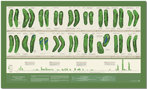
Bill Younker from Historyshots.com has designed a new infographic poster!  Augusta National Golf Club- Then and Now, shows how the famous golf course has changed since its first Masters Tournament 79 years ago!

Augusta National Golf Club has undergone continuous modification since hosting its first Masters Tournament in 1934. This graphic depicts the more than 100 major changes made to the course over the past 79 years. At the top is a visual side-by-side comparison of each hole for 1934 and 2012. Below the hole comparisons is a timeline that maps tee, fairway and green area changes year-by-year. The combination of visual comparison and detailed timeline provides a sweeping overview of all the major changes made since 1934.

This is a great design that demonstrates how simple visuals can be used to show the viewer differences between the hole designs.  By showing a terrain map of each hole then and now, side-by-side, the poster is easy for viewers to compare the changes and enjoy.

You can buy the 40” x 24” inch poster for $34.95 and definitely check out the zooming viewer to see the poster up close at Historyshots.com.

Great job Bill!

Thursday
Apr052012

The Fiction to Reality Timeline

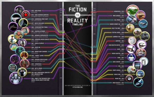
The Fiction to Reality Timeline infographic from attsavings.com brings all of cool gadgets from the future in movies into the present.  Anything is possible!

Do you remember “Star Trek” and all the great gadgets the crew members used in each episode? Or the fancy gizmos from “The Jetsons” or “Minority Report?” Ever wonder when, or if, we’ll invent technology like what we’ve seen in the fictional universe? Satisfy your craving for fictional tech with The Fiction to Reality Timeline.

Although I disagree that some of their actual technology references are the first time certain technologies have appeared in the modern world, the overall message is clear.  Things like Heads-Up Displays have been around in fighter cockpits for much longer, and the iPad wasn’t the first portable display device, just the first mainstream commercially successful device.

I couldn’t figure out if the line colors had any meaning.  Are they color-coded to match some type of category?

Where’s my flying car?!?

Thanks to Ryan for sending the link!

Monday
Apr022012

Jer Thorp: Make data more human

Jer Thorp works in the New York Times labs to design big data visualizations, and his great presentation from TEDxVancouver was just posted.

Jer Thorp creates beautiful data visualizations to put abstract data into a human context. At TEDxVancouver, he shares his moving projects, from graphing an entire year’s news cycle, to mapping the way people share articles across the internet.

Jer Thorp’s work focuses on adding meaning and narrative to huge amounts of data as a way to help people take control of the information that surrounds them.

He’s been involved in some great big data projects that I have posted about here on the blog previously, like OpenPaths.

Monday
Apr022012

Interactive Infographic: Coca-Cola vs. Pepsi


The Coke VS. Pepsi: The Cola Wars infographic from cnntees.com. Which side are you on?

For over a century Coke and Pepsi have been at each other’s throats in a constant struggle for a bigger piece of the billion-dollar soda market. 

Along the way the companies have picked up a slew of loyalists and fans, adamant that their cola reigns supreme. While there are countless spots online to check out the history of either company we decided to put together an interactive infographic, putting all cola war highlights together in one spot.

This is a really fascinating experiment with infographic design.  Although it appears to be a static infographic, it’s actually interactive.  If you look closely, there are two videos built directly into the middle of the infographic that play when clicked.  The growth chart at the top is also interactive.  Click on a decade, and then choose the specific year, and it displays events in each companies history related to that time period.

The interactivity is so subtle though, most people will probably miss it without me spelling it out in the title and here in the commentary.

The financial stats section is a really poor use of pie charts in the bottle caps.  The logo images work, but pie charts are for visualizing percentages.  Here, they forced the data into the cute visual, but it makes the data confusing and hard to understand.    Are the charts visualizing the percentages of each expense related to total revenue, or just arbitrarily visualizing the values to represent the comparison between the two companies?  No percentages are shown, and no values are shown for the values of the total pie.  This is forcing a round peg into a square hole.

At the bottom, it’s missing a URL to the original blog post (so readers that find this on the Internet can find the original high-resolution infographic), a copyright statement, a trademark statement and a credit to the designer.

Thanks to Ron for sending in the link!

Friday
Mar302012

Guide to the Final Four Ticket Pricing

Timely for the Final Four on Saturday, the SeatGeek to the Final Four infographic takes a fun look at the expenses related to anyone headed to New Orleans to watch the Final Four games in person.

The infographic stands on its own nicely without any description, and I really like the design.  Of course they used a basketball court wood flooring as the background, and carefully didn’t use any official Final Four logos from the NCAA.  Even the jerseys are helpful illustrations and avoid using any official school logos. 

I like most of the data visualizations.  The line charts are simple, and the map is easy to read with clear driving paths.  The Flying vs. Driving comparisons are also very easy to understand, but should have been visualized.

The design makes one big mistake!  Only a couple data sources are mentioned at all (Kayak.com and Hipmunk.com), so we are left to wonder if the rest of the data is accurate. Did the rest of the data come from the SeatGeek servers?  Where did the historical ticket prices come from?

The ticket price chart title indicates that they only charted the actual face value of the tickets, but they probably should have been adjusted for inflation.  The doughnut charts for ticket sales by state and by city are hard for the viewer to compare, and I think it was a poor choice of visualization method.  Aren’t these supposed to add up to 100%? 

The visuals are very heavily weighted at the top of the design layout, and it’s disappointing that the information becomes mostly text at the bottom.  My guess is that the designer was running out of time.  The Total Spent values and the spending comparisons also should have been visualized.  As an infographic designer, you should never make fake visualizations either (like showing 40 Hurricanes from Pat O’Brien’s next to the actual value of 125).

It’s interesting that they didn’t include the URL to the find the original infographic at the bottom, it’s really an ad URL to their Final Four page of ticket sales.  I would have recommended including both URLs.  There’s nothing wrong with the link to the sales page, but you should also include the infographic URL.  There should also be a copyright statement at the bottom as well.

Thanks to Ryan for sending in the link!

Wednesday
Mar282012

Client Infographic: The Mobile Advantage

Nuance Communications has released a new infographic, The Mobile Advantage, sharing the results of their own mobile consumer preference research.  Designed by InfoNewt, this infographic design tells the story of how important mobile apps are to brands.

If you’re a consumer-facing organization hoping to use mobile to build a strong, long-lasting relationship with your customers, there’s some good news!  A new survey shows that smartphone owners are increasingly downloading not just games but customer service apps - especially from their mobile carrier, bank and favorite retailers. In fact, 84% of consumers surveyed generally prefer to use a company’s mobile app for routine inquiries (checking balance, check flight status, etc.) rather than calling the company on the phone. 

As a B2B communication tool, this infographic does a great job sharing the key findings from the research statistics.  Since Nuance performed the research behind how apps form positive customer service experiences for customers, the infographic is a good tool to share that unique knowledge with their customers.

Broken into a three-part story, the design starts with some basic information about the growth of mobile devices.  The center section focuses on the huge impact on the customers’ view of a company when they have a customer service app.  And finally, the last section explores what customers would like to see in a customer service app.

Thanks to the team at Nuance for being outstanding to work with!

Tuesday
Mar272012

Seven Motorcycle Safety Tips

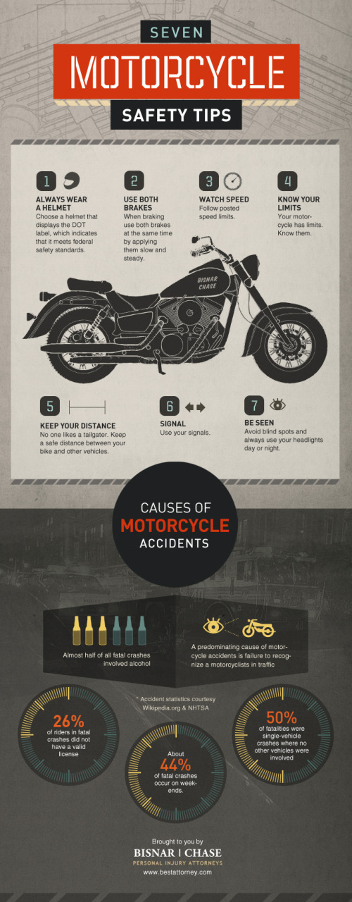
The Seven Motorcycle Safety Tips infographic comes to us from Bisnar|Chase. This infographic gives some helpful tips on saftey to prevent injuries, but if you do have an accident, they’d like to help!

Motorcycle safety is no joking matter. Please take your safety seriously. If you do become injured in a motorcycle accident we would like to help. Contact us immediately to schedule your free consultation with our reputable California motorcycle accident lawyers.

A couple things I really like about this design.

  • It tells a simple, easy-to-understand story
  • Clean design, not too much visual noise
  • Good illustrations to illustrate each safety tip and statistic
  • Each of the values included are visualized to make them quick and easily to read

The data source is listed in the infographic, but it’s missing a copyright statement and a URL to the original infographic posting at the bottom.  The page with the original posting is also missing sharing buttons for social media, so it’s difficult for readers to share the infographic.

Thanks to Chris for sending in the link!