About
Randy Krum
President of InfoNewt.
Data Visualization and Infographic Design

Infographic Design

Infographics Design | Presentations
Consulting | Data Visualizations

DFW DataViz Meetup

Join the DFW Data Visualization and Infographics Meetup Group if you're in the Dallas/Fort Worth area!

Search the Cool Infographics site

Custom Search

Subscriptions:


Feedburner

The Cool Infographics® Gallery:

How to add the
Cool Infographics button to your:

Cool Infographics iOS icon

- iPhone
- iPad
- iPod Touch


Read on Flipboard for iPad and iPhone

Featured in the Tech & Science category

Flipboard icon

Twitter Feed
From the Bookstore

Caffeine Poster

The Caffeine Poster infographic

Entries in color (48)

Thursday
Sep162010

The Most Powerful Colors on the Web


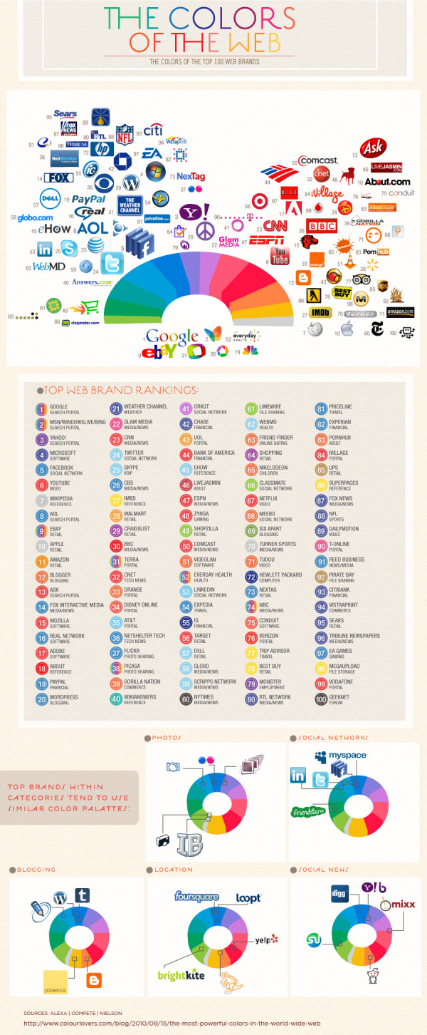
The Colors of the Web is a very cool infographic by ColourLovers.com.  Looking at the color distribution of the icons of the top 100 web brands.

When we released our report on the colors of the social web, based on data analyzed by our Twitter theme tool, we were surprised that blue was such a dominant color in people’s profile designs. Was Twitter’s default color influencing their design decisions? Or is blue really THE most popular and dominant color online? …We decided to look at the colors in the brands from the top 100 sites in the world to see if we could paint a more colorful picture.

Maybe a yellow icon wasn’t the best choice I’ve ever made…

Friday
Jun112010

The Color Strata, a beautiful color naming infographic

Stephen Von Worley at WeatherSealed.com has taken the data made public from XKCD’s Color Name Survey and created a very cool infographic, The Color Strata.  Check out the high-resolution version.

The Color Strata includes the 200 most common color names (excluding black-white-grayish tones), organized by hue horizontally and relative usage vertically, stacked by overall popularity, shaded representatively, and labeled where possible.  Besides filtering spam, ignoring cruft, normalizing grey to gray, and correcting the most egregious misspellings (here’s looking at you, fuchsia), the results are otherwise unadulterated.  As such, similar color names, like sea green, seafoam green, and seafoam, each appear separately.  They’re synonymous… or are they?

Also check out the smoothed version:

It’s the same basic graph, but with flipped shading, label-free, stretched to fill the vertical, and whipped until creamy smooth.

The volunteer survey have over 200,00 respondents that named over 5,000,000 color samples.  Here’s the original image created by XKCD.com when they posted the data.

Found on ChartPorn.org and FlowingData.com

Tuesday
Apr272010

The Color of Twitter

I really like The Color of Twitter from InfoChimps.org that plots the background colors used by all 40 million of the Twitter.com users.  I do think the infographic would be better if they had actually extended out the default light blue color instead of just noting that it extends 4.8x longer.  They also don’t account for background images that cover the background color, which would account for a large number of people not changing their colors.

As part of the release of a number of new, free Twitter data sets, Infochimps created the following beautiful infographic showing just what color Twitter really is.

The data for the infographic comes from the just-launched Histograms dataset that aggregates anonymous data about Twitter users such as how many users have x number of friends or followers, or how many users are in x location. The company also released new data sets (paid) about stock tickers, hashtags and URLs on Twitter.

Found on Mashable.com

Tuesday
Feb092010

The Crayola Color Timeline, 1935-2010

From WeatherSealed.com, the visual timeline of Crayola crayon colors.

Ever industrious, Velo also calculated the average growth rate: 2.56% annually.  For maximum understandability, he reformulated it as “Crayola’s Law,” which states:

The number of colors doubles every 28 years!

Found on ChartPorn


Friday
Jul032009

Graphical History of the American Flag


A great infographic for America's Independence Day from Mike Wirth.  The graphical history of the American Flag shows a circular timeline of when changes were made over the years and when stars were added.  I love additional information Mike included like the official folding pattern and the state each star represents by showing them chronologically.  Makes a great poster!


Tuesday
Jun162009

The Conversation Prism 2.0 has been released!


Check out the new version of The Conversation Prism 2.0 by JESS3 and Brian Solis and theconversationprism.com.  Available as a poster for $20 US on thier website, and they also have some high-resolution versions available.

I love the design of this one.  It's seems to be essentially a mind map, but much easier to read and understand.

This is an update to the original Conversation Prism that you can see here on Flickr.

Thanks Dana!  I found the link to the 1.0 version on ON:Digital+Marketing

Friday
May222009

The Amazon Book Map


Now this is impressive.  Chris Harrison has created the Amazon Book Map using data scraped from Amazon and which books Amazon thinks are related to each other.
Aaron Swartz, who runs theinfo.org, contacted me back in January '08 with an interesting data set. He had built a list of 735,323 books by crawling Amazon. Of course a gigantic list is pretty boring, but Aaron had also captured similarity data between books. In particular, he had amassed a whopping 10,316,775 connections (edges) between books Amazon believed were related. This allowed me to throw the data into my old wikiviz engine to spatially layout a huge mosaic of books (I let it run for a 140 hours). Items that were noted as being similar had attractive forces, bringing them together, often into large groups. Unsurprisingly, when we color coded by Amazon book category, there was an obvious coalescence. The way various high-level categorizations mix and meet also seems fairly logical.
I produced a few versions of what I am dubbing the Amazon Book Map. The first visualization is a huge mosaic of book covers, tinted by their respective category colors. I can't produce this in one go at full resolution because the memory requires are enormous. The second version uses color-coded dots. 
As you zoom into the image, you can see its built using the book cover images with a color overlay depicting the category of the book.


Thanks to @anniesmidt on Twitter for the link to this one!

Saturday
Nov292008

How Star Wars Changed the World


The original Star Wars has certainly gone on to produce more than just sequels.  It has created the people and the technologies that are now considered the best in the industry.  Michelle Devereaux created this family tree for Wired magazine back in 2005 and I love how the line colors indicate people, technologies and company connections, but the tree is organized into movies, sound, effects and technologies.

I actually believe the tree is incomplete.  I think Star Wars had far greater reach and influence that what Michelle mapped out here.

It all started with a band of rebels who wanted to help a farmboy follow his dream.  Three decades later, the Star Wars empire has grown into one of the most fertile incubators of talent in the worlds of movies (Lucasfilm), visual effects (Industrial Light & Magic), sound (Skywalker Sound), and videogames (LucasArts).  Along the way, some of the original Lucas crew has gone on to become his biggest competitors.  This chart maps the people, companies and technologies touched by the Force. - Michelle Devereaux
Thanks Alwyn!

Thursday
Nov132008

Seasonal Visual Timelines


Roberto Rovira, and assistant professor of landscape architecture at the Florida International University's, School of Architecture, was kind enough to allow me to share some of his work with the readers of Cool Infographics.
 
Working as a consultant, these seasonal timelines were developed to show the activities and the plants used in a proposal for a project he led called "Envisioning Hudson Square" on the Hudson River near Manhattan, NY.
 
The first one shows the time of year that different activities would be active in this green area during the year like bicycling, bird watching and ice skating.  It also shows the different wildlife that would be present during the year like blue heron, striped bass and snowy egrets. Using the visual timeline you can see how the different activities overlap and that there would always be some type of activity during the year.
 
The second timeline from the same project show the proposed plant and trees to be used in the project, and with the use of the visual timeline shows their color and appearance throughout the year.
 
Graphics by Roberto Rovira, RLA, with assistance from landscape designer Kelly Woodward. Roberto is Assistant Professor in Landscape Architecture at Florida International University (www.fiu.edu/~soa) and Senior Landscape Architect consultant for ArquitectonicaGEO (www.arquitectonicageo.com), a Miami-based landscape and planning firm. He led GEO's design team and developed the concepts for 'Hudson Square Prints Green!', a proposal for a 30-block New York City district on Manhattan's West Side, adjacent to the Hudson River.

Tuesday
Oct282008

Map of Newspaper Presidential Endorsements


Staying on the presidential election theme, here's a great infographic on infochimps.org.  Red shows newspapers endorsing McCain, and Blue show newspapers endorsing Obama.  The inner color of each circle also represents which candidate the newspaper endorsed in the 2004 election.  The size of the circle represents each newspapers circulation.

Also notice the mismatch between the newspaper endorsement and each state's "Red vs. Blue" alignment.

Thanks Garrett for the link!