About
Randy Krum
President of InfoNewt.
Data Visualization and Infographic Design

Infographic Design

Infographics Design | Presentations
Consulting | Data Visualizations

DFW DataViz Meetup

Join the DFW Data Visualization and Infographics Meetup Group if you're in the Dallas/Fort Worth area!

Search the Cool Infographics site

Custom Search

Subscriptions:


Feedburner

The Cool Infographics® Gallery:

How to add the
Cool Infographics button to your:

Cool Infographics iOS icon

- iPhone
- iPad
- iPod Touch


Read on Flipboard for iPad and iPhone

Featured in the Tech & Science category

Flipboard icon

Twitter Feed
From the Bookstore

Caffeine Poster

The Caffeine Poster infographic

Entries in design (479)

Tuesday
Jun082010

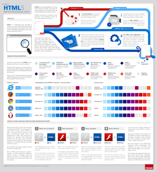
WTF is HTML5 and Why Should We Care? (infographic)

From Focus.com, WTF is HTML5 is a cool visual explanation of HTML5, how supported it is by different browsers and how it compares to Adobe Flash.

From an infographic design view, I don’t like the legend for the color codes in the browser matrix.  I shouldn’t have to look back and forth to figure out what feature is missing from a particular browser.

Thursday
May272010

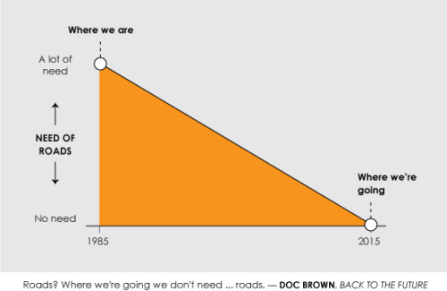
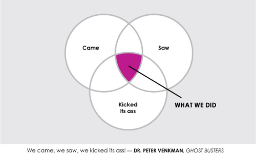
5 SciFi Movie Quotes...made into infographics

Nathan Yau has designed these humorous infographics representing five famous sci-fi movie quotes for SciFi Wire.

You can see Nathan’s explanation on his website, FlowingData.com, and all of the quotes on SciFiWire.com.  I hope you do more of these Nathan!

In something of a Data Underload, special edition, I played with famous science fiction quotes for Sci Fi Wire. My favorite is obviously from Back to the Future, the greatest movie of all time.

Monday
May242010

Ecological Footprint from Digital Eskimo

In their interactive 2009 Ecological Footprint infographic report, Digital Eskimo has used the analogy of the football field (soccer field in America) to visualize their impact because global hectares (the standard units of ecofootprint measurement) aren’t easy to conceptualize.

I love that the team at Digital Eskimo is not only using this infographic to share results and information within the company, but also sharing it publicly to demonstrate their commitment to working on projects that inspire positive social, organisational and environmental change.  Infographics are a VERY powerful tool for communicating clear messages within your company, even if you never share it with the outside world.

Digital Eskimo has always worked very hard to minimise our impact on the environment. In order to help us better understand these impacts, and develop more effective strategies to address them, we calculated our ecological footprint for the 2009 financial year.

Ecological footprinting is one way of measuring whether the way in which we operate is sustainable in a global context. We chose this method because it is widely used, it provides results in an understandable format while clearly showing relative impacts of different elements of our operations.

Thanks to Sally for the link and a description of how Digital Eskimo is walking the talk.

Friday
May212010

15 Things You Didn't Know About Star Trek [infographic]

Posted on Dump.com, the 15 Things You Didn’t Know About Star Trek infographic from designer Ricky Linn.

You can see the high-resolution version in Ricky’s Flickr photostream.

Thanks to Ben for sending in the link!

Friday
May212010

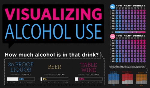
Visualizing Alcohol Use

From phlebotomist.net (a website all about blood!), the highly-colorful Visualizing Alcohol Use infographic explores the effect of alcohol 

How much alcohol can your bloodstream handle? Take a look at the graphic to check out everything from blood alcohol averages to the highest blood alcohol content ever survived (you won’t want to try this at home).

There’s no designer credited, but if this wasn’t designed by EJ Fox (@pseudoplacebo) then it was heavily influenced by his work.

Thanks to Cate for the link!

Friday
May142010

The Insipid World of Infographics (infographic)

The Insipid World of Infographics is a very funny parody infographic making fun of the wave of infographics that have been popular on the web lately.  From Will Lybrand at willlybrand.com.

I’ve recently spent a lot of time reviewing a bunch of infographics on the internet. As a result, I thought I should contribute to the new trend with my own infographic. It’s chock-full of good information, legitimate and factual sources, and amazing but revealing charts.

Found on VizWorld and Visual Loop

Thursday
May132010

Visualizing "Drive", an illustrated presentation by Dan Pink

Great job by the RSA (The Royal Society for the encouragement of Arts, Manufactures and Commerce) to visualize and illustrate this presentation given by Dan Pink, author of Drive: The Surprising Truth About What Motivates Us.

This is definitely walking the fine line between illustration and infographics, but I thought it was worthy to share.  I think the presentation is much more engaging with the visuals.  I wish I knew who the designer was so I could give him credit.

More illustrated videos are available on the RSA Videos page.


If anyone is interested in buying Dan’s book, this link will help support Cool Infographics.

Tuesday
May112010

Frog Design Envisions Your Future in 2020

At the end of 2009, Forbes magazine asked a team from Frog Design to Envision the Future, but only a future a short time ahead of us in 2020.  Augmented reality played a big part in what the team at Frog came up with, but I think infographics played an even bigger part.

At the end of last year, Forbes magazine asked frog to help them envision the future in 2020.  The day-long event led to an extensive online feature: “Your Life in 2020,” a collection of illustrated concepts and videos that envision the future of ubiquitous computing. In that future,  your computer is not only incorporated into every aspect of your life but is a part of you.

I love that they included the Whuffie, a personal score system developed by Cory Doctorow.

The term “whuffie,” by the way, is a word coined by author Cory Doctorow in his book Down And Out In the Magic Kingdom. It refers to the measurement of respect or karma a person gains or looses in their lives. In Doctorow’s future, humans have implants in their brains that visually project their whuffie, which has replaced money as currency.

Found on VizWorld and DesignMind, the Frog Design blog

Monday
May032010

Design For America Contest Deadline

The May 15th deadline for the Sunlight Labs’ Design For America contest is quickly approaching!  With $40,000 in prize money available, there’s still time to enter the Data Visualization category (or Process Transparency or Redesigning The Government).
The submission deadline for the Design for America competition is rapidly approaching. Designs are due by May 15th and the winners announced on May 27th. With a grand total of $40,000 in prize money on the line, we would like to invite designers from every corner of the globe to participate. We can’t wait to see the great ideas people have for redesigning government, visualizing data and explaining government processes.

Our team at the Sunlight Foundation put together this video to give a little context about the competition. In addition, our own Ali Felski, one of Design for America’s judges, did a nice write up of competition where she talks about the need for designers to come together to, “overwhelm the government with good design.”

Government information can be so boring and obtuse. Reams of data on spreadsheets and hundreds, even thousands of pages of legalese can unintentionally obscure the real, and beautiful meaning of public information.
Thanks to Brad for reminding me and sending the link!
Friday
Apr302010

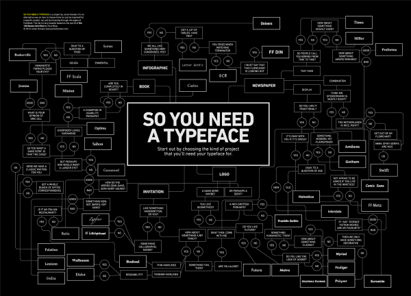
What Font Do I Use? - a Typeface Decision Flowchart

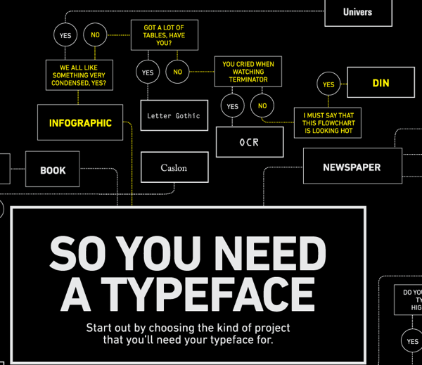
Graphic designer Julian Hansen created this cool typeface decision flowchart, So You Need A Typeface, as part of a school project.  The high-resolution version is available to view online, but you can also pre-order the poster version here for $22.  It should start shipping on May 2nd.

So you need a typeface is an alternative way on how to choose fonts (or just be inspired) for a specific project, not just by browsing through the pages of FontBook. The list is (very loosely) based on the top 50 of the “Die 100 besten schriften”.

Of course, the part all of you want to see is the infographic branch…

Found on FlowingData.com