About
Randy Krum
President of InfoNewt.
Data Visualization and Infographic Design

Infographic Design

Infographics Design | Presentations
Consulting | Data Visualizations

DFW DataViz Meetup

Join the DFW Data Visualization and Infographics Meetup Group if you're in the Dallas/Fort Worth area!

Search the Cool Infographics site

Custom Search

Subscriptions:


Feedburner

The Cool Infographics® Gallery:

How to add the
Cool Infographics button to your:

Cool Infographics iOS icon

- iPhone
- iPad
- iPod Touch


Read on Flipboard for iPad and iPhone

Featured in the Tech & Science category

Flipboard icon

Twitter Feed
From the Bookstore

Caffeine Poster

The Caffeine Poster infographic

Entries in history (262)

Monday
Mar022015

Stories of the Past and Future

xkcd Stories of the Past and Future

Stories of the Past and Future is an awesome timeline design from Randall Monroe at xkcd.com depicting the differences between when movies and TV shows were released, and the time periods they depicted. I printed off the large version and starting adding a few more on my own.

Thanks to Tweets from Nathan Yau @flowingdata and Alberto Cairo @albertocairo!

Wednesday
Feb042015

The Evolution of Spawn

The Evolution of Spawn infographic

The Evolution of Spawn infographic is a fantastic design. Not fan art, this official infographic was designed by Todd McFarlane, Creator of Spawn and Co-Founder and President of Image Comics!

From Todd’s Facebook post:

THE EVOLUTION OF Spawn!!!!!

With Spawn issue #250 coming up at the end of the month…. I thought it would be COOL to put together all the different costumes Spawn has had over the years.

And if you’re doing the math, that’s 24 YEARS. TWENTY-FOUR!!!!!!!! It’s cool to look back and see how things have changed since 1992….it’s hard to believe we’re already coming up on our #250th issue.

Thanks for all your support over the years!!! I’ll be doing a giveaway with these, soon.

TODD

P.S.- There have been a few requests for a downloadable poster (and higher res)… You should be able to download the poster from this link: https://flic.kr/p/qKcR9q

Found on GeekTyrant

Tuesday
Nov182014

Old World Language Families

Old World Language Families infographic

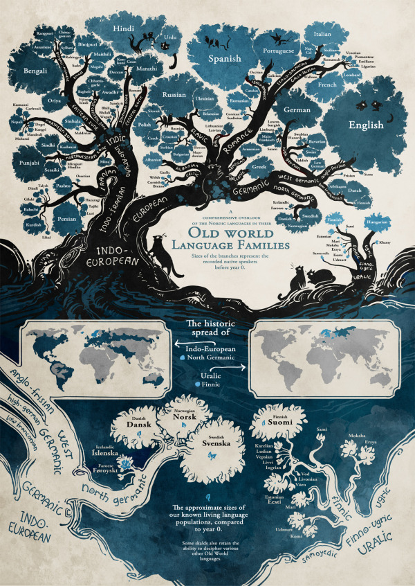
The Old World Language Families infographic from Stand Still Stay Silent Comic shows the “roots” of our modern languages. Follow each language’s path from bush to roots and discover how closely languages are related to each other.

Language trees for the language lovers! I’ve gathered pretty much all the data for this from ethnologue.com, which is an awesome well of information about language families. And if anyone finds some important language missing let me know! (Naturally most tiny languages didn’t make it on the graph, aww. There’s literally hundreds of them in the Indo-European family alone and I could only fit so many on this page, so most sub-1 mil. speaker languages that don’t have official status somewhere got the cut.)

Fantastic illustration that visualizes the evolution of all the modern languages! It’s a complex design that is intended for readers to dive deep and explore.

Knowing that the image itself will be shared as a stand-alone content piece, the image should include credits and links to the original site.

Found on http://mentalfloss.com

Monday
Nov172014

Interesting Things to Know About Amazon

Interesting Things to Know About Amazon infographic from TechieSense shares a whole bunch of facts and history about Amazon’s business, e employees and customers.

This is a really long infographic that is not a quick and easy read. This is an exhaustive guide to all of the stats about Amazon they could get their hands on. Personally, I would have suggested to break this up into multiple, shorter infographics.

I like the various data visualization methods that help the readers visually understand they have moved from one section to the next. Any stats that are not visualized and shown in text-only are perceived as secondary information, and are likely to be skipped over. Good use of logos from different departments in Amazon and other websites and companies.

Interesting social media tactic is that the infographic landing page highlights eight facts from the infographic and lists that in text as suggested tweets with custom Tweet This links.

Found on Parampreet’s Google+

Wednesday
Sep172014

The Evolution of iOS from iOS 1 - iOS 8

The Evolution of iOS from iOS 1 - iOS 8 infographic

On iOS 8 launch day, The Evolution of iOS from iOS 1- iOS 8 infographic is a timeline of the iOS systems from 7 Day Shop. The infographic shows the evolution of the home screen, app icons, and the most noteworthy features.

This week saw the launch of the highly anticipated iPhone 6, iPhone 6 Plus and iWatch. Apple also announced that iOS 8, the operating system that will run both of the new iPhones will be made available for download on September 9th, 2014.

In light of the evolutionary change of the iOS, we decided to dig a little deeper to the first ‘iPhone OS’ right through to it’s latest iteration iOS 8. It’s development both in the hardware and software front over just only 6 years is beyond remarkable.

We have charted the evolution of the home screen, app icons and the most noteworthy features of each iOS.

It’s a tall design with a lot of information, but the visuals help out tremendously.  There’s way too much text in this design, and they chose to make the font size too small to fit it all in.  For the new features added with each major upgrade I would remove the text descriptions, and just keep the titles.  Keep the design simple.

This is a good example of an informative infographic capitalizing on a hot trending topic. There’s no hard sales pitch or even a call-to-action. This makes people more willing to share the infographic, and 7DayShop.com just put their logo in the footer to claim credit and build their overall awareness and credibility. They should have included the URL link to the original infographic on their site to help readers find it. Especially on a design this big, because most blog and social shares will post a smaller thumbnail version.

Are the new features compelling you to upgrade to iOS 8? Did you order the new iPhone 6? Let me know in the comments!

Thanks to Kunie for sending in the link!

Friday
Sep052014

Alchemy of Tea

Alchemy of Tea Infographic Poster

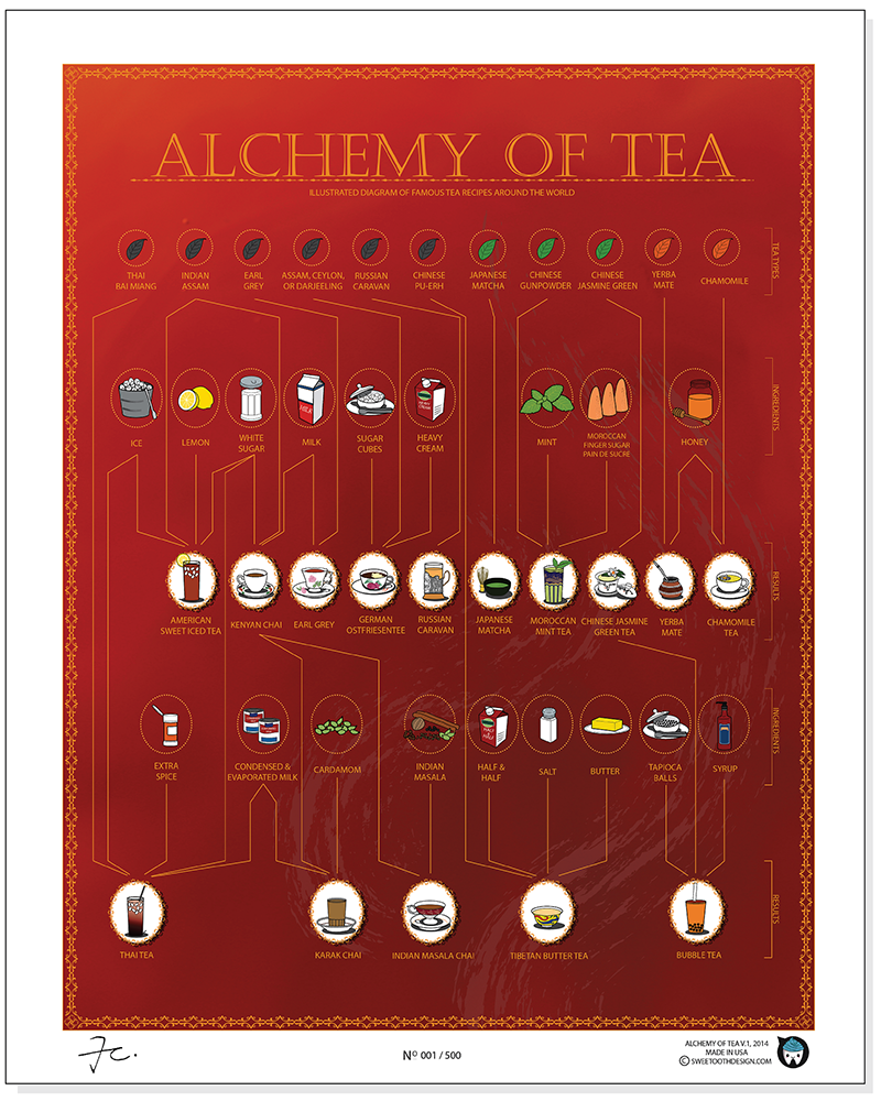
The Alchemy of Tea infographic poster from SweeTooth Design Company maps out 15 traditional tea recipes from around the world, paying homage to the 4,000 year old beverage. Posters are available for $25 through the Kickstarter project, and will ship in November.  They have already exceeded their funding goal, so these will definitely go to print.

“Alchemy of Tea” is the first infographic illustration that depicts traditional tea recipes from around the world. It is not only a poster, but an informative recipe diagram of one of the most favorite drinks, tea.

There is a total of 15 tea recipes. Through mixing tea base with different ingredients, there are different results. What is more interesting is that simply by adding one or more ingredients, the entire recipe may becomes an entire different drink. 

Alchemy of Tea Infographic Poster Red Closeup

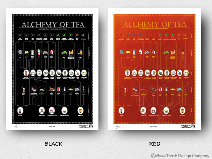
Posters will be printed in Red and Black:

Alchemy of Tea Infographic Poster Red Black

Found on http://www.fastcodesign.com

Monday
Aug112014

The State of AIDS

The State of AIDS infographic

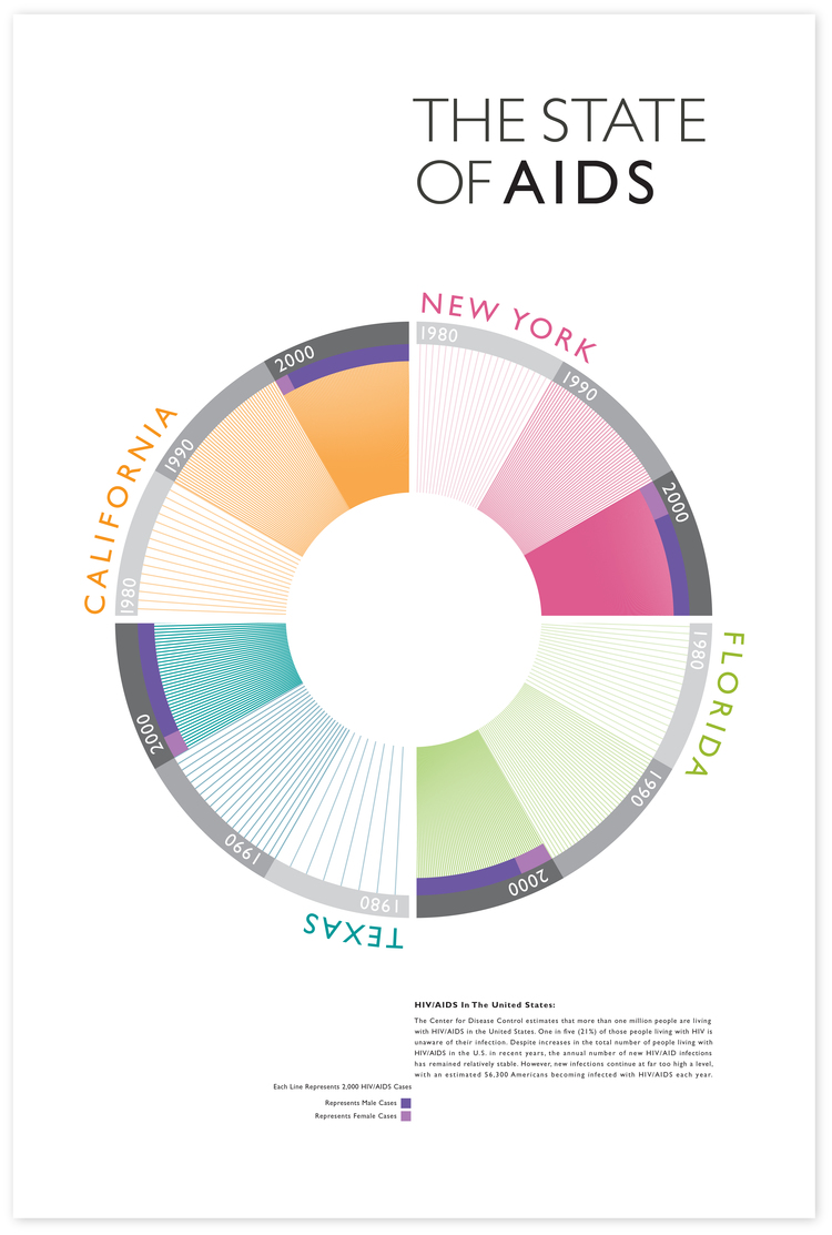
The four states in the US that have the highest number of cases of HIV and AIDS cases are California, New York, Florida, and Texas. The State of AIDS infographic shows the increase in cases from the 1980’s to the 2000’s and was designed by Alan Bui.

An Info-Graphic produced using statical reports from the CDC to represent visually the Four State in the US that have the highest cases of HIV/AID’S cases. The Info-Graph also shows disparity from the first reported case of HIV/AIDS in the 1980’s to the 2000’s.

Good data visualization that tells one story really well.  You can clearly see the number of reported cases increases dramatically each decade. 

Thanks to Alan for sending in the link!

Wednesday
Jul302014

World Records from the Commonwealth Games


World Records from the Commonwealth Games infographic

IVC Signs has compiled some statistics about the commonwealth games into the World Records from the Commonwealth Games infographic. Find out record holders names, time, and place where each record was made!

Following on from being appointed the official signage supplier for the 2014 Games, IVC Signs have followed this up with this fantastic info graphic, packed full of world records and global statistics from the Commonwealth Games over the decades.

The infographic has great, fun illustrations to portray the sports that are being discussed. I would of liked to see a better interpretation of time, distances and locations rather than the same graphic icon over and over again with the value underneath it. The infographic is missing the URL link at the bottom, as well as a list of sources.

Thanks to David for sending in the link!

Wednesday
Jul302014

Around the World in 80 Hats

Around the World in 80 Hats infographic

Around the World in 80 Hats infographic from Venere is a quick culture trip around the world with a little help from a fashionable article of clothing, hats.

All cultures of the world use the clothes they wear to define how they live, work, and respect their history. From the first world to the third world, hat styles especially have become important iconic markers of cultural dress. This infographic looks at 80 culturally significant hats from all corners of the earth, showing just how wonderfully diverse and interesting humanity can be.

A story like this depends on the visuals.  You have to see the hats to understand the history and connection to each country.  The footer should include the URL to the infographic landing page in text so readers can find the original when other sites post the infographic without the link.

Thanks to Thomas for sending in the link!

Tuesday
Jul012014

Defining Moments in Canadian History

Defining Moments in Canadian History infographic

Happy Birthday Canada! To celebrate, American Appraisal has created the Defining Moments in Canadian History infographic to commemorate the last 147 years that have shaped Canada into what it is today.

July 1st is Canada Day and from coast-to-coast, Canadians will celebrate our country’s 147th birthday with pride.

To kick off celebrations, here’s a fun infographic with little-known facts about Canada, events that made headlines, and uniquely Canadian milestones.

I like the visual timeline of major events and milestones with illustrations and icons.  The statistics should be visualized though.  Big fonts are not data visualizations, and numbers alone don’t give the audience any context about the values.

Thanks to Christine for sharing!