About
Randy Krum
President of InfoNewt.
Data Visualization and Infographic Design

Infographic Design

Infographics Design | Presentations
Consulting | Data Visualizations

DFW DataViz Meetup

Join the DFW Data Visualization and Infographics Meetup Group if you're in the Dallas/Fort Worth area!

Search the Cool Infographics site

Custom Search

Subscriptions:


Feedburner

The Cool Infographics® Gallery:

How to add the
Cool Infographics button to your:

Cool Infographics iOS icon

- iPhone
- iPad
- iPod Touch


Read on Flipboard for iPad and iPhone

Featured in the Tech & Science category

Flipboard icon

Twitter Feed
From the Bookstore

Caffeine Poster

The Caffeine Poster infographic

Entries in infographics (33)

Tuesday
Jul142015

Pro Tips to Track Results from Infographics

Creating an infographic is no simple task. A lot of time and resources go into the data research and design of a good infographic, but not always into figuring what happened after publishing it on the Internet. Where many companies miss the mark with their infographics is in their tracking efforts after the infographic has been released. Pageviews, social shares, reposts, backlinks, and more are all part of measuring the success of an infographic.

It is important to understand that infographics need as much promotional and tracking support as articles, videos, advertisements, and even the products and services their business is marketing. Learning what works and doesn’t work should be a huge part of future marketing plans.

The work of tracking an infographic starts the day it’s published online. Here are five key areas a company should focus on after they've released an infographic.


1. Dedicated Landing Page for Analytics
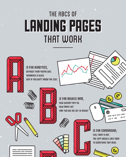
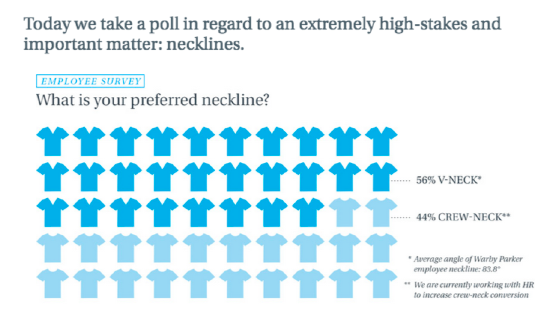
 

via: CopyBlogger

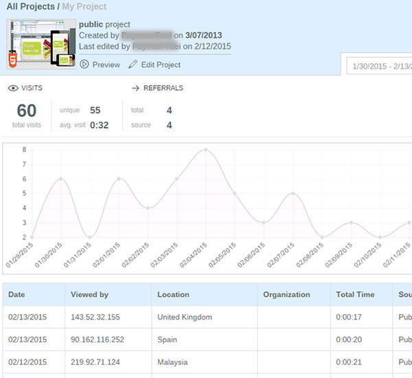
To make sure you get the most out of your infographic, make sure it is published on the company’s website on a dedicated landing page or if that’s not available, in it’s own blog post. That will provide a dedicated landing page URL as the one primary link in posts to drive all the views and backlinks to one place. By creating a landing page you can access your own web analytics to see pageviews, traffic patterns and referring sites. You also have control over which social sharing buttons to include for default text and sharing statistics.

An often overlooked ally to tracking infographics after their release is your company’s own website analytics. When you examine the metrics of the overall company website, inbound links can become a jackpot for insights about who picked up your content.

Pro Tip:

Use inbound links to keep track of pick-up, and target new outlets for future outreach efforts.

An alternate (or secondary) method would be to publish your infographic on a hosted platform like Visme or SlideShare. These platforms display the infographic within an enclosure that can be embedded and shared on other sites, and gather the analytics from all of the sites displaying the enclosure in one tracking report.


2. Track the Value of Backlinks


via: Pole Position Marketing

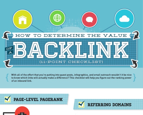
For many companies, the goal of publishing infographics is to attract links and visitors to its own website. To find all of those links, you have to go looking for them.

Pro Tip:

Use an SEO backlink tool like Majestic SEO Site Explorer, Moz Open Site Explorer, or even do a Google search of the full landing page URL (another advantage of having a dedicated landing page URL). These tools will allow you to be able to find all of those valuable backlinks.

Be sure to check the value of links from those sites. One strong link can be worth more than many weak links. Google call this PageRank, Moz calls this Authority, and Majestic calls this Trust. Choose one metric for your tracking so you are comparing the same type of score across all of the sites that link to your infographic landing page.

Go through your list of industry specific websites, blogs, and news media outlets you pitched the infographic to, and search their website to see if anything pops up (wait about a week or two before searching to give time for an article to be written).


3. Social Share Counters


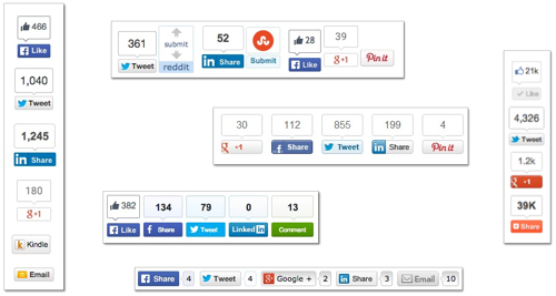
Social media can be used as a good indicator of how well your content is performing online, especially when looking at social shares from a specific media site pick-up. It’s important to remember that social sharing doesn’t help your own website’s pagerank, but it does build widespread awareness and exposure of your infographic content.

Pro Tips:

a. Use the counters from the social share buttons you set-up on the dedicated landing page.

b. Search Twitter (and other social media sites) for the full URL link to the landing page to find other social media posts that didn’t use your buttons but did link back to the infographic.

c. Check the social share button counters on other sites that reposted the infographic for additional sharing stats.


4. Reverse Image Search


When a blogger, media outlet, or journalist has chosen to write about your infographic, it doesn't always mean they will also take the time to include a link back to your website, or will even remember where they found the infographic. Reverse Image Search is a valuable tool to use to find reposts of your infographic that don’t link back to your website..

Reverse Image Search is a service offered by Google, Bing and TinEye. They allow you to drag and drop, upload your own image or choose an image online to start the search. The results will list all of the web pages in their index that include that image, in any size. This is the best way to find sites that posted your infographic without linking back to your landing page.
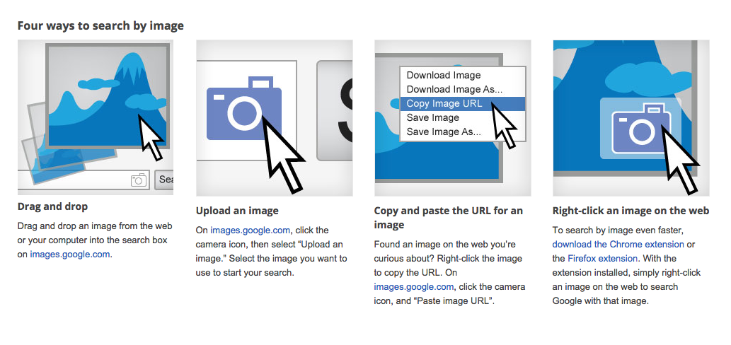
Via: Google Images

Pro Tip:

Reach out to any high value sites you find that published your infographic but didn’t include a link. Politely thank them for sharing your infographics, and ask them to add a link back to the original landing page.


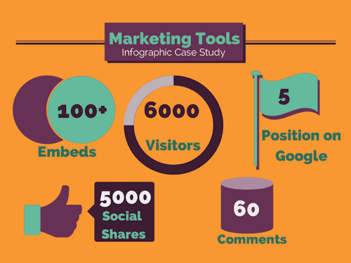
5. Gather Your Results

Pull together all of the results you found into a summary that your company can use as a benchmark to evaluate future published content. Your web analytics, combined social shares, backlinks from sites and image-only posts together paint an overall picture of how well your infographic performed.

via: Razor Social

Pro Tip:

Site that have seen their own success from posting your infographic are more likely to post future infographics from you as well. Start building an outreach list of people and sites that appreciate your content.


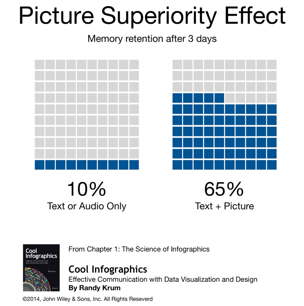
Even the slightest effort put into tracking your infographic can significantly improve your understanding of the value of visual content. In order to understand it’s value, you have to understand its reach. Then, you can evaluate how your content is performing, and make any changes needed to make future content more likely to garner the pick-up and exposure your team or company seeks.

Remember, you can’t improve what you don’t measure!

Are there any other tracking methods you use to keep track of your infographics or other visual content? How do you measure success for infographic (or any visual content)?

Tuesday
Jun162015

Visme 3.0 Design Platform Launches Improved User Interface

Visme Infographic Templates

Visme is an online design platform, and can be used to create infographics, presentations, banners, reports, and even resumes. With over 200,000 users, Visme is being used by many as a replacement for expensive desktop applications like Microsoft PowerPoint and Adobe Illustrator.

"Visme epitomizes everything we strive for. At the core we are a visualization tool and our mission is to simplify the ability for anyone to easily transform their thoughts and ideas into engaging visual content," - Founder Payman Taei

In April 2015, the team at Hindsite Interactive launched Visme 3.0, a complete redesign, moving to a cleaner, easy-to-use user interface. The redesign has made a major move towards flatter design elements that help users focus on the content they are creating without being distracted by the interface tools.

Visme Flat Design Interface Updates

If you’re not a professional designer that can invest in a high-end hardware and software setup or don’t have the time or budget to hire a professional, Visme is a great platform to create eye-catching visual content with minimal effort. You can start with one of the many professional templates, and then customize your design by changing colors, rearranging the layout, uploading your own images, inserting video, building simple data visualizations using the Graph Tool, or use any of the millions of free icons and images from the huge built-in library.

Specifically for infographics design, the built-in Graph Tool and Infograph Widgets can be very helpful. Although you may import more complex data visualizations created elsewhere, the Graph Tool let’s you build simple charts directly in your design by entering the data and editing the chart settings. This is a huge advantage over many other online design tools that only provide chart shapes and objects that you have to adjust manually to match your data. Accuracy of your data visualizations in an infographic is crucial!

Visme Graph Tool

Here you can see a simple area chart created with the Visme Graph Tool. Over 600 data points were uploaded to create this simple data visualization. Because it was built with the Graph Tool, the chart is editable as the data set continues to grow in the future. The design has been inserted here using the embed code created by the Visme platform to display the chart. As future updates are made to the chart on the Visme site, the most current version will always be displayed here. For infographics, you can update the data in your design, and every site that uses the embed code will always display the latest version of your design.

Original: http://my.visme.co/projects/growth-of-infographics-in-search-613ce1

 Personally, I’d like to see the Graph Tool expand into more visualization styles, and give the users more ability to customize the charts it creates. It’s pretty good with the simple charts, but I hope this is only the starting point for the Visme team. I hear that improvements to the Graph Tool are in the plan for release later this year.

Infographics are made to be shared, and the Visme tool gives you plenty of options. In addition to embed code for both animated and static sharing, you can also download your design as a static image file (JPG or PNG) or a PDF file for easy distribution.    You can also download as HTML5 version which would retain all interactivity of your live version and open locally in any browser without third party software or plugins.

Two other advantages of designing your infographics in Visme. First, you can keep your designs private, and only allow those that have the link to view your design. You can even password protect your design so only those with the link and the password can view your design. Second, you can see the analytics for your design in one place. This is a real challenge for tracking infographics online, and seeing the combined statistics of views and visits to your infographic is a fantastic feature. For everyone that shares your infographic on their own using the embed code, those viewer statistics are all gathered together in your Visme analytics dashboard.

Visme Analytics


Visme is free to everyone to try with many of the basic design tools. Paid plans start at just $6/month to unlock premium templates, along with the ability to manage privacy, download content, analytics and collaboration tools.

Special for readers of Cool Infographics, use the discount code VISME3 to get a lifetime 25% discount on any subscription.


Monday
Jun152015

Infographics Are Evolving into Many Formats

The internet is full of noise, and your job is to break through that wall of information with something that resonates with your target audience. When you are communicating any message, you want to ensure that your audience will understand and remember the valuable takeaways about your products or services. You want your communication to be clear and concise. This is where infographics come in.

Infographics are your opportunity to convey complex ideas and information in a simple and easily digestible manner. Simply put, our brains love visual information. Infographics can make your marketing and advertising stand out in the crowded world of visual content.

As the Internet, our computing devices and out screen sizes continue to evolve and change, infographics need to evolve as well. Moving past the original static images, infographic storytelling with data visualizations and illustrations can now be found in a number of different formats.

Below, are great examples of different ways to leverage the five different types of infographics to make your product or services more memorable.


1. Static Infographics - Kitchen Conversion Guide

Static infographics are the most simple and most common infographic format out there. They are usually saved as an image file to be easily distributed and consumed (JPG or PNG format). Static infographics are easily shared using email and social media since there are no moving parts to consider.

The Common Cook’s How-Many Guide to Kitchen Conversations

Source: https://shannon-lattin.squarespace.com/how-many-guide/

This type of infographic is also easily split up into segments in order to focus on one piece at a time. This is ideal for giving presentations or sharing on social media.


2. Interactive Infographics - Daily Dose of Water

Interactive infographics are great to utilize when you want people to move beyond simply looking at the information. Ideally your audience should get intimate with the facts you’re presenting by following a specific storyline told through your data. By giving your audience something to interact with, they are engaging more of their attention with the data, and will become more immersed in the information.

For example, this infographic from Good.is and Levi’s walks users through their typical routine and calculates how much water is used for each task. This allows a personalized experience for each person that views the infographic, creating a stronger connection to the information being shared.

Your Daily Dose of Water

Source: http://awesome.good.is/transparency/web/1204/your-daily-dose-of-water/flash.html


3. Video Infographics - The Fallen of WWII

Video infographics have been gaining popularity over the years in part for a lot of the same reasons static infographics work: the ease of sharing and the ability to embed it almost anywhere.

In this video infographic that has recently gone viral, the creator uses data visualization to make a powerful statement about the sacrifice soldiers made during World War II. Data visualization is used in such a way to show the stark juxtaposition between the Second World War and more modern conflicts.  Check out this quick motion graphic titled, The Fallen of World War II from Austin-based developer Neil Halloran. His use of sound and motion brings the information to life.

The Fallen of World War II from Neil Halloran on Vimeo.


4. Zooming Infographics - The History of Film

Some infographic topics tackle a large amount of information, and a larger design is required to display all of its information. This infographic from Historyshots is a great example of a zooming infographic:

The History of Film

Source: http://www.historyshots.com/products/history-of-film

The History of Film plots out the most important films of the last 100 years into a beautiful, flowing timeline that visually separates the films into 20 different genres. As can be seen above, if this infographic was just left as a static image, it would be difficult to read everything because it is so detailed and complex. In the web browser, a large design is reduced in size so that the entire design can be viewed all at once on the screen, and the zooming controls are made available to the reader to view the small details clearly.


5. Animated Infographics - Flight Videos Deconstructed

Some topics for infographics are best created to feature motion, none more so than one that shows the the flight patterns of an Egyptian Fruit Bat, Dragonfly, Canada Goose, Hawk Moth, and Hummingbird. Flight Videos Deconstructed is an animated infographic about flight patterns within the animal kingdom. Covering five winged animals the and the motion their wings use while taking flight, this animated graphic uses vibrant colors and geometric shapes to convey the beauty and simplicity of flight.

Animated infographics create some motion or change in the design as the reader watches. It might be the bars in a bar chart growing, a color change, or (in the case of these winged animals) an animated character. These are differentiated from the video infographics because these are not video files. These are animated with HTML code or an animated GIF image file format to create the animation but can exist as a stand-alone object on a web page.


Flight Videos Deconstructed

Source: http://tabletopwhale.com/2014/09/29/flight-videos-deconstructed.html


With so many new and different formats of infographics available to today’s marketers, providing your audience with a story that conveys your message has never been more exciting. Sharing the key takeaways from your product or services can be done in an expertly designed way that appeals to your audience and leaves them wanting more. 

Wednesday
Feb252015

Five Innovative Ways Companies Are Using Infographics to Share Data

The popularity of turning data into visuals has skyrocketed in recent years. Especially the keyword “infographic,” as evidenced through Google Trends. This has sent capable marketers scrambling for a competent team of: designers, copywriters, and producers to create new and exciting content. While charts and graphs are nothing new, the way they are displayed visually (and the stories they can tell), is expanding into uncharted waters.

via: Google Trends - “Infographic”

Infographics and data visualizations were once the playthings of academics. Beautiful displays of information were created and tucked away in their ivory towers of academia. Those days are now long over, and the power of data combined with visual information has been passed on to the masses.

For a while, it seemed nearly everyone under the sun was creating infographics. This resulted in an over-saturation of infographics online, with marketers cranking them out as fast as possible. Complete with often poor designs, and misleading data.

While this over-saturation did hurt the online marketing reputation of infographics slightly, their growth in online popularity did not. This online exposure and awareness of infographics has driven a significant increase in the use of infographics inside companies as well.

To help clear the air, check out these six examples below for how companies are coming up with innovative ways to use infographics.  


1. Hotels.com: PR Infographics

Traveling and flying to new cities can be equal parts exciting and terrifying. This infographic from Hotels.com, provides travelers with valuable insights they should know before arriving in major cities around the world. This infographic is great because it gives their customers valuable information (and saves a bit of decision-making time) to make their transition from the sky to the city that much smoother.

Another great thing about these infographics is that they are specifically targeting the press with their proprietary internal data. This builds their credibility by sharing their expertise and valuable insight into the hotel industry. They’re not just telling the press, they’re showing them the data visually as well.


2. Wine Folly: Food and Wine Pairing

This infographic from Wine Folly looks at all the different taste profiles, such as sweet and sour, to create the perfect food and wine pairings. The great thing about this infographic is its online life span - which can easily last for many years. Twenty years from now, the information will still be the same, and the design will still be relevant to readers.

Online lifespan can make a huge difference to the ongoing SEO value of any infographic, and should be an integral part of the topic selection process.


3. SumAll: The Internet is a Zoo - The Ideal Length of Everything Online

This infographic from SumAll looks at something we all struggle with: our attention spans. How many characters long should a Facebook post be? What is the ideal subject line length? How many words should a blog post be so that it actually gets read? All the answers to your burning questions are here in one place. 

What makes this graphic so good is that these observations apply to all social media audiences, no matter what industry they come from. It’s a valuable topic for marketers in any industry.


4. Warby Parker Annual Report

The annual report is getting a strong makeover thanks to innovative companies like Warby Parker. The annual report used to be a non-event. Everyone made an annual report, and they all basically looked and felt the same; i.e. lots of words, mixed in with some charts and graphs. Warby Parker really hit the mark with their 2013 Annual Report

In an article on Business Insider, they explain how Warby Parker’s previous two annual reports fit into it’s quirky brand, but the 2013 annual report is it’s most ambitious. It may seem like it has plenty of meaningless information, but it’s a smart business move. Because amidst all of the meaningless information, you begin to realize that it’s not actually an annual report at all, but a giant advertisement intended to become viral. This resulted in some of their biggest sales days.

Seeing as how every business loves talking about itself on social media, it’s surprising it has taken this long for the annual report to become relevant again.


5. MHPM Corporate Sustainability Report

This infographic from MHPM examines the creation of a sustainably built environment, project by project. More and more, sustainability matters to clients, employees and the communities they all live and work in. With the right practices in place, a sustainable building is worth more (and costs less to operate) than traditional buildings, helping to make them an attractive choice versus competitors.

This new application of infographics lets MHPH tell their own story in a visually appealing way. By providing the numbers behind their commitment to keeping their projects green, MHPM has not only helped prove their own claim that Sustainability is Free™, but they also share how they can help their customers.

As we have seen over recent years, infographics have continued to grow in popularity. Giving rise to a new Internet, continually heading in the direction of displaying more advanced, and beautiful ways to visualize information. What are some other creative uses of infographics you have seen lately?

Sunday
Feb222015

Cool Infographics Course at SMU

Cool Infographics Course at SMU

Infographics & Data Visualization Design

April 7-May 19, 2015 | 6am-9pm Tuesday Evenings | SMU CAPE Dallas Campus | $495

$50 off discount code for Cool Infographics readers: VIP50

I will be teaching a new course at the SMU Dallas Campus this spring as part of the CAPE program (Continuing and Professional Education). In this course, working professionals will become familiar with the exciting and expanding field of data visualization and infographics. By attending this course you will start to develop your own portfolio and learn:

  • The art and science of data visualization and infographics
  • The data visualization and infographics design process
  • Data analytics and basic statistics for the designer
  • Different chart types, dashboards and graphing options
  • How to use the various software and online tools readily available and when to use them
  • Strategies for publishing and promoting infographics online
  • Understanding IP, trademark and copyright issues and how they relate to infographics
  • And more…

Please share with anyone in the Dallas area, or join the class yourself. Enrollment is very limited, so register quickly!

Click Here to learn more: bit.ly/SMU-DataViz


Also check out the DFW Data Visualization & Infographics Meetup group with monthly speakers and events in the Dallas-Fort Worth area!

Thursday
Feb122015

Who's Going to Malofiej 23?

Malofiej 23 conference workshop speakers

The Malofiej 23 Workshop days will be March 15-18, 2015, and the Infographics World Summit conference will be March 18-20, 2015. Malofiej 23 will be held this year in Pamplona, Spain by the Spanish Chapter of the Society for New Design (SNDE). The line up of speakers looks amazing! I’ll be giving a talk, but I can’t wait to hear some of these other fantastic speakers!

Here’s the link to download the conference program PDF:

Malofiej 23 conference workshop program

This year I have will have the honor of both speaking during the conference, and acting as a judge for the Malofiej Awards. I’m putting together a new presentation titled “The Seven Deadly Sins of Infographics Design” that I will present during the conference portion.

If you have plans to attend the workshop or conference, let me know and we can arrange to meetup.

Tuesday
Feb032015

The 6 Principles of Design

The 6 Principles of Design infographic

The 6 Principles of Design is an elegant design that visually shows the readers many of the ways design can visually communicate information. Designed by FOLO, a firm in Ahmedabad, India.  

This infographic visualises the six guiding principles of Unity/Harmony, Balance, Hierarchy, Scale/Proportion, Dominance/Emphasis, Similarity & Contrast. How one applies these principles determines how successful a design may be.

Simple colors, minimal text and white space work together to tell a clear story.

Took me a while to find the original design. The footer should include the URL directly to the infographic landing page to make it easier for readers to find the original. Most people that share infographics, don’t include the link back to the original. They just share the image file.

Thanks to Peter Sena for pinning on Pinterest!

Tuesday
Jan202015

The Key to Infographic Marketing: The Psychology of the Picture Superiority Effect

In Ancient times, Cicero considered memory training to not just be a method, but a form of art. He felt strongly that training your memory was one of the most valuable things you could do to improve your capabilities as a speaker, and a citizen.  Even in ancient times, Cicero knew that remembering images was superior to remembering text alone.

People remember pictures better than words, especially over longer periods of time. This phenomenon as we know it today, is called the Picture Superiority Effect*. It refers to the notion that concepts that are learned by viewing pictures are more easily and frequently recalled than are concepts that are learned by reading their written word form counterparts.

What had been known to the Ancients throughout the centuries, has been quantified scientifically in our modern times. In my book, I included this quote from John Medina’s Brain Rules, to help explain the value of the Picture Superiority Effect. However, to make it visual I created this simple data visualization to help readers remember the power of visual information.

“Based on research into the Picture Superiority Effect, when we read text alone, we are likely to remember only 10 percent of the information 3 days later. If that information is presented to us as text combined with a relevant image, we are likely to remember 65 percent of the information 3 days later.” - John Medina, Brain Rules, 2008

Cool Infographics Picture Superiority Effect

via: coolinfographics.com/book

Advertisers have known this for years. Whether it’s been a simple application like the Yellow Pages (ads with pictures got more business) or giant billboards in New York’s Times Square. To see a real world example of how the Picture Superiority Effect works, check out this excellent coverage area map ad campaign from Verizon:

Verizon Coverage Map Infographic Ad

These maps show Verizon’s 4G LTE network coverage area, compared to the coverage area of their competitors. If you were only to get the text version, imagine how much of this paragraph explaining their coverage area you would remember 3 days after reading it:

“Among the four major wireless carriers, only Verizon’s 4G network is 100% 4G LTE the gold standard of wireless technology. Available in over 500 cities, Verizon 4G LTE covers almost 97% of the U.S. population. Experience the speed and power in more places.”

Now, take a look at the maps again. How much easier it is to see how the four major wireless carriers stack up against each other? It’s obvious Verizon covers the most area. Verizon takes it a step further, and has a link to a PDF highlighting their coverage in Alaska and an interactive map to view different parts of the country. All complete with map visualizations, of course.

However, there is another very important aspect of the Picture Superiority Effect that must be understood: It’s not just any image. It needs to be an image relevant to the content, which reinforces the message from your data. This works across all mediums of advertising, and of course, infographics.

In infographic design, the Picture Superiority Effect is extended to include charts, graphs, and data visualizations. Infographic designers use data visualizations and illustrations as the visual component of a design to trigger the Picture Superiority Effect, which can have incredible success getting the audience to remember the information presented.

Here is an great example from Dan Roam, author of the book, The Back of the Napkin, Solving Problems and Selling Ideas With Pictures, of how using images and text can help a designer understand which type of visualization is appropriate to use when communicating different types of information. Easy to understand, easy to remember.

Dan Roam Back of the Napkin <6><6> Rule

via: DanRoam.com

Infographics work so well because using text and images together helps people to retain the information. Remember, if it’s just words, people will only remember 10% of the information they read. But, if you combine the text with a relevant image, they are likely remember 65% of the information! While others may choose to work harder by crafting a perfectly written article or advertisement, it would be a smarter choice to use text and relevant images together.

Remember to “Make It Visual” if you want your audience to remember the information about your company’s products or services. You don’t have to be a professional designer either. You can make your content visual using a wide range of tools like the Adobe Creative Cloud suite, Microsoft PowerPoint, OmniGraffle, or online design tools like Visme.co or Tableau Public.


Sources:
*Nelson, D.L., Reed, U.S., & Walling, J.R. (1976). Pictorial superiority effect. Journal of Experimental Psychology: Human Learning & Memory, 2, 523-528.
Tuesday
Jan062015

Infogr.am Acquires Infographics Blog Visualoop

Infogr.am Acquires Infographics Blog Visualoop

Big news in the world of infographics. In December, the online design site Infogr.am closed a deal to acquire the infographics blog and news site Visualoop.

December 3, Riga. – Infogr.am, the company behind the popular infographic creator, has acquired Visualoop, one of the leading data visualisation news sites from Brazil. The website covers infographics and data visualisation in English and Portuguese languages.

“Our ambition is the make Visualoop the leading data visualisation blog in the World,” says Uldis Leiterts, co-founder and CEO of Infogr.am: “It would strengthen our presence in Brazil, it would also support the social mission of Infogr.am to educate and raise the overall interest in data visualization” Along with acquisition Infogr.am reveals a Portuguese version it’s web-based infographic creator.

I included Infogr.am in the Cool Infographics book chapter covering design tools, but it’s great to see them expanding their capabilities with this acquisition and other new endeavors like increasing global data literacy with Infogram.org.

Congratulations to Tiago Veloso, the Founder and Editor of Visualoop! Tiago has been a long-time friend of Cool Infographics, and supporter of the infographics design community as a whole. I asked Tiago for a brief comment about the acquisition…

“As you imagine, Randy, this is a very special moment for Visualoop, and for me personally. The deal with Infogr.am allows me to dedicate myself full time to both websites (English and Portuguese), and that without having to deal with all those concerns websmasters usually face, (you know what I mean, right?). And it also made me revisit old projects and ideas that go way beyond that notion of ‘blog’ that people are perhaps used to, when hearing the name Visualoop - so, who knows what will come out of all this! :).”

I hope we see some new and exciting things out of the partnership between Visualoop and Infogr.am!

Monday
Oct202014

DFW Data Visualization & Infographics Meetup Group

DFW Data Visualization & Infographics Meetup Group

Announcing the launch of the local DFW Data Visualization & Infographics Group through Meetup.com. The group is free to join, and I’m partnering with SMU CAPE to provide us with a location to meet in the Dallas-Fort Worth area. If you’re in the area, please join and share the group with your friends and coworkers!  We strive to be a group of visualizers that includes a mix of marketers, entrepreneurs, managers, researchers, teachers, scientists and of course designers. Anyone that deals with presenting or communicating data.

I’m also looking for potential speakers and future event ideas, so let me know if you, or anyone you know, would be interested in engaging with this group. I would love to schedule a full range of beginner to advanced topics covering data visualization, data communication, infographics, data analysis, charts and graphs, presenting data, visual marketing, infographic resumes, content marketing and more!

Our first event will be November 12th in the SMU CAPE building (Continuing and Professional Education). I’ll give a presentation sharing many Innovative Ways Companies are Using Infographics, and the group will have an open discussion about the kinds of speakers, topics and events that we would like to see from this group in the future.

We are also looking for interested partner companies to help sponsor the group by providing refreshments, event locations or funding for future group events and speakers.

If you love the idea, but aren’t in the DFW area, check out these other great DataViz Meetup Groups across the country:

Also, check out The Universe of Data Visualization Meetups infographic which a great visualization design by Voilà Information Design in Montréal, Canada to find many more active groups.

The Universe of Data Visualization Meetups infographic