About
Randy Krum
President of InfoNewt.
Data Visualization and Infographic Design

Infographic Design

Infographics Design | Presentations
Consulting | Data Visualizations

DFW DataViz Meetup

Join the DFW Data Visualization and Infographics Meetup Group if you're in the Dallas/Fort Worth area!

Search the Cool Infographics site

Custom Search

Subscriptions:


Feedburner

The Cool Infographics® Gallery:

How to add the
Cool Infographics button to your:

Cool Infographics iOS icon

- iPhone
- iPad
- iPod Touch


Read on Flipboard for iPad and iPhone

Featured in the Tech & Science category

Flipboard icon

Twitter Feed
From the Bookstore

Caffeine Poster

The Caffeine Poster infographic

Entries in sports (38)

Tuesday
Feb182014

Education is Gold - 2014 Sochi Winter Olympics

Education is Gold - 2014 Sochi Winter Olympics infographic

The Olympics are in full swing. But how much does an athlete’s success depend on their education? In the Education is Gold - 2014 Sochi Winter Olympics infographic from College Atlas, they analyze the educational backgrounds of Olympic athletes.

The much-anticipated Sochi Winter Olympics Games are here, and soon the entire nation will be glued to their TVs cheering on Shaun White, Mikaela Shiffrin and the rest of Team USA. While watching these athletes compete is entertaining in and of itself, knowing the academics behind the games can be just as fascinating.

In this infographic, we analyze the educational backgrounds of the top medal-producing countries and our favorite Team USA athletes. We also outline the physics behind some of the most popular Winter Olympic sports.
 

Thanks to Alyssa for sending in the link!

Monday
Dec162013

The Genealogy of Baseball Teams

The Genealogy of Baseball Teams infographic poster

New infographic poster released by HistoryShots, The Genealogy of Baseball Teams charts the lineage and evolution of the major league teams.  Covering more than 140 years starting in 1871!

The Genealogy of Baseball Teams chronicles the origin and evolution of baseball teams from every major league from the inception of the National League in 1876 to the present day. Trace the fascinating histories of the Boston Red Caps to the Altanta Braves from the Washington Senators to the Minnesota Twins from the Brooklyn Trolley Dodgers to the Los Angeles Dodgers.

The Genealogy of Baseball Teams infographic poster closeup

Printed poster available for purchase from HistoryShots is 42” x 20”, and starts at $36.


You can see this one and many other infographic posters collected on the Cool Infographic Posters page or my Infographic Posters board on Pinterest!

Monday
Dec022013

NFL Concussion Watch 2013

NFL Concussion Watch 2013 infographic visualization

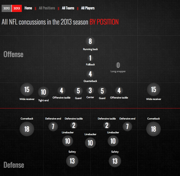
PBS Frontline has published the interactive data visualization, NFL Concussion Watch 2013 to summarize all of the player concussions reported in the NFL.

Every week in the National Football League, a player is sidelined by a head injury. In some cases, their symptoms are clearly visible and they exit the game. Other times, less obvious warning signs can mean a missed diagnosis and a return to the field. Either way, research indicates that the long-term health effects of such injuries — including memory loss, depression and even dementia — can pose problems for players long after retirement.

Concussion Watch is an effort to monitor the NFL’s response to the persistent risk of head injury in professional football. To do so, FRONTLINE will track which players are being removed from games after a hit to the head — and which players are not — and keep score of how long they are kept from the field following a concussion.

I really like the idea of this data visualization, but they messed up the visuals.  The circle sizes are supposed to change relative to the values, but they’re not correct.  The designer chose to make the circles for 1-3 too large in order to fit the numbers inside the circles, and 4-5 are larger but the same size.  The choice of aesthetics over accuracy is a common mistake, and creates a false visual to the readers.  It’s the wrong choice.  Accuracy of the data visualization is more important than any other part of the design.

In visualizations, the design is supposed to visually compare values to create context and understand for the readers.  Because some of these circles are larger than their actual values, this creates the impression that most of the football positions have similar risk, instead of clearly highlighting how less risky some positions truly are.

I do like the design layout that places the circles into their correct player positions.  Readers can grasp this layout in a fraction of a second, and understand where the riskiest positions are.

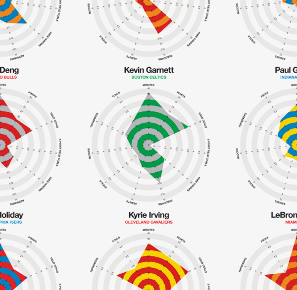
Thanks to Melanie for sending in the link!

Tuesday
Sep102013

Our World Ski Calendar – Seasonal Ski Resorts around the World 

Our World Ski Calendar – Seasonal Ski Resorts around the World infographic

Avid Skier? Want to know where to go at anytime during the year? Our World Ski Calendar – Seasonal Ski Resorts around the World infographic from Monarch has all the financial and event information that you need to know to plan a ski trip during any month out of the year!

To celebrate our new ski flights we produced a world ski calendar so you can ski all year round across the world. For each destination we have provided some interesting stats plus individual piste information. Let us know your favourite ski destination by commenting below!

Thanks to Sam for sending in the link!

Tuesday
Aug062013

How Big Are The Biggest Waves Ever Surfed?

How Big Are The Biggest Waves Ever Surfed? infographic

By using a well recognizable symbol like the Statue of Liberty, the How Big Are The Biggest Waves Ever Surfed? infographic from San Diego Surfing School can show you how much higher you can get with surfing than other sports.

Now that a 100-foot wave has been surfed, the bar has been raised yet again for somebody to step up and set a new record. Until then, we take a look at some other feats of record height to get a better perspective on just how big the biggest waves ever surfed really were.

Clear design that tells one story really well.  The visual comparison to the Statue of Liberty is instantly recognizable to readers.

Thanks to Melissa for sending in the link!

Monday
Jun032013

The History of NFL Logo Designs

The History of NFL Logo Designs infographic

Football is extremely popular in the United States. People pick sides and cheer on their teams loyaly.  The History of NFL Logo Designs infographic posted on Visual.ly tells the story of each football team’s logo through the years.

In Infographics below we are going to show you some of the interesting logo design changes across the (NFL) community with their territory maps.

Cool design that shows visual evolution of various NFL logos.

Thanks to Rachael for sending in the link!

Thursday
Feb282013

Ski Holidays 2013

Ski Holidays 2013 infographic

If you like to ski, this is the infographic for you. Ski Holidays 2013 infographic from Home Away UK tells you where to find the best snow for skiing in Europe. Then as an added bonus, a few tips and facts to educate the reader about ski flags and types of snow.

Winter is here and the snow is starting to fall across the ski resorts of Europe and North America. Now is the time to start planning your next ski holiday, but before you do check out HomeAway’s fun guide to the slopes of Europe. We have also put together some interesting ski tips and advice including information provided by ski experts Nicola Iseard (Editor of Fall-Line Magazine) and Fraser Wilkin (Founder of Weathertoski.co.uk).

The information is well organized and the I like the simple, line-art illustrations.  By keeping the illustrations simple, they don’t pull attention away from the data.

Designed by This Is Visual, they provided a URL link to the data sources in the infographic instead of listing them out.  You can see the data sources at http://bit.ly/SpNJ1v, and the list extensive so I understand why they listed them separately.

The infographic should include both a copyright statement and the URL to the infographic landing page so readers can find the original when they see this infographic posted on other sites.

Thanks to Russell for sending in the link!


Friday
Feb152013

2013 NBA All-Stars Player Stats

2013 NBA All-Stars Player Stats infographic

Rami Moghadam has just published two infographic posters detailing the stats for each of the players on the NBA All-Star teams.  2013 NBA All-Stars East and 2013 NBA All-Stars West both use radar charts to highlight each player’s strongest areas.

2013 NBA All-Stars Player Stats infographic

The individual radar charts are color-coded for each player’s regular team.  In the radar charts, you have to look at each stat to determine which direction is a favorable number.  A high number of turnovers isn’t a good thing, so I might suggest reversing the direction of some of the negative stats like fouls and turnovers.

2013 NBA All-Stars Player Stats closeup infographic

Good job Rami, and thanks for sending in the link!

Wednesday
Jan022013

Comparing NFL Stadium Screens

Comparing NFL Stadium Screens infographic

This visual comparison of NFL Video Screens was uploaded by reddit user dbeat after the announcement of the new video display being built for the Houston Texans’ Reliant Stadium.

I would have liked to see a link to the data behind all of the screen sizes, but this visual representation does a great job of telling one story really well.  The readers can easily find their favorite team, and understand how they stack up.

Found on FlowingData and Deadspin

Friday
Nov162012

Choosing the Right Line - The Science of Corners

Choosing the Right Line- The Science of Corners infographic

Choosing the Right Line- The Science of Corners infographic is a design about Motocross.  Motocrossgear.com takes the science of successfully navigating corners in motocross racing and brings it to the infographic world. 

Since the beginning of racing, riders have been faced with many choices on the track. The fastest rider is often the one who chooses the best lines on the track. Many factors exist when deciding which line to take through a corner. Use this visual guide to help you pick the fastest line.

Not a design based on a lot of data, this visual explanation relies more on diagrams to communicate the message.  In general, I really like the design style that reinforces the feel of motorcross, but in my opinion this could be a better design with less text.

Thanks to John for sending in the link!