Map of Online Communities
Wednesday, July 23, 2008 at 6:50PM
Randy in Digg, Wikipedia, design, experience, internet, map, relative, twitter, visual, web
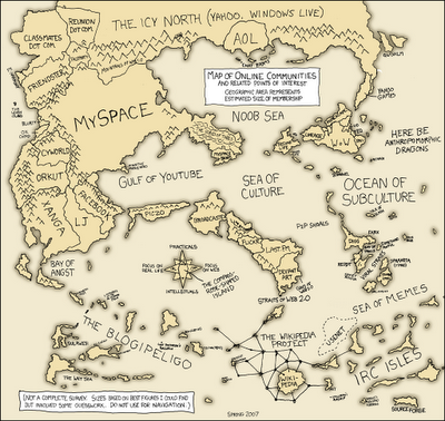
Greetings from the Blogipeligo!
A fun infographic from xkcd.com that uses a map image to communicate the relative sizes of the different types of online communities. I was impressed that I at least recognized most of them, and actually participate in some of them.
Article originally appeared on Cool Infographics (http://coolinfographics.squarespace.com/).
See website for complete article licensing information.