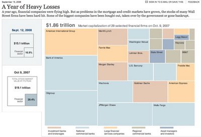
Over at Nytimes.com, they have a good treemap showing the drop in market capitalization over the past year of most of the big financial firms on Wall Street. It's a little bit interactive, in that when you hover your mouse over any box, you will see more details.
Found on infosthetics.com