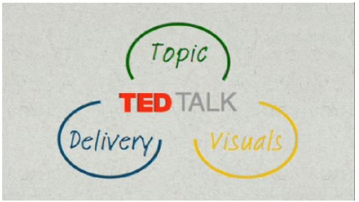
Very funny video from TEDActive, by Sebastian Wernicke that analyses the best and worst of TEDTalks using statistics and word analysis.
In a brilliantly tongue-in-cheek analysis, Sebastian Wernicke turns the tools of statistical analysis on TEDTalks, to come up with a metric for creating “the optimum TEDTalk” based on user ratings. How do you rate it? “Jaw-dropping”? “Unconvincing”? Or just plain “Funny”?
Found on ILoveCharts.tumblr.com

 Randy
Randy