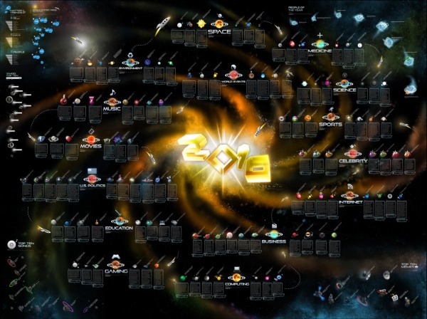
OnlineSchools.org has released the 2010 Year in Review zoomable infographic summarizing the major events of 2010. The zoomable version is below, and it’s best viewed in full-screen million.
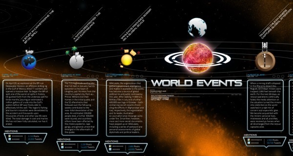
I have mixed feelings about this one. Using the outer space metaphor, there are 15 major news categories with text descriptions of a handful of events in each. Each event has a small celestial body illustration related to it, and a measure of blog posts and tweets on Twitter related to the event.
It really does need the zoomable feature, because the font sizes are dramatically different between the titles and the text. That does make it difficult to read sometimes. I noticed the Star Trek font used as well as part of the sections.
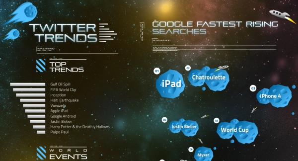
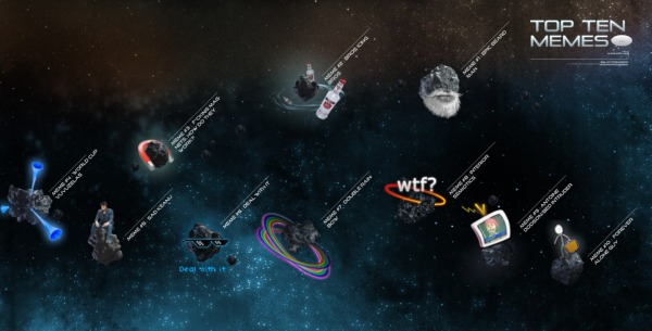
In the corners are some visualizations of things like Top Memes, Top Songs, Twitter Trends, Yahoo Searches and Google’s Fastest Rising Searches.
I think this one is missing good sources for where their information came from, a designer listing, some of the text s too small and in some cases is more illustration then infographic. Overall it’s fun to zoom around and appreciate the details they’ve included.
Thanks Brittany!


