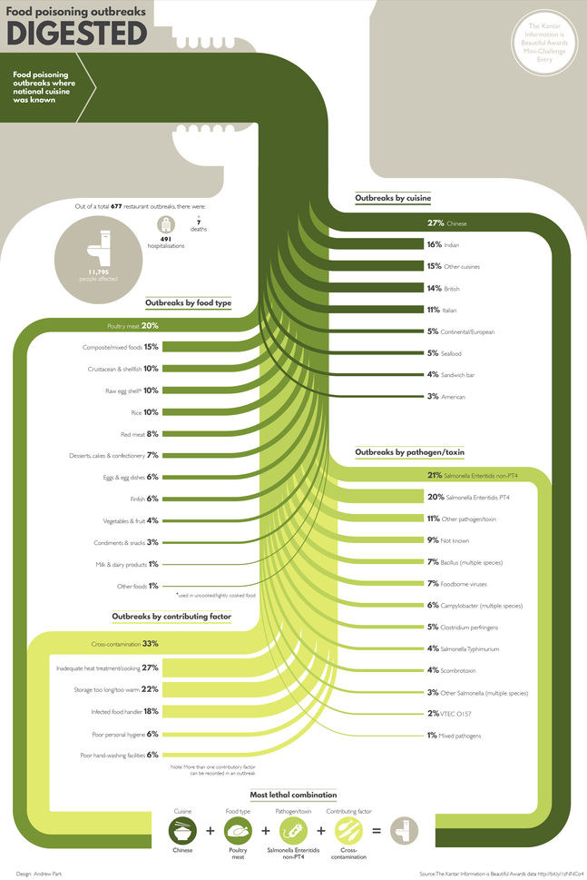
The Food Poisoning Outbreaks Digested infographic is the static graphic winner for the Food Poisoning challenge put on by Kantar Information is Beautiful Awards. Designed by Andrew Park, the infographic ranks the number of food outbreaks within different categories like specific cuisine or the toxin/pathogen.
Using a Sankey diagram, the visualisation charts the percentage breakdown for food poisoning outbreaks by national cuisine, food type, pathogen/toxin and contributing factor where the cuisine type was known.
The diagram concludes with the “most lethal combination”, highlighting the top factors that led to an outbreak.
I thought it would add context to frame the Sankey diagram in a human body, as though it was being eaten and spreading through the body like a disease.
I really like this approach to a Sankey Diagram that breaks the original total into four different categories of data.
