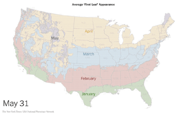
Spring is coming! Jeremy White at the NY Times has animated data from the USA National Phenology Network showing the average dates of "first leaf" across the U.S.
In some cases, an animated data visualziation is better at communicating the data to the audience than a static design. This animation clearly shows the progression of Spring across the country and you can understand the data within seconds.