About
Randy Krum
President of InfoNewt.
Data Visualization and Infographic Design

Infographic Design

Infographics Design | Presentations
Consulting | Data Visualizations

DFW DataViz Meetup

Join the DFW Data Visualization and Infographics Meetup Group if you're in the Dallas/Fort Worth area!

Search the Cool Infographics site

Custom Search

Subscriptions:


Feedburner

The Cool Infographics® Gallery:

How to add the
Cool Infographics button to your:

Cool Infographics iOS icon

- iPhone
- iPad
- iPod Touch


Read on Flipboard for iPad and iPhone

Featured in the Tech & Science category

Flipboard icon

Twitter Feed
From the Bookstore

Caffeine Poster

The Caffeine Poster infographic

Entries in beer (19)

Monday
Sep062010

Colorado: The Beer Me State! (infographic)


From Spork Marketing (great company name!) comes the Colorado: The Beer Me State infographic.  Light on the “info” and heavy on the “graphic”, the use of illustrations helps provide context for each of the facts about beer in Colorado.

Personally, I would have added more data visualizations for the altitude of Denver, number of breweries, average beer consumption and how much beer production there is.  That’s just me.

Thanks for the link Jason!  You had me at “beer”…

Friday
May212010

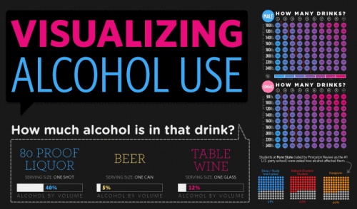
Visualizing Alcohol Use

From phlebotomist.net (a website all about blood!), the highly-colorful Visualizing Alcohol Use infographic explores the effect of alcohol 

How much alcohol can your bloodstream handle? Take a look at the graphic to check out everything from blood alcohol averages to the highest blood alcohol content ever survived (you won’t want to try this at home).

There’s no designer credited, but if this wasn’t designed by EJ Fox (@pseudoplacebo) then it was heavily influenced by his work.

Thanks to Cate for the link!

Friday
Dec112009

Send your own Augmented Reality Christmas Cards!


Merry Christmas from Cool Infographics!

What better way to share your Christmas wishes than with augmented reality?!?  You can send your own AR Christmas cards courtesy of arwishes.com.  You can choose from an assortment of animated images that will appear on screen when you friends and family hold up your Christmas card in front of their computer's webcam.


The cards are printed with the marker, disguised as a holiday image.  In this case, the marker is obviously the Christmas Tree.

A number of companies did this last year, sending out cards with an AR marker printed as part of the card, and a number of them are still online.  You can also print out a card from the sites to see the image yourself.  There will probably be a few more this holiday season as well, but here are some videos from last year's AR cards and links to sites if you want to experience them yourself.

Specialmoves.com:


Special Moves Augmented Reality Xmas Card from Iain Tait on Vimeo.

TellArt:


Tellart 2008 Holiday Card from Tellart on Vimeo.

Stella Artois:

Total Immersion:

There's even a video of sending your own AR Christmas Cookies!

Monday
Aug312009

Best Beer in America: 2009 Update!


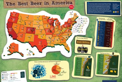
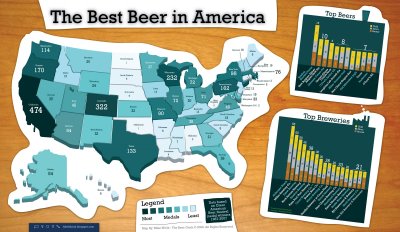
Our friend, Mike Wirth, has released the 2009 Great American Beer Festival Medal Map, but it's much easier to call it the Best Beer in America Map!

Mike uses the data of the Great American Beer Festival medal winners from 1987-2008, and this year he has added some new infographics to help support the map.  If you live in Oklahoma or North Dakota, I hope you're drinking out-of-state beer!  I'm just saying.

I posted about his original poster here.  The infographic was published on the Lyke2Drink blog, and on Mike's own website.

Nice work Mike!

Thursday
Aug272009

Beer Comparison: Porter vs. Stout (100% more infographic)


For those of us that enjoy dark beer, it may come as a surprise that there really is a technical difference between a porter and a stout beer.  The guys over of GeekBeer.com have attempted to explain it, along with this great infographic by Ethan John.  Ethan was kind enough to put the images up on his Flickr Photostream.


Great job Ethan!

Friday
Apr242009

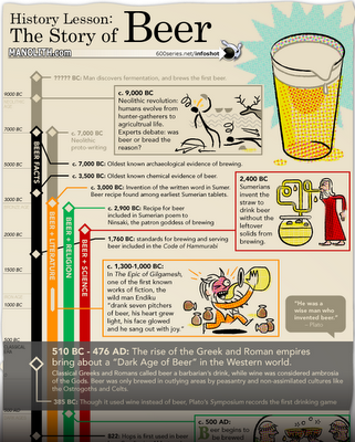
The History of Beer infographic


The History of Beer was published on Manolith.com.  I like the twist on a timeline infographic.  First, it's vertical instead of horizontal.  Then, it's actually four timelines in one highlighting different events in Science, Religion, Literature and Facts using the four colored tracks.

Design and layout by 600 Series Design, illustrations by Dan Zettwoch.

Check out some of the original sketches and story on Dan's blog.

Wednesday
Apr222009

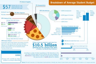
How do College Students Spend Money?


 I certainly don't remember having 40% of my budget as "discretionary" when I was in college!

This is from the Westwood College website, but I don't see a specific creator listed.

Friday
Apr172009

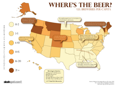
Where's The Beer? (U.S. Breweries per Capita)


Found on SloshSpot.com, a U.S. map showing breweries per capita by state.  Drink up!

Friday
Jan302009

The Best Beer in America


Mike Wirth, The Beer Geek, created this map of award winning beers using 20 years of data of the Great American Beer Festival medal winners from 1987-2007. Originally created for the Lyke 2 Drink blog, it also shows the breweries with the most medals and the specific beers with the most awards.

Great work Mike!

UPDATE: Mike has put up an updated version of the Best Beer in America map.

Page 1 2