About
Randy Krum
President of InfoNewt.
Data Visualization and Infographic Design

Infographic Design

Infographics Design | Presentations
Consulting | Data Visualizations

DFW DataViz Meetup

Join the DFW Data Visualization and Infographics Meetup Group if you're in the Dallas/Fort Worth area!

Search the Cool Infographics site

Custom Search

Subscriptions:


Feedburner

The Cool Infographics® Gallery:

How to add the
Cool Infographics button to your:

Cool Infographics iOS icon

- iPhone
- iPad
- iPod Touch


Read on Flipboard for iPad and iPhone

Featured in the Tech & Science category

Flipboard icon

Twitter Feed
From the Bookstore

Caffeine Poster

The Caffeine Poster infographic

Entries in Wikipedia (11)

Friday
Nov202015

Histography

Histography

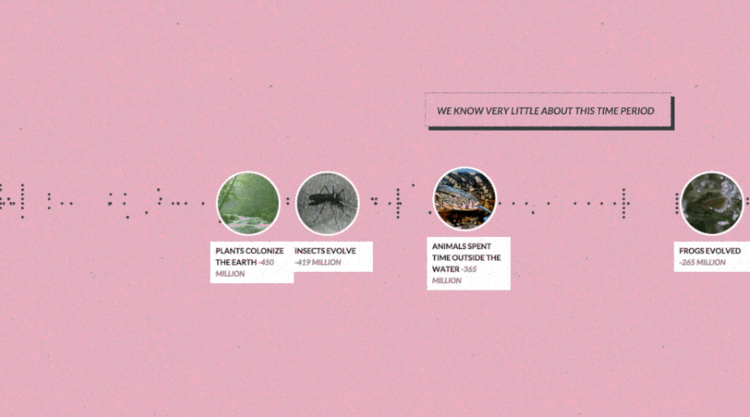
Histography is a timeline created by Matan Stauber that visualizes every moment in history from Wikipedia as a steel ball. You can navigate the timeline by using a slider to determine what time period you would like to see. Then simply place the courser over a ball to read an event! It is very easy to navigate and tons of fun. Go to Histography to visit the full imteractive site.

Below is an article from Fast Co Design that explains the process in detail.

If every moment in human history was a single steel ball, Histography is like an 4-D Newton's Cradle, visualizing how all of these events bump up and knock up against each other on a 14-billion-year time frame. It's beautifully hypnotic—and impressively, it's all sourced from Wikipedia, which means that it keeps on updating itself.

Created by Matan Stauber, Histography is an interactive timeline spanning the Big Bang to whatever was in the news yesterday. It basically draws all historical events from Wikipedia, visualizing each as a black dot. You can click on each dot to get more information about the event it represents. These dots are then ordered chronologically from left to right, with simultaneous events being stacked vertically on top of each other. The result is that the Histography looks something like a pointillist sound wave, growing and shrinking according to how noisy a year, era, or epoch was.

There's a number of different ways you can browse Histography. The default view shows every historical event from Wikipedia's database at once, which you can then filter down by category: for example, by literature, politics, assassinations, and so on. But I think the 'Editorial Stories' view (accessible by clicking the Histography logo) is more interesting. It represents Wikipedia's database as a nearly endless spiral, which you can descend through scrolling, zooming right down to the Big Bang.

Found on FastCo Design

Monday
May072012

How Has Internet Changed Education?

How Has Internet Changed Education? infographic

How has internet changed education infographic from SEO.com explores what kind of impact the Internet has on education. Ever had a question and found yourself on wikipedia? Apparently your not the only one!

If you want evidence of the way the internet is pervading every aspect of our lives, you need look no further than its effect on education. The internet and social media have dramatically changed both teaching and learning.

In fact, most students’ (an incredible 93 percent) first instinct when confronted with a research problem is to turn to Google or Bing to get information rather than going to the library, and despite the best efforts of faculty to discourage its use, Wikipedia is the research resource that is used most often. It’s not only students that are turning to the web, however. A whopping 90 percent of faculty uses social media in the courses they’re teaching, and 8 in 10 have used online video in class. In addition, colleges and universities are reaching out to students in a way they never could before—85 percent of admissions offices use some sort of social media, from video blogging to social networking.

Great clean design.  Easy to read and the visualizations are easy to understand.  The only visual I had an issue with was the grid of icon people.  It’s hard for readers to grasp quantity when the rows aren’t 10 people across, but 33 people across is a very odd number.  33x17=561, 561x10,000=5,610,000, which is less than the “Over 6 million” number on the text.

I’m not sure why the 8 out of 10 faculty data point is shown as 6 out of 8 people in the visualization???

The sources are all listed on the original landing page, but because they are in the infographic design, they are lost whenever someone shares the infographic on another site (like this one), and that hurts the credibility of the design.  That’s one more reason the original landing page URL should be included in the design as well.

Found on WiredAcademic

Wednesday
Jul232008

Map of Online Communities

Greetings from the Blogipeligo!

A fun infographic from xkcd.com that uses a map image to communicate the relative sizes of the different types of online communities.  I was impressed that I at least recognized most of them, and actually participate in some of them.

Wednesday
Apr162008

Quake Family Tree

From Wikipedia, the Quake Family Tree shows the history of the Quake computer game engine and all of the other games that were built from each version using a mind map.

Found on digg.com

Tuesday
Apr012008

Visualizing Pi (π)


Cool little GIF animation to visualize the value of Pi (π) from Wikipedia. Click the image to view the animation.

Found on digg.com

Monday
Feb112008

The Timeline of "Cool"


Found on Wikipedia, this is the timeline of what was "Cool" from 1500 A.D. through today. Apparently, the Beatles aren't cool anymore...

Monday
Nov122007

Grokker


It's not new, but Grokker does a good job of searching multiple sites and mapping the data back to the user in visual form.

...a web-based enterprise search management platform that leverages the power of federated content access and visualization to maximize the value of information assets for enterprises, content publishers, libraries and other research-intensive organizations.

Friday
Oct262007

Science Related Wikipedian Activity


A new visualization from the same group that did the earlier visualization of Wikipedia revision activity. This one focused on science and tech related articles. The mystery is the significance of the blue/green band that crosses the map.

Monday
Oct222007

Wikipedia Activity Visualization


From A Beautiful WWW, this image is a pretty good attempt to visualize the article revision activity on Wikipedia. An article explaining the visualization is here, but the image is a combination of images are from the most linked-to articles, and the size of the colored dots represent the amount of revision activity in the linked articles.

A really cool interactive version was made using the Google Maps API so you can zoom in and move around the graphic.

Sunday
Sep022007

World Population Density


This is a prime example of how seeing the data visually is better than reading numbers. Here is a population density map from Wikipedia.

We have heard that China and India have most of the human population in the world, but here you can really see and understand how much. Reading that China's population is four times that of the U.S. is much harder than really seeing it on a map.

The Wikipedia page on World Population has some other great information too.