About
Randy Krum
President of InfoNewt.
Data Visualization and Infographic Design

Infographic Design

Infographics Design | Presentations
Consulting | Data Visualizations

DFW DataViz Meetup

Join the DFW Data Visualization and Infographics Meetup Group if you're in the Dallas/Fort Worth area!

Search the Cool Infographics site

Custom Search

Subscriptions:


Feedburner

The Cool Infographics® Gallery:

How to add the
Cool Infographics button to your:

Cool Infographics iOS icon

- iPhone
- iPad
- iPod Touch


Read on Flipboard for iPad and iPhone

Featured in the Tech & Science category

Flipboard icon

Twitter Feed
From the Bookstore

Caffeine Poster

The Caffeine Poster infographic

Entries in students (6)

Tuesday
Feb182014

Education is Gold - 2014 Sochi Winter Olympics

Education is Gold - 2014 Sochi Winter Olympics infographic

The Olympics are in full swing. But how much does an athlete’s success depend on their education? In the Education is Gold - 2014 Sochi Winter Olympics infographic from College Atlas, they analyze the educational backgrounds of Olympic athletes.

The much-anticipated Sochi Winter Olympics Games are here, and soon the entire nation will be glued to their TVs cheering on Shaun White, Mikaela Shiffrin and the rest of Team USA. While watching these athletes compete is entertaining in and of itself, knowing the academics behind the games can be just as fascinating.

In this infographic, we analyze the educational backgrounds of the top medal-producing countries and our favorite Team USA athletes. We also outline the physics behind some of the most popular Winter Olympic sports.
 

Thanks to Alyssa for sending in the link!

Thursday
Aug232012

The Rising Cost of Higher Education

The Rising Cost of Higher Education infographic

The Rising Cost of Higher Education from SchoolTutoring Academy does a good job visually showing the reader how quickly the price of college educations have risen.

Attending a college or university represents a significant investment for families. Tuition fees have continued to rise which has made it increasingly difficult for families to accurately budget and save. This problem is exacerbated for low and middle-income families where tuition fees as a percentage of median family income has increased significantly. Learn how affordable tutoring can help your child.

The design gets to the point immediately.  If the reader only looks at the top portion of the infographic (without scrolling down) they still walk away understanding the key message of how dramatically college costs have risen as a percentage of the median family income.  However, I don’t see any indication that the values have been adjusted for inflation or not.

I also like the concentric doughnut graphs that are used with consistent colors to show the same 8-year comparison for different income level families.  The line chart comparison of annual costs is also clear and easy to understand.

The lower portion of the design becomes too text heavy, and begins to show data values in text without visualizing them.  This is where the design will start to lose readers by trying to convey too much text information.  What is the icon in the description of Private Loans?

The bottom of the design is missing a copyright (or Creative Commons) license and should also include the URL to the infographic landing page where readers can find the original, high-resolution version.

Monday
May072012

How Has Internet Changed Education?

How Has Internet Changed Education? infographic

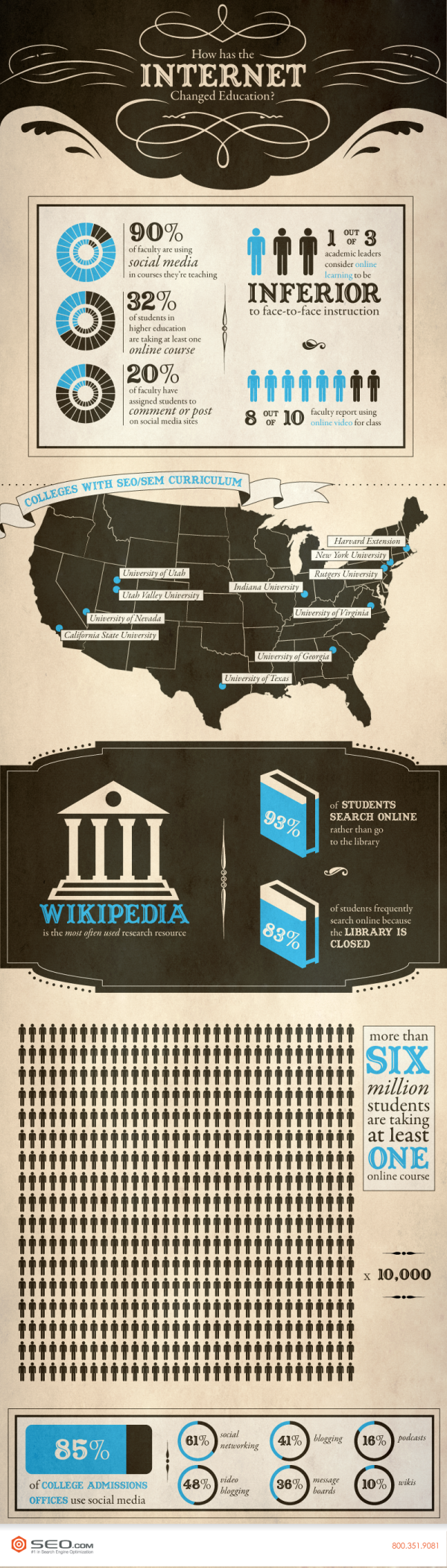
How has internet changed education infographic from SEO.com explores what kind of impact the Internet has on education. Ever had a question and found yourself on wikipedia? Apparently your not the only one!

If you want evidence of the way the internet is pervading every aspect of our lives, you need look no further than its effect on education. The internet and social media have dramatically changed both teaching and learning.

In fact, most students’ (an incredible 93 percent) first instinct when confronted with a research problem is to turn to Google or Bing to get information rather than going to the library, and despite the best efforts of faculty to discourage its use, Wikipedia is the research resource that is used most often. It’s not only students that are turning to the web, however. A whopping 90 percent of faculty uses social media in the courses they’re teaching, and 8 in 10 have used online video in class. In addition, colleges and universities are reaching out to students in a way they never could before—85 percent of admissions offices use some sort of social media, from video blogging to social networking.

Great clean design.  Easy to read and the visualizations are easy to understand.  The only visual I had an issue with was the grid of icon people.  It’s hard for readers to grasp quantity when the rows aren’t 10 people across, but 33 people across is a very odd number.  33x17=561, 561x10,000=5,610,000, which is less than the “Over 6 million” number on the text.

I’m not sure why the 8 out of 10 faculty data point is shown as 6 out of 8 people in the visualization???

The sources are all listed on the original landing page, but because they are in the infographic design, they are lost whenever someone shares the infographic on another site (like this one), and that hurts the credibility of the design.  That’s one more reason the original landing page URL should be included in the design as well.

Found on WiredAcademic

Tuesday
Sep132011

The Flipped Classroom infographic


From Knewton comes and infographic about The Flipped Classrom.  It’s a good explanation of one theory behind changing the classroom environment.  I don’t know how widespread it is, but the results from Detroit look impressive.

Many educators are experimenting with the idea of a flipped classroom model.  So what is it and why is everyone talking about it?  The flipped classroom inverts traditional teaching methods, delivering instruction online outside of class and moving “homework” into the classroom.

Thanks to Krista for sending in the link!


Monday
Aug292011

Students vs. Prisoners infographic


Nice, clean, simple infographic design.  Students vs. Prisoners by the law firm Buckfire & Buckfire in Michigan visually communicates one message really well: In Michigan, the average spending per prisoner is close to three times that spent per student.

Potentially a controversal budget topic in Michigan, I appreaciate that they clearly listed the link to the data source.  A couple things I would change about this design:

  • Visualize the total spending dollars that are currently listed at the the bottom in text
  • I like the use of a chalkboard style font, but it’s not used consistently throughout the design
  • For the benefits listed in the middle, I think it would be more interesting to show how much each one contributed to the total spending per prisoner

Thanks to Larry for sending me the link!

Wednesday
May112011

Student Bullying infographic

Student Bullying
[Source: Buckfire and Buckfire.com]

From Buckfire & Buckfire in Michigan, comes an infographic about Student Bullying in the U.S.

Student bullying in schools in the United States is a serious issue and very prevalent in our school systems today. The statistics show that a student is bullied every seven minutes in our country and that most bullying occurs on playgrounds. The effects of bullying are profound and have a major psychological impact on the bullied student and often causes learning problems in the classroom.

The majority of states have bullying laws on the books, but most are not significant enough to impact this problem or reduce the amount of bullying that occurs nationwide. Without more stringent laws and the actual enforcement of those laws, school systems will not feel the pressure to take the affirmative measures necessary to eliminate the bullying problem that terrorizes so many innocent and vulnerable children everyday.

The lawyers at our law firm receive calls from concerned parents every week about their children who are being bullied in Michigan schools. We are actively pursuing lawsuits in several cases. We created the infographic below to display the facts and statistics about student bullying.

I really like the statistics shared in this one, although they should have visualized more of the numbers.  A value like 160,000 students miss school every day out of fear could be put into context if they had visualized it in comparison to total students or something like that.  

I really like the fact that since they get so many calls from parents, that they chose an infographic to reach out to their customers to share some of the facts.  This is a great example of using an infographic to provide valuable information to parents and teachers everywhere.  People will share it because it’s good content, and some may eventually become new customers.

Thanks to Kathryn for the link!