About
Randy Krum
President of InfoNewt.
Data Visualization and Infographic Design

Infographic Design

Infographics Design | Presentations
Consulting | Data Visualizations

DFW DataViz Meetup

Join the DFW Data Visualization and Infographics Meetup Group if you're in the Dallas/Fort Worth area!

Search the Cool Infographics site

Custom Search

Subscriptions:


Feedburner

The Cool Infographics® Gallery:

How to add the
Cool Infographics button to your:

Cool Infographics iOS icon

- iPhone
- iPad
- iPod Touch


Read on Flipboard for iPad and iPhone

Featured in the Tech & Science category

Flipboard icon

Twitter Feed
From the Bookstore

Caffeine Poster

The Caffeine Poster infographic

Entries in olympics (6)

Wednesday
Aug172016

The Fastest Men in the Olympics Since 1896

The Fastest Men in the Olympics Since 1896

To put Usain Bolt's 3rd consecutive Olympic Gold Medal for the 100m dash into perspective, the NY Times designed this great graphic showing Usain Bolt and the Fastest Men in the World Since 1896 – on the Same Track.

Usain Bolt’s historic third consecutive gold medal in the men’s 100-meter dash cemented his status as history’s greatest sprinter and the world’s fastest man. He edged out Justin Gatlin, an American, and Andre De Grasse, a Canadian, on his way to the gold.

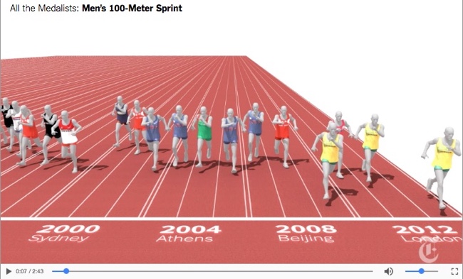
But how does Bolt compare to the full Olympic field in the 100-meter dash – not just this year, but against every Olympic medalist since 1896? To answer that question, we created a massive (and imaginary) track with 88 lanes – one for every medal awarded in the 100-meter dash in the modern Olympics.

We then pitted these runners against each other in an imaginary race, using their average speeds. We froze all the runners at the moment the winner crossed the finish line.

This is an update to the same graphic they created in 2012 when he broke his own World Record. The 2012 piece also included this great infographic video explaining the significance of his win:

Found on FlowingData

Tuesday
Feb182014

Education is Gold - 2014 Sochi Winter Olympics

Education is Gold - 2014 Sochi Winter Olympics infographic

The Olympics are in full swing. But how much does an athlete’s success depend on their education? In the Education is Gold - 2014 Sochi Winter Olympics infographic from College Atlas, they analyze the educational backgrounds of Olympic athletes.

The much-anticipated Sochi Winter Olympics Games are here, and soon the entire nation will be glued to their TVs cheering on Shaun White, Mikaela Shiffrin and the rest of Team USA. While watching these athletes compete is entertaining in and of itself, knowing the academics behind the games can be just as fascinating.

In this infographic, we analyze the educational backgrounds of the top medal-producing countries and our favorite Team USA athletes. We also outline the physics behind some of the most popular Winter Olympic sports.
 

Thanks to Alyssa for sending in the link!

Wednesday
Aug152012

Which Countries were Successful at the Olympics?

Which Countries were Successful at the Olympics? infographic

A personal infographic design project by Paulo Estriga, Which Countries were really the Most Successful in London 2012? compares the Top 10 medal winning countries with a normalized set of data showing the number of medals per one million people in the population of each country.

The official standings are reached by counting the number of gold medals obtained by each country, using silver and gold [bronze? - Randy] medals to break ties.  By this method, the USA was the most successful country, followed by China in second and Great Britain in third.

However, most of these countries have many millions of people to pick from, which naturally generates a large number of quality athletes making it to the Olympics.  What happens when we take population numbers into account?  Which are really the most successful countries in getting the most gold medals out of the fewest people?

This design is clear, easy-to-read, and does a great job of showing how normalizing the data with population gives you a very different result.  He clearly cited his sources, included a copyright statement and the URL to his site.  I would have preferred the URL to be directly to the infographic.

Paulo’s structure of the overall infographic is a great example of the 3-part story format!  The introduction visualizes the traditional way of measuring countries based on their gold medal counts, by showing medal icons.  The Main Event is the visualization of the new, normalized for population chart that shows something new and unexpected to the reader.  Finally, a conclusion wraps up the design describing where the traditional Top 10 countries fall in the new ranking.

Outstanding job Paulo!

Wednesday
Aug012012

VISA London Economic Outlook

VISA London Economic Outlook infographic

VISA was smart and jumped on the London band wagon.  Designed by Bright Blue Day, the VISA London Economic Outlook infographic from Visa Europe shows a summary of the Olympics impact report.

The London 2012 Olympic and Paralympic Games will deliver an £804m consumer spending injection for the UK this summer and an economic legacy worth £5.33bn by 2015, according to Visa’s report, “Realising a Golden Opportunity: Visa Europe’s London 2012 Olympic and Paralympic Games Expenditure and Economic Impact Report”.

The report looks at the consumer expenditure and economic output related to the Games and its distribution across the country. It is based on Visa’s unique insight into consumer spending in the UK and spending data from previous Games and major sporting events.

We have also produced a unique infographic providing an easily-digested visual summary of the report’s findings.

This is a great use of an infographic as an executive summary of a much larger report.  This builds awareness, interest and traffic to a report that VISA Europe obviously spent a lot of money to sponsor.

A few thoughts about the infographic design:

  • The call-out circles surrounding the map of the UK should be sized to match their values.
  • The doughnut charts don’t work for the Distribution of Economic Activity.  The percentages are too close together, so all of the doughnuts look almost the same.  I think a pair of bars for each location, but keeping the scale consistent across all locations would have worked much better.
  • I love the icons for the business sectors
  • The color scheme is fantastic!  Simple, directly tied to VISA and makes the overall design bold without being gaudy.
  • The monument silhouettes from London are easily recognizable, and work nicely in the background without drawing too much attention.
  • The bottom should have a clear copyright, and the direct URL link to the original infographic landing page.

They also created a short infographic video based on the static infographic:


The infographic is available as a high-resolution JPG image file or a high-resolution PDF.

The designer at Bright Blue Day was Ollie Flippence.  Great job Ollie!  Thanks for sending in the link!

Monday
Jul302012

Olympic Swimming 2012: Faster, Better, Stronger

Olympic Swimming 2012: Faster, Better, Stronger infographic

CREAX created this infographic for their June 2012 newsletter. Every day, they analyse tens of thousands of patents and look for clues of “the next breakthrough innovation” in all kinds of industries.  In their Olympic Swimming 2012: Faster, Better, Stronger infographic, they combined their knowledge of innovation with the upcoming olympics.  The infographic links the performances of swimmers with technology in swimming gear, pools and venues for the last 10 Olympics, and their predictions for the future.

At CREAX we are always fishing for the latest technological evolutions. Infected with Olympic fever, we wanted to investigate the link between technological evolutions and athletic performance. We had a closer look at swimming in the Olympic games since 1972. We took a deep dive into scientific literature, patents, Youtube movies and old school pictures of macho men in speedos and designed the Next Generation of Swim Equipment!

This design had a number of really cool data visualization styles that are nicely customized to the data they represent.  Just remember that the 2012 data is their suggestion, not the actual data from the current Olympics!

  • I like that each visualization matches the timeline across the top for consistency, and the monument silhouettes are great for each location.
  • The timeline of swimming pool lanes is great, as the overal width changed over the years.
  • I liked the depth of the swimming pool as an inverted bar chart, but the small icons of Speedo swimsuits are totally unnecessary and detract from the data.
  • Love the isotype hair styles
  • I like actually seeing designs of the swim suit styles, and I guess the flags are for the gold medal winner for each Olympics?

Overall, a good design.  The text blocks are too small to be full-justified.  A copyright statement and the URL to the high-resolution original infographic should be included at the bottom.

Thanks to Frederik for sending in the link!

Thursday
Jul262012

2012 London Olympic Venues

2012 London Olympic Venues infographic

The 2012 London Olympic Venues from Cottonwood Financial’s CashStore.com site is an interactive infographic design showing facts and information about each of the main event locations in London.

The 2012 London Olympics are rapidly approaching, and they’re set to become the most expensive games yet with a budget of $14.5 billion. So what can Olympic attendees expect this year? Impressive landmarks, state of the art facilities, millions of sports fans and of course the best athletes in the world competing for the title of Olympic Champion.

Click the venues for more information on the events and ticket prices (figures in U.S. dollars and British pounds) for each one.

I really like the interactivity, but I think they used way too much text.  All of the statistics (like seating capacity and ticket prices) should have been visualized to make it easy for the reader to see.  Event icons and the Olympics are always tied together, so lining up this year’s icon designs instead of the text event names would have been more visually appealing as well.

The reader clicks on each of the venues to bring up different information, but the building illustration is the only indicator showing which venue the information is referring .  A connecting line or a highlight color to indicate which building is currently being displayed would have helped out tremendously.

It’s all designed in HTML5 too, so all of the interactivity works on mobile devices (like the iPad) as well!  Very cool!

I’m very jealous if you’re going to any of these events, but this guide could give you some idea of what to expect when you get there.

Thanks to Joe for sending in the link!