About
Randy Krum
President of InfoNewt.
Data Visualization and Infographic Design

Infographic Design

Infographics Design | Presentations
Consulting | Data Visualizations

DFW DataViz Meetup

Join the DFW Data Visualization and Infographics Meetup Group if you're in the Dallas/Fort Worth area!

Search the Cool Infographics site

Custom Search

Subscriptions:


Feedburner

The Cool Infographics® Gallery:

How to add the
Cool Infographics button to your:

Cool Infographics iOS icon

- iPhone
- iPad
- iPod Touch


Read on Flipboard for iPad and iPhone

Featured in the Tech & Science category

Flipboard icon

Twitter Feed
From the Bookstore

Caffeine Poster

The Caffeine Poster infographic

Entries in travel (66)

Thursday
Dec012016

Thanksgiving Flight Patterns

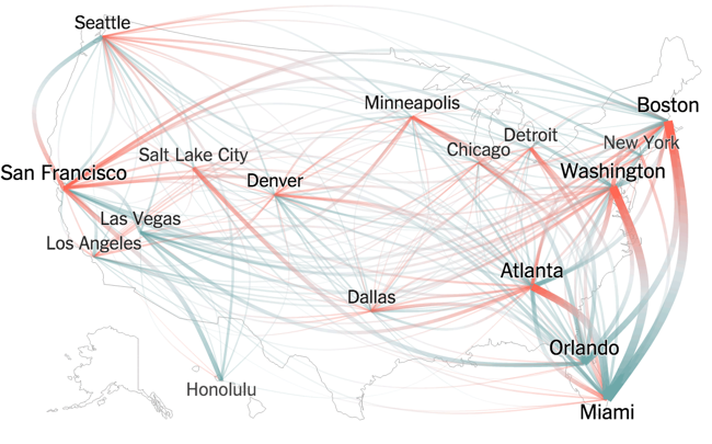
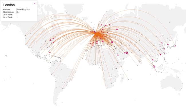
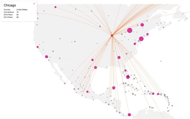
Thanksgiving Flight Patterns is a cool animated, interactive data visualization from the NY Times TheUpshot that looks at where people traveled to for the Thanksgiving holiday last week. On the interactive version on the NY Times site, you can hover over any included city to see only those connections. There was a huge surge of people headed to Florida!

Thanksgiving is known as a time to return home to family, with the holiday calling to mind images of grandmother’s house. But for many Americans, it’s also now a chance to go on vacation.

This week, Florida will see a surge in the number of people arriving by plane. Las Vegas is another popular destination. Much more than is commonly realized, Thanksgiving is a time to seek out sun (and gambling), in addition to (or possibly instead of) catching up with loved ones.

These conclusions emerge from The Upshot’s analysis of search data from Google Flights. In all, more than 3.6 million Americans — or slightly more than 1 percent of the country’s population — are expected to take a flight for Thanksgiving.

I really like the design choice to change the colors at both ends of each line. It really helps to see the traffic departing a city in comparison to the traffic arriving. 

I think the animation of the dots moving along the flight paths in the interactive version was unnecessary.

Wednesday
Jul132016

Global Connectivity Ranking

Global Connectivity Ranking interactive infographic world London

The Global Connectivity Ranking from Rome2rio includes a beautiful interactive data visualization showing how connected we are on a global scale. Above you can see the direct flight connections from London, the most connected city on Earth.

Just how connected are our cities?  How do we measure such connections?  How do these connections change over time?

To answer these questions, my research team at KPMG collaborated with Rome2rio to produce the Global Connectivity Ranking. We ranked all 1,212 cities on the planet which operate international airports.

The Rome2rio Global Connectivity Ranking reflects the number of international cities that a city is connected to through direct flights. It measures connections from city to city - not airport to airport. For example, the connection count for London reflects how many cities outside the UK that can be reached from any of London's 6 international airports. Rankings were computed using Rome2rio's global transit data from April 2014 and January 2016.

Choose any city on the list to animate to direct flight connections. The size of the bubbles over each city also represent the total number of connections from that city.

The default is the world view, but can also choose to focus on a single continent. Here you can see the connection from Chicago when zoomed in to only North America.

Global Connectivity Ranking interactive infographic North America Chicago


Wednesday
Jun292016

The U.S. MiseryMap of Flight Delays

The U.S. MiseryMap of Flight Delays Map Infographic

Stuck in an airport? The MiseryMap from FlightAware shows a real-time view of flight delays and cancelations at the top 30 airports in the U.S.

Doughnut charts highlight the totals for each major city (combining airports if there are multiple) and hovering or clicking a specific city will show the flight routes (sankey diagram style) that are experiencing delays and cancelations. The full details are shown in the barr chart sidebar.

Pressing the play button will animate the map for the last 48 hours showing the changes to the weather map overlay, and delays in 4-hour increments. The overall size of each doughnut also seems to represent the total number of flights from that city in each 4-hour increment.

The U.S. MiseryMap of Flight Delays Map Infographic DFW

Thanks to Mary Kaye for sharing the link!

Friday
Jun032016

The Global Air Transportation Network

The Transportation Clusters infographic is a force-directed map of the 3,275 global airports and all of the connecting flight routes. Designed by Martin Grandjean, each bubble represents an individual airport and the bubble sizes represents the number of flight routes (37,153 routes in total) based on OpenFlights.org data.

People travel not just more frequently, but increasingly far and quickly. Mapping the connections between all the airports worldwide is a fascinating network visualization exercise.

This post (which may be followed by further experimentations in this area) is an attempt to make explicit the network behind air transport. The structure of the relationships has an impact on the spatial distribution of nodes in a graph. Let’s see how this landscape is reorganized without geographical constraints.

This “map” is the result of the application of a force-directed layout algorithm on a graph of 3.275 airports (37.153 single routes – the weighted total is higher because many airlines take the same route), based on OpenFlights.org data. Naturally, network geography is not completely disrupted: the continents are mostly visible and regions are generally in their original position (with the exception of the Pacific islands that connect Asia and America – imagine this graph in three dimensions, with the Pacific Ocean behind). Major observations: India is more connected to the Middle East than to South and East Asia. The Russian cluster is very visible, connecting airports in Russia but also in many former Soviet republics. Latin america is clearly divided between a South cluster and a Central American cluster very connected with the U.S.

The force-directed layout spaces the bubbles apart so there are no overlapping bubbles. The color coding is a color spectrum based on longitude, and generally groups airports from the same continent together. The total number of flights is much higher than the number of routes because many airlines share the same routes. I would like to see a version that weights the connecting lines with the number of flights that share that same route.

Here you can see the original map with the bubbles accurately located geographically, but a lot of overlap based on close proximity of the airports:

Martin also published a cool animated GIF and YouTube video of the change from geographical to force-directed layout.


Found on FlowingData

Tuesday
May172016

Election Exodus - Moving to Canada?

Election Exodus - Moving to Canada infographic

Frustrated by the U.S. Presidential candidates? Ready to just pack up and move the Canada? The Election Exodus infographic from SpareFoot looks closer at what it would take for Americans to move North to Canada.

Trump or Clinton.

The prospective of either of these presidential frontrunners emerging victorious in November is too much for many Americans to bear.

A shocking number of U.S. citizens would consider a move to Canada—15 percent if Hillary Clinton is elected and 20 percent if Donald Trump is elected, according to recent polls.  (To be fair, we’re willing to bet there would be plenty of supposed defectors under President Sanders or Cruz as well.)

The question remains: How serious are these people? And how hard is it to move to Canada?

The answers to these questions and more lie below:

Designed by NowSourcing, this is a visually busy take on the side-by-side comparison style of infographic. A lot of text, and many of the statistics are not visualized, which makes it harder for readers to understand all of the information.

Thanks to Brian for sending in the link!

Thursday
Oct082015

10 Ways to Fall Asleep on a Plane

10 Ways to Fall Asleep on a Plane infographic

Traveling can be exhausting, especially when you can't catch any sleep on the flight. However, Work the World has come up with not just one, but 10 Ways to Fall Asleep on a Plane! Whether you are traveling for business or for pleasure, you can be assured that your flight will be a restful one.

Trying to fall asleep on a plane can be one of the most frustrating experiences during your travels. After some serious research we decided to put an infographic together detailing the top ten ways to fall asleep on a plane. If you struggle to fall asleep in the air, read on for reassurance that it can be done.

Great informative infographic that uses a classic content marketing strategy of a Top 10 list, even if it's a little text heavy for a graphic. Icons and illustrations make each idea visual, which will help readers remember the information when they actually need it.

The footer properly included a Creative Common license, and detailed sources. The only thing missing is the URL to the infographic landing page so readers can find the original, full-size version on the Work The World site.

There's so much text in this one, I would make the additional recommendation to repeat the text on the infographic landing page below the infographic image itself. By also putting all of the text on the page, the search engines will be able to parse and index all of this good text data.

Found on Visual.ly

Thursday
Jun252015

Business Etiquette Around the World

Business Etiquette Around the World infographic

When you are on a business trip, making a good impression is always key, but meeting internationally for business can make things a little tricky. The Business Etiquette Around the World infographic from CT Business Travel has compiled a list of expectations for those meeting in foreign countries around the world. As the infographic states, "Follow these tips and never put a hand, fork, or word out of place again."

Customs and etiquette vary wildly from country to country, and business professionals are often unaware of the differences.

This made us think, wouldn’t it be really useful to research and produce an illustrative guide that provides an easy to digest overview of the essential cultural differences for when professionals meet international clients, suppliers and colleagues overseas – so we did and here it is.

For instance the French prefer to shake hands lightly, as do the Japanese and South Koreans, and pre-business chit-chat may be customary in Brazil, but this is not the case in Russia, Switzerland and a number of other countries.

The following Infographic outlines the rules that can be unwittingly broken across the world and will be of interest to anyone who wants to seal the deal rather than tarnish their reputation.

Table data like this is always a challenge to visualize. Using icons in the table format is a good way to make the data easier to understand and compare between rows.

Thanks to Danny for posting the link on Linkedin!

Monday
Mar092015

Life Hacks for the Modern Traveller

Life Hacks for the Modern Traveller infographic

The Life Hacks for the Modern Traveller infographic from Direct Holiday Cottages provides you with some new travel tips for the connected traveller.

Here is an infographic that we have created providing a number of hacks to help you out on your holiday as well as some must have travel apps.

Busy design style, but that’s how people lay out their belongings before packing them all up in luggage. The font size is too small for the size of the infographic. 

Friday
Jan092015

World Map for Power Plug Types

World Map for Power Plug Types infographic

When traveling abroad, it is best to be prepared. However, does your check list include power plugs? The World Map for Power Plug Type infographic from Easy Smart, maps out the location and types of each plug throughout the world. Never go on vacation unprepared again!

Helpful, information visualizations are fantastic topics for infographics. Not a fan of the color scheme. Just a thought, but this would be even better if it was printed on small cards for travelers to carry!

Found on Life Hacker

Wednesday
Jul302014

Around the World in 80 Hats

Around the World in 80 Hats infographic

Around the World in 80 Hats infographic from Venere is a quick culture trip around the world with a little help from a fashionable article of clothing, hats.

All cultures of the world use the clothes they wear to define how they live, work, and respect their history. From the first world to the third world, hat styles especially have become important iconic markers of cultural dress. This infographic looks at 80 culturally significant hats from all corners of the earth, showing just how wonderfully diverse and interesting humanity can be.

A story like this depends on the visuals.  You have to see the hats to understand the history and connection to each country.  The footer should include the URL to the infographic landing page in text so readers can find the original when other sites post the infographic without the link.

Thanks to Thomas for sending in the link!